It's a side project. All of us still have full-time jobs but we've had a lot of fun and we've continued to work on new things that we're excited to release to everybody. Yeah, I'm passionate about email. It started for me when I was head of creative on several VC backed, large SAS product startups and email, consistently, was one of the last things that people were thinking about, but I knew it was one of the most important because our customers were seeing the emails sometimes more than the product itself, the online product. I started paying attention to that, and as I did that I noticed that there were not many places where you could go and find the best of the best emails out there. I wanted to provide that. It's been a fun journey.
I've been at this for about six or seven years in email marketing and around 15 in design in general. When I'm not doing Really Good Emails, I run a company called, Bunsen, which provides design services for biotech and life sciences companies because I care about where we're heading as a human race, and that way I can keep my work really meaningful. It’s great, I'm glad to be here.
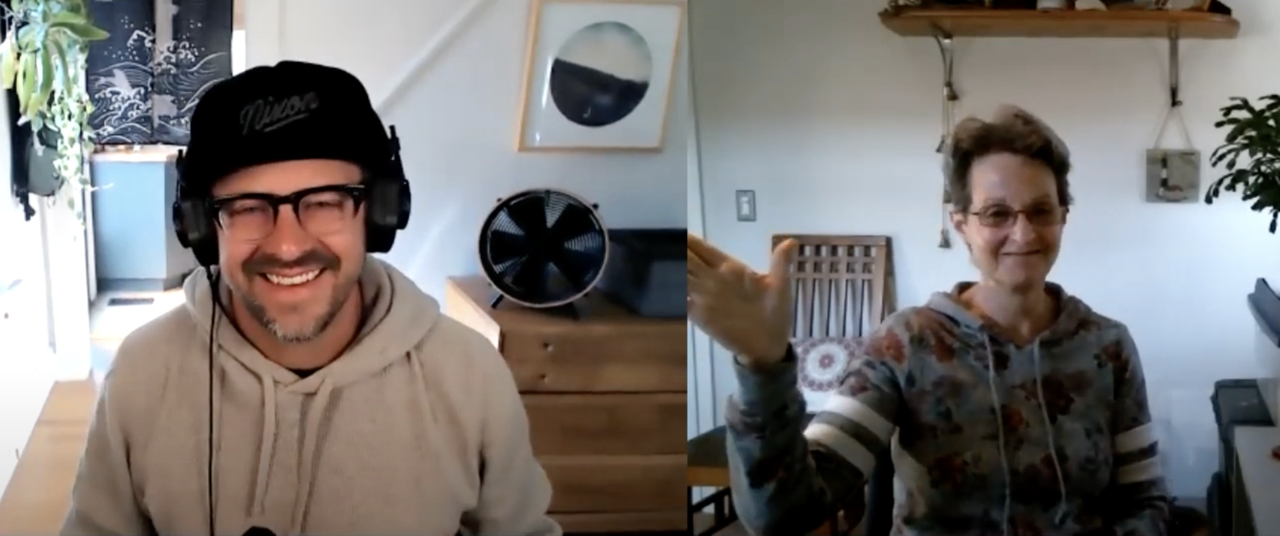
Joi Brooks: I didn’t know about that little bit there, there’s a little bit of learning every day. Of course, this is Email and Coffee, and I'm drinking cold coffee. My little leftover from this morning. It's decaf, it's about time for decaf. What are you drinking?
Matthew Smith: You know, it's interesting that you say that about decaf. For a long time, my go-to drink period was alcohol and I gave that up four and a half years ago and then coffee became this thing. I started paying attention to what I was drinking in my coffee; getting the best beans, getting the best roast, paying attention to all of those details. Recently, I've had to switch to decaf because I have some anxiety stuff that comes up and it doesn't feel good in the body when that's going on, so I switched and. Thankfully, there are more and more good decaf roasts out there these days.
This is a Greenville roast from a company called Bridge City that has a cool mission. They do a pretty good job so I'm pretty psyched on that.
Joi Brooks: Yeah, I think it's not so bad. I had tested that myself.
Today we're going to talk a little bit about psychology. Around 1943, Abraham Maslow theorized that human nature is grounded in five core physiological needs. I'm going to share my screen to give folks an idea of what Maslow’s hierarchy looks like.
Let me just get everything in order here. Here we have the very bottom, by the way, Matthew, you can see the screen, correct?
Matthew Smith: You got it.
Joi Brooks: Good. I hate when tech things fall apart. At the very bottom, we've got the physiological, the very basic needs of food, air, water, sleep, and then you start moving up and you go into safety, where we're talking about health, security, and protection. Then, loving and belonging, where you've got family, friends, a sense of community. Esteem and respect, which are more about the ego-driven belief that you are valuable and you are deserving. Then, you finally move into the pit of home, where it's self-actualization and you fully get into your potential.
Maslow's theory can be applied to marketing and we can connect a brand with a customer and appeal to their basic needs. You've got Quaker Oats at the bottom, “it's the right thing to do”, and then Allstate with regard to safety, “you're in good hands with Allstate''. You've got Pepsi, trying to get along, “You're in the Pepsi generation”, community. You've got Royal Salute Scotch, “what the rich give to the wealthy''. Needless to say, the highest you can get, the U.S. Army, “Be all that you can be''.
We've all heard these and we're all familiar with them. You may not have considered how they apply to Maslow’s theory, but I'm wondering Matthew, how Maslow’s hierarchy of needs applies to email marketing? And design a little bit too. Tell us a little about that.
Matthew Smith: Actually, I give a talk called, The Mental Inbox, which deals with this a little bit. When I think about design, a lot of people think about anything visual, but for me, it's capital “D” design, which means thinking about the entire package, thinking about what is the job of the email. What is the job of the subject line or the job of the visual design or the job of the copywriting?
The customer is hiring your email to do something for them, to solve a problem for them. Especially in our current scenario, mid-pandemic, our audiences are in a state of being where a lot of our day-to-day is down here in these bottom three categories, if not the bottom two. We're wanting to make sure that our physiological well-being and our safety well-being are taken care of. At different times, some of us have been able to move up the ladder, so to speak, or up the pyramid, but it's been a challenging time.
Emails and their content can do a lot to meet people where they are by using literary content or written content in a way that helps attune to people's challenges that they're facing, and not ignore that, not be tone-deaf to that. That's not just during the pandemic, but it also applies to some of the things that we're facing as a country, where we have incredible polarity politically. Where certain groups of people in the United States or even beyond are facing humanitarian rights issues, racism challenges, et cetera. Ways that we can meet those people and understand where our audience might be in their experience of Maslow’s hierarchy of needs and then addressing those.
From a visual design perspective, one of the most important things that you can do is think about the evolutionary picture of humankind. It's important to create clarity in a situation because confusion can feel dangerous. Confusion often excites the amygdala and I think the sympathetic nervous system, so when we're in an excited state, we're trying to figure something out. If you've heard somebody get upset on a confusing phone call with customer service, that's the sympathetic nervous system getting amped up. “What do you mean? I thought it was this way. You said it was going to do this. What, now you're saying this?”. That kind of confusion really gets that going. That's an uncomfortable state.
Now, humankind can do interesting things and be very powerful within that state, but generally, that's not the state we want to address our customers in. We want to get them into their parasympathetic brain, which is their more relaxed, slower thinking brain where they can make better cognitive decisions.
You can do that using visual design by creating simplicity, clarity, by reducing the number of things that you're trying to do in an email, to their essential package, and have what I think of as a minimum viable job that this email needs to do with, potentially, some simple, secondary or tertiary things that they can do.
Most emails that we get at Really Good Emails that we reject and don't accept into our, what we call “really good”, are generally just too busy. That's one of the clearest factors. They're trying to do too much and they include too many different types of typography, colors, design elements, visual elements, et cetera, making it hard to read. It's hard to scan and understand in a short period. Those are the kinds of things that I think apply to Maslow's hierarchy of needs.
The biggest thing though is knowing your audience. For example, if you have a significant other, who's just been in a car accident, then that's not a great time to talk to them about maybe some relational issues you're having with them or talk to them about the next vacation that you're going on. That's a time to listen to how they're feeling because they're down at the bottom of Maslow's hierarchy of needs. Knowing that about your significant other is important, but also knowing your audience so that you can attune to what they're experiencing. That's the most important thing.
Joi Brooks: Yeah, these are difficult times and we are hitting the lowest two levels, but there is a certain amount of community also because we're all shut out of the community. There are many ways that email marketing can story tell using these methods.
The top two where you're actualizing yourself so your customer is being all that they could be with your product. That's a tough sell, but the basic three bottoms are easy, storytelling, and comfort. As you said, the design element is clean, it's clear. You don't want to confuse your customer. You don't want to put them in that exciting space because they don't know what to do and they don't belong anywhere.
As a graphic designer, you're tasked with getting a message into a design with a CTA, and that's a call to action, within the HTML stack. Now designers don't code so they're not necessarily aware of that stack and how to address a design within the stack. As such, they might be likely to apply a brochure or a full, four-color advertisement, even a package design, and work it into an email that doesn't always work.
How does the designer apply everything that they've learned to email marketing specifically? How do they get through the noise?
Matthew Smith: Email is a unique medium, it's different from the web, and as you're pointing out, it's different from print. I would say my experience these days is that many designers do code and/ or they have a better and better understanding of how HTML works. However, understanding how email HTML works is another unique beast particularly because of the need to meet a lot of the Outlook audience and so on and so forth.
Email as a medium, more and more, is read in the mobile experience. That's extremely critical. When you're on mobile, then that also means that people are in a mode that is not a long-form reading mode, generally speaking. That's not always the case, certain emails can be effective for that, but generally, people are in a utility mode. They're ready to read your email and get going. Email, on the whole, is a place to summarize content and lead people toward things that appeal to them more. Whereas a brochure, for instance, a printed brochure has to cover all the ground. It has to tell you the whole story and email does not. An email can be a high-level summary of a set or an array of topics, and then give people an opportunity to move to a website, to finish checking out, to complete an action, to read more about something, those kinds of opportunities.
Then, when you're in the utility mode, again, to my point earlier, when you can be simple and effective using visual treatments like hierarchy, you help people scan to see what they're interested in more quickly. Most people can relate to visual hierarchy thinking about going to a newspaper website. You and I are old enough that we remember newspapers. You open a newspaper and you see the front headline and you know that they've created a greater hierarchy on the articles they want you to read first. You can use visual hierarchy through bolding headlines and through making your body copy slightly lighter, still accessible, and dark enough to read, but slightly lighter. You can help somebody be able to look from a high level and see what's in this email. “Oh, it wasn't point 1 or 2, but it's point 3 that I'm interested in. Okay, now I'm going to dive in”.
Those are some of the ways that we try and think through email design, but all of that is predicated on the hope that you know your customer already. Instead of guessing at what your customer might be needing or wanting, it's appropriate, that you spend the time getting to know them through surveys, through phone calls, through analytics, and seeing what kinds of actions that they take, and then potentially, even personalizing your email to begin addressing their unique needs.
A good example that I often use is my friend Jorge was at a shop called Reverb, which was all about selling used musical instruments, and at one point they had a sales email that would go out that would talk about all of the different sales across categories that they had. Then, they started being able to pay attention to who was purchasing what, and then they segmented their audience into different groups. For example, this is a drummer, this is a guitarist, this is a flutist, whatever, and then they started sending that person hierarchically more important information that Identifies with them. Their sales went up by 12% or something like that, with only that small change. Anything that you can do to be a better listener, because, ultimately, that's what that is, right?
If you and I become friends and you are consistently talking about how important your vegetarian diet is to you and I always bring up what it's like to be a ranch hand and slaughtering cows, that's insensitive. Sensitivity aside, if I'm in a sales position, that's especially bad, I'm not attuned to what you need or what you want. So, when we can personalize better, we're mirroring, which is the psychological term, and that has the opportunity to trigger something called mirror neurons in the receiver's view.
There's never been a study on whether that happens in email marketing, but there's been plenty of studies to show that it works very well when you are communicating. It releases something called oxytocin and oxytocin is a bonding chemical. It's what is released in mothers and children, for instance, when they are talking to each other at an early age. It’s what's released in couples when they are communicating and connecting. When you can do things like that in your relationships with your customers, there's an opportunity to have some of that oxytocin flowing and create that bond and relationship with them.
Joi Brooks: Yeah, once you have all of the background elements of your email together, you've got your writer, you've got your designer, you've got the marketing team altogether, you shouldn’t forget about all that data that's coming out of the backend. The strategy should start up front where maybe your campaigns are general to start with, but you start driving your campaigns so that the data that is coming out can further segment and dig into all of the different profiles, personalities, and behaviors of all of your customers.
You know that they wear sneakers, because they've purchased sneakers, you know that they wear high heels, because they’ve purchased high heels. Odds are, you're building a profile on somebody and it's not difficult to take a moment every week to take a look at that data, with your cup of coffee, decaf or otherwise, just to see the trends, to see the stories, to see what that data is telling you. You could come up with some interesting campaigns that are off the grid. Once you start getting that data, you may not realize who your customers are. You may say, “oh, my demographic is 50-year-old men”, and then suddenly you realize, wait a minute, where are all these women coming from? They're buying stuff for their 50-year-old men so the message comes slightly different.
Considering that you're a designer, considering all of the skills and elements, how can you distill those skills and elements into email marketing where you're trying to be the stack, you're trying to get a CTA across, but you still want to be creative? You still want to be exciting, you still want to be slightly glamorous. How do you do that?
Matthew Smith: I think the way that I work on some of these kinds of things is to set a constraint early and upfront. I like to play a game called design golf and it's basically to get the lowest point score possible. Every time you use a different font, every time you use a different color, every time you have a different visual treatment for something, that's an additional point.
When you're in communication design, every point of difference asks the user's brain to interpret that difference, why this difference? If that difference isn't doing a job by saying, “okay, this button is different from this other one, because it's less important”, okay, that's doing a job. For example, we have a filled-in button and then we have a ghost button with just an outline. Cool, that’s doing a job. Do we need a tertiary style for a button? Probably not, it's not doing its job then. Do we have a different kind of rule or a divider? Do we have two or three of those? Why? Is that necessary? By reducing, reducing, reducing, getting down to the simplest form possible, then you're helping people to concentrate on what's the real intent and potency of the email, which is the content.
You can fancy up a design or an email all day long, but at the end of the day, a text-based email probably is affected on its own, but figuring out how to make it better with the visuals, not more distracting with the visuals. Starting simple and then looking for a way to make the email something unique with about 5% effort. Usually, it's just doing something with an image, making an image into a GIF, using Canva, or something like that, but again, generally speaking, most of the emails that I get into my inbox that people submit are just too busy. They're too much. They've tried too hard. There are too many grid points. It's not scannable, it doesn't serve the customer. It feels like it's more about the designer or more about the business than the customer.
The biggest thing for me is just to get simple and there are some great examples on reallygoodemails.com that you can go see that are simple and effective. That's my priority.
Then, if you want, you can also get interesting results by being more interactive in your code. If you're further along in your email journey and you know what you're doing, you can do some really interesting things. Google recently released an email for their Nest home product that was fully interactive, where you were able to choose a different color and choose how many you want, and then select a CTA and it took you to a checkout page. That was next level. What's interesting, if you think about it from web technology, it's like, what's the big deal, this has been available on the web for ages? If we can just get rid of some of the protocols in email and adopt a unified system, AMP is problematic because of its ties to Google and so on, but it is exciting to think about where we could be going.
On the simple end, you can just make a hover state on a button, which is a nice touch. Those are the kinds of things that I recommend people do. Generally, I'd say 90% of people are doing too much. It's not about doing more, it's about doing less better.
Joi Brooks: In marketing, we do overthink everything and we look at emails in a completely different way than everyone else. I remember Jason Rodriguez had a show where he was talking to his wife and he said to his wife, “what were some of the subject lines of your emails today?”, and she said, “huh, what?”. Most people don't. Subliminally, yes, they do impact you. You'll see the subject line, you'll see the pre-header, you see it, but you're looking at the brand. It's Disney, I'm opening it. Did they catch you with the subject line? Possibly. I'm not saying that, but I'm saying it's often the brand that's getting the recognition and not the subject line.
It’s often the cleanliness of the email that drives the person to read it and interact with it, other than all of the flashing lights, the colors, and the print. You slice and dice and all of these things that you go through, it's that simple story that brings you down to the bottom that gets you to click, that gets you into the conversion mode or whatever it is.
I do think that marketing sometimes over-markets itself. They try to use all of the golden objects one after the other. “Okay, we'll do it this way, and then we'll test this”. It's almost like A/B testing sometimes, and A/B tests are a great thing, but A/B testing yourself, the depth gets you nowhere. Any tool that you overuse, anything that you overstate, any comment that's used too often, a button too often, anything; everything in moderation, even in email marketing.
Last words, Matthew, what books and what influences are you following these days?
Matthew Smith: Yeah, that's a good question. The books that I would recommend that people check out are Understanding Comics by Scott McCloud. It's a really interesting book written in a comic book format actually, but it teaches you the visual language so that you can understand the role of color, the role of angle and dimension, shape and form, texture, movement, or perceived movement, to communicate what you're trying to communicate in an email or otherwise.
Then, the center of communication design is typography, so reading The Elements of Typographic Style by Robert Bringhurst, or Web Typography by Richard Rutter, either of those, are going to be effective at helping you understand how to use typography. If you can learn typographical techniques, that's going to serve you well in your design work. That's even for non-designers. I think that helps copywriters and people trying to understand how to communicate.
In terms of influencers, these days, for me as a designer, I'm more interested in photography or architecture. There's a blog called Colossal that I enjoy following because they show me architecture, artists, photographers, and give me an insight into what's beautiful in the world. That's often the most inspiring for me. I enjoy letting the natural world inspire the work that I do. That's where I'm at these days.
I always enjoy the Email Geeks Slack channel to hear what people are saying out there and how people are doing. This is a little bit of eating your own dog food, but anytime I'm designing an email, I'm using reallygoodemails.com. I'm glad that we have a repository of over 7,000 emails that have been curated by us to show what are good practices and what are some new things. We're always working on new ways of teaching the community what we believe are the best of the best. I’m having a lot of fun.
Joi Brooks: Yeah, I have to admit Really Good Emails is my go-to. It's my go-to for any designer that's asking you the question of, what I should be doing? Or, if I see that they're going off the rail, I'll say, “Here's Really Good Emails” and I’ll pick out a category for them and I'll try to curate it for them. They're always very appreciative.
It’s somewhat enlightening because designers may not know about all of the email accessibility, dark mode, they may not know about the stack. It really may come to them as some sort of a light bulb in their head when they see the stack in motion. It’s not a dirty word and they understand how they can work within that medium because it may not be glamorous, but it can be very exciting when you get that conversion when you see it happen in motion. That's the point, with a print magazine, you're a designer, you designed that four-color print, and it goes in the magazine, you don't interact with it. Maybe you get the magazine, you open up and say, “look what I did”. You put it on your coffee table, you leave it open, maybe it goes on your wall, but you don't interact with it. Email is interacting the moment it gets out. It's a vehicle right into a customer's hands, snd for a lot of people that do design, they're communicating. They get to do that on an instantaneous level. It's so very interesting.
I appreciate you being here with me today and as I said, I learned a little bit about you. How can people find you on the web? How can they interact with you?
Matthew Smith: Reallygoodemails.com is a great place to be, Twitter.com/reallygoodemail. We ran out of characters to the “S” and Twitter doesn't allow that. Then, you can also find me at Twitter.com/whale, like the animal. I'm always open to questions and just love to be as helpful as I can be.
Joi Brooks: Great Matthew. Thanks so much for being here and that's a wrap. Happy email marketing y’all.
Matthew Smith: Thanks, everyone.