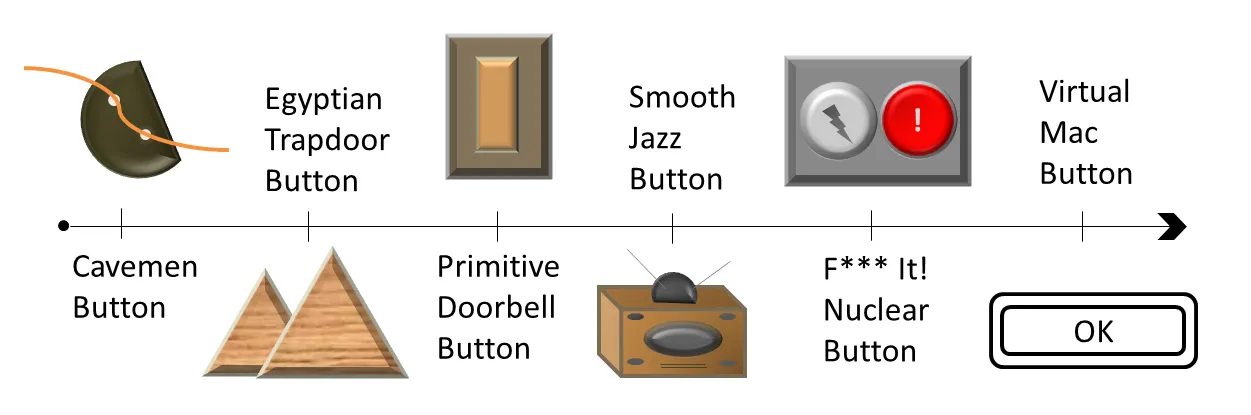
From the beginning of mankind/womankind, buttons have been useful in interacting with the physical world. Here’s a quick rundown on how humans have developed buttons for special purposes:

Exhibit: History of the button. Not approved by the Smithsonian, but it could be.
Since the button transitioned into the virtual world via Apple computers in 1986, there really hasn’t been that much of a development. Sure, there is a one less border (or maybe no border at all) and some color added, but it looks very much like it did back then.
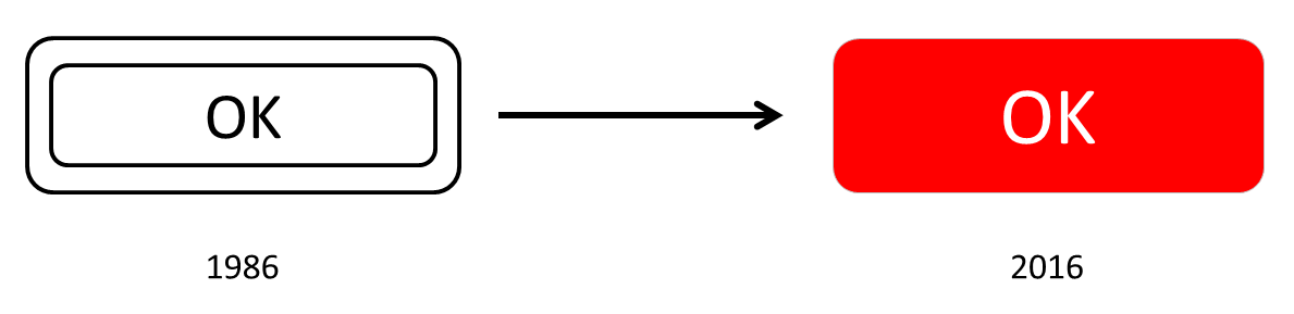
Now in technicolor!
Interests
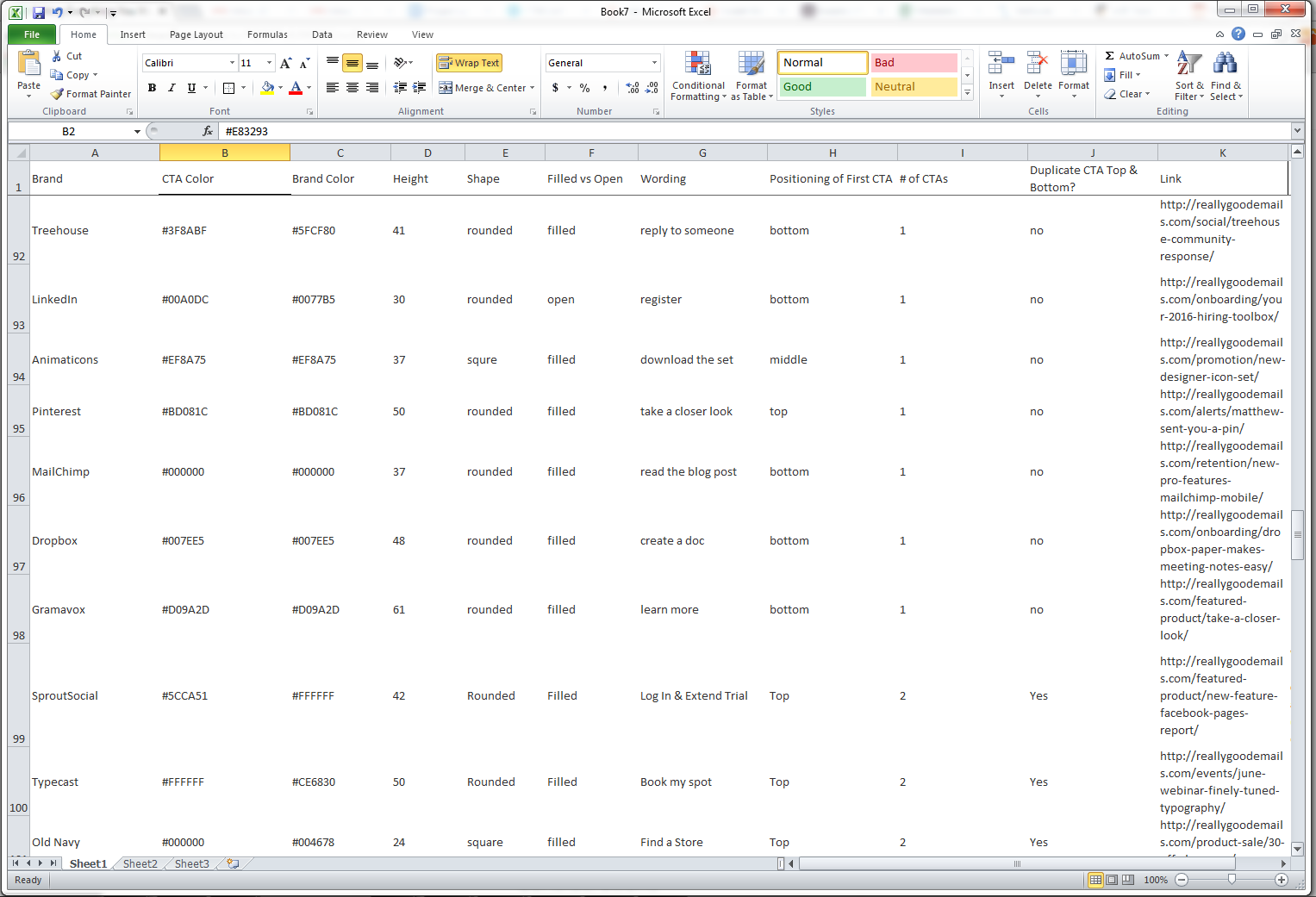
So, as the second part of the Email Design Trends of 2016 article, I took every email submitted to ReallyGoodEmails.com in 2016 and broke down their call-to-action (CTA) buttons. I logged multiple data points for each email to learn everything I could about what people were doing with their branded buttons. It was pretty tedious. It sucked. I kept telling myself: “Do it for the children!”
Here’s what I was looking for specifically:
- What’s the most popular size for a CTA button?
- What’s the most popular color for a CTA button?
- What’s the most popular shape for a CTA button?
- What’s the most popular frequency of a CTA button?
- What’s the most popular placement of a CTA button?
- What’s the most popular wording used in a CTA button?
- What’s the most popular character length in a CTA button?
The proof is in the pudding, as the say. And I love pudding.
Then there were more peripheral answers I was looking for, such as:
- How does branding dictate CTA choice?
- How often do icons, images, or unicode characters appear in CTAs?
- How does frequency affect tertiary CTA buttons?
- How do I order a pizza at 1 am when I am working on stuff like this?
Discoveries
Surprisingly, there wasn’t one data point that every brand does exactly the same. Sure, there are clusters, showing a common acceptance of some practice, but there are definitely deviations and traits. Here’s what I found:
SIZE
- The average CTA button is 47.9 pixels tall. However, the two largest clusters are 47 pixels and 50 pixels tall.
- The smallest CTA button was 20 pixels tall. With Apple suggesting that any touch point should be at least 44 pixels tall, it is very unlikely that someone will tap on this on their phone. (However, in every instance where this button size existed, it was baked into an image — not hard coded — and the entire image was linked. This occurred in most buttons that were below 40 pixels tall.)
- The largest CTA buttons were 115 pixels tall. These were definitely an outlier. Just look at the frequency distribution below. It is way out there, without any friends.
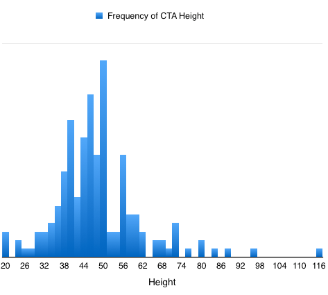
I do need to mention, though, that there are factors which affect the size such as font size, padding, and maybe even genetics. I’ve thrown some of those into a “Consideration” section below.
COLOR
- 48% of brands match their CTA to a color within their brand logo (of non-black or non-white logos). Of brands with black logos, 30% matched it with a black CTA while brands with white logos only matched it 10%.
- Blue is the clear winner for CTA color of choice. Brown wasn’t ever used. Sorry, brown.
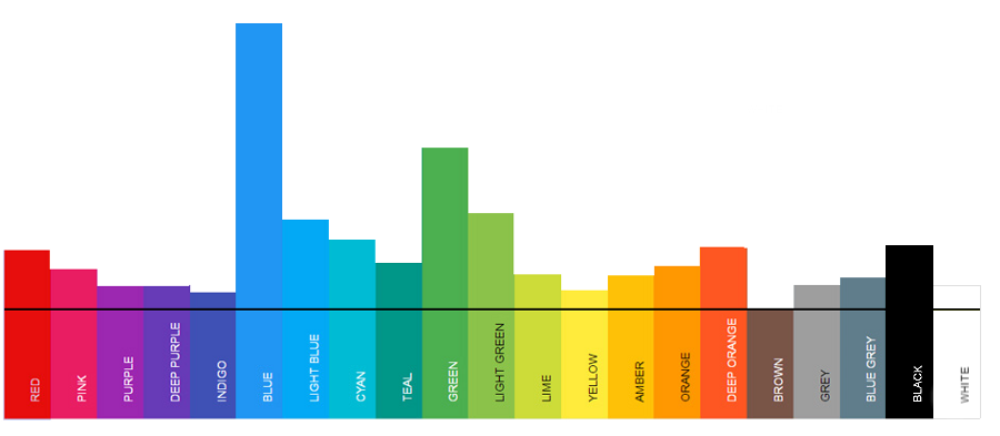
Blue is always chosen first on my playground kickball team.
- Only 2 hex color codes appeared multiple times in the data: #28AFFA and #55ACEE (the latter happens to be Twitter’s official color so maybe there’s been some code stealing? Just sayin’.)
- White buttons appeared less because a majority of emails had a white background. One could assume that if there was an increase of colored backgrounds, you would see white used more often to contrast that background color.
SHAPE
- Rounded edges are used the most: roughly 54% of the time.
- Completely square is used second most: 28% of the time.
- Pill-shaped comes in last: 18% of the time. However, in the past few months, this shape is being used more (26% more compared to the beginning of the year). Maybe a growing trend?
FREQUENCY
- The average email contains 2.1 CTA buttons. It is kind of like the census saying that the average American household contains 2.54 people. Don’t ask how you get 0.1 of a button in there, nor 0.54 of a person.
- The maximum number of CTAs in an email is 11. 56% of all emails contain 1 CTA, 24% contain 2, and 20% contain 3 or more. And of those that contain more than 3, 50% of those contain more than 5. Yikes.
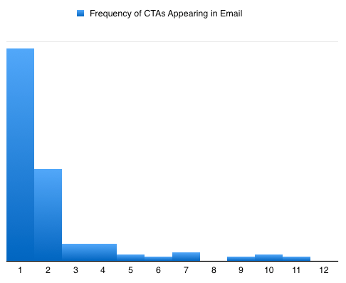
- Of emails that contain 5 or more CTAs, retail brands account for 90%.
PLACEMENT
- The most popular place for a CTA is in the top 3rd of the email. 38% of all emails had their first CTA somewhere near the top, usually within an image or right below a header image.
- The second most popular place was the bottom 3rd. Even though it is second, it is a very close second: 35% of all emails put their first (and usually only) CTA at the bottom.
- The least popular was the middle. Not too far off, with 27% of CTAs happening here.
WORDING
- The most popular verb in a CTA is “Get”. As in “Get it now” or “Get yourself a pizza.” This word was used more than 10% of the time to instill action.
- The top ten verbs are as follows (in order of frequency):
- 1. Get
- 2. Shop
- 3. Take
- 4. Read
- 5. Book
- 6. View
- 7. Start
- 8. See
- 9. Find
- 10. Join
- Surprisingly, there was only one CTA that started with “Buy” compared to almost 10% that started with “Shop.”
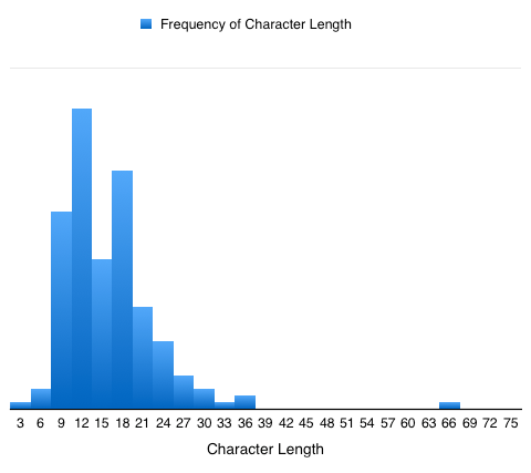
CHARACTERS
- The average button contains 14 characters.
- The shortest character count was just 3 letters. (It was “YES”.)
- The longest character count was 66. That is more than what Google displays in search results for a title tag. Also, looks like it may be on the same diet as that super big button we saw earlier.
Love this? You’ll love our newsletter!
OTHER INSIGHTS THAT DIDN’T FIT UNDER A TOPIC ABOVE
- 17% of brands duplicate their first CTA. They throw the second CTA at the end as a reminder. The average email that has a duplicate CTA contains 3.9 buttons.
- 87% of brands fill in their buttons as opposed to just having an open button with a border around the text.
- When CTAs compete (placed side by side), some brands show that one has less priority by making the second CTA open (not filled in).
- 4% of brands use an extra wide or edge-to-edge CTA button.
- Gradient buttons seem to be dead. Only 3 emails out of the data set contained a gradient button.
- Only one email contained an image within the button. It was a Facebook icon.
- While some brands were consistent with their formatting and colors, some change with every send. For example, InVision always uses their branded pink and rounded edges and Dollar Shave Club uses their branded orange and rounded for all of their newsletters. On the other hand, Moo uses rounded corners, but changes the color or fill of the CTA.
Considerations
- Within the findings, I use “average” which refers to the mean; the most popular is the value that occurs most often; and in some cases I note the median or middle value.
- I used tools such as ColorZilla (to determine the button color), Awesome Screenshot (to determine the size of the button when it was baked into an image) and an excel.
- The CTA button color varies based on background color and branding guidelines. For example, a white button will show very well when the background is dark or always using the color pink for branding purposes. This also plays a part with colors chosen to match the brand’s logo.
- The CTA button analysis for color, character length, size, shape, and positioning only used the first CTA button to appear in the email. This was done on the assumption that the first CTA was the most important CTA in the email and also because I didn’t want to log every single tertiary CTA’s attributes.
- Lastly, and probably most importantly, this data may be skewed based on if a brand used elements provided by their ESP and how many of those emails appeared in the data set. For example, MailChimp and Campaign Monitor’s drag-and-drop button is rounded. Mailchimp’s buttons are also, by default, blue and 47 pixels tall with a bold font at size 20.
If you enjoyed this post, send it to a friend (or arch-nemesis) and follow us on twitter