
Email marketing deep dive with Megan Boshuyzen
Matt Helbig and Mailgun’s Megan Boshuyzen unpack Email Camp, showing how accessibility, live text, and smart CTAs turn event emails into signups.
July 24th, 2020
Aero is a luxury travel company providing first-class private air travel from the lounge to the jet.
This FF episode was sponsored by emfluence. Get paired with a marketer to see how your strategy will work in the emfluence Marketing Platform.
📋 TL;DR key takeaways from this episode:
1. Simplifying your email can give you the opportunity to keep track of how your emails are performing before you make any changes to the design.
2. Think of a travel email as an invitation for your audience to learn more. The email doesn't have to be complicated, and the website can do the selling.
3. Explain the details of what you're promoting and the features you offer in a clear way. For example, lead into a section with icons (the airplane seats in this Aero email), and then explain the feature in a short paragraph below the icons.
Matthew Smith: It's Feedback Friday, everybody. Wassup?
Matt Helbig: Welcome back to another episode of Feedback Friday.
Matthew Smith: Yeah. I'm excited about talking through the qualities of emails with you, Matt Helbig. Good to see you again. It's been a minute.
Matt Helbig: Yeah. This one popped up in my inbox. I thought it would be worth talking about.
Matthew Smith: Yeah. Tell me more.
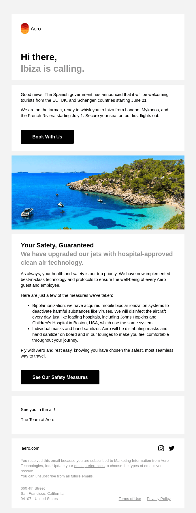
Matt Helbig: I was just shopping around for a private jet. This is a luxury travel company. They have some simplistic use of live text. They use very simplistic colors of their logo throughout the emails and some stunning photography. It just really brought me in.
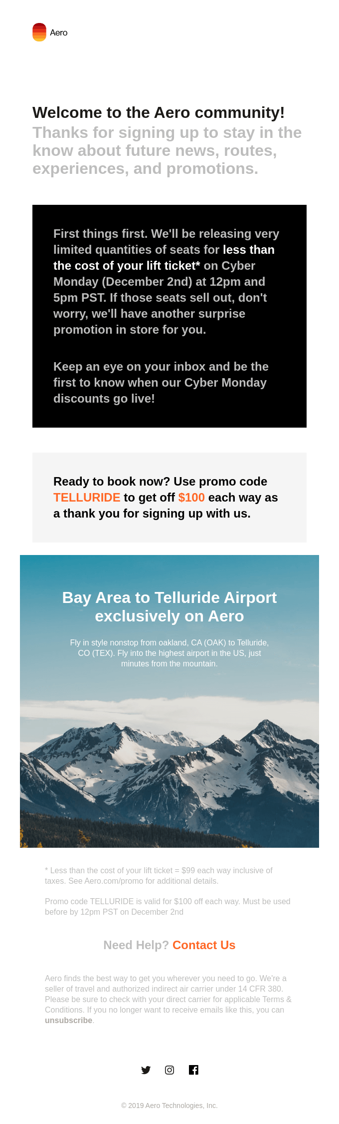
Matthew Smith: They do an interesting job of getting you right in there pretty fast. They're using simple typography. These blocks to call out actions. It's a little bit much for me to have black, gray, gray on black, white on black, this big black block. Oh, now gray block with orange in it, but it's just a highlight. It's not an actual CTA. You know, those kinds of things.
It gets me down to a CTA at the very bottom, for "Contact Us", but that one's a CTA and this one's not. Some things are effective. One of the things that I continue to talk to people about is to simplify your emails. Get simple faster. It moves the design forward to just stay simple and get your typography right.
From a typography perspective, I think they're doing some interesting things here. I think the mobile works better than the desktop in this version. Think about this email for a minute. If this big black block wasn't there, just the ways that that might be different. THey're trying to solve a problem. They're trying to call this out. That's one way to do it,
Imagine it without the photography. It would just be a completely different email and would not work nearly as well. So I think you're right. The imagery is really important and they're using it well. Should we jump to the next one and see what else is going on?
Matt Helbig: Sure.
Matthew Smith: It looks like you've signed up, which is awesome. Little do they know that you're not going to buy a jet on Really Good Email money. So what is it about this one that caught your eye?
Matt Helbig: I think the ticket price for a single seat on their jet is over a thousand dollars. So it's almost like a weird thing to be selling in an email. I just liked, especially this mobile view of simplistic and with the left aligned text and the use of live text.
The double repeating CTAs, I think works for this. I like the little icons with the seats. So to me, it's just a very simple paired down email compared to some other travel emails that we might've seen from airlines showing a lot of different images.
This one just seems very clean. I think they maybe know who their customer is and they don't need to like be sold really on this service. Either you want to fly in a private jet or you don't.
Matthew Smith: One of the things that I would say from a brand perspective is, on the one hand, I like the emails because of how simple they are. On the other hand, I feel like a brand like this has an opportunity. Look how sleek this black jet is. That's amazing.
Why not go with like a dark theme, kind of more refined email? That's a big question I've got. It seems like something like that would be aesthetically more in line with their audience and somebody ready to plop down $1000, $2000, $3,000 a flight to very specific places.
They only fly four places currently. So they're out of the gate, right? Like this is a brand new startup. If I'm not mistaken. Is that kind of the idea?
Matt Helbig: Yeah, I think so. Yeah.
Matthew Smith: Yeah, it's some interesting things, but again, one of the things that they're doing here is they're just keeping it really, really, really simple.
It's amazing how often teams just get their emails too complicated, too fast. They can work on their style. I'm going to guess they're trying to look at, are these emails performing as we need them to, before they do anything else. Which I think is an interesting move.
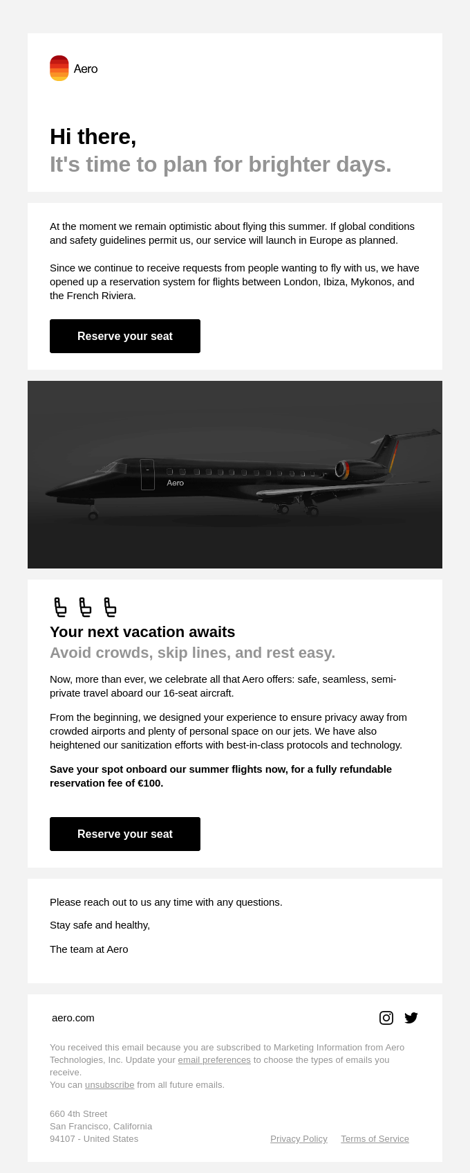
This is a similar one, the template set that they've got. This is a design system in the simplest possible way to think about it, right?
Like you have these blocks. This "Hi there," block with a subheading in gray and you can see they use it here and they use it up here as well. These blocks just get repeated. The difference would be this one has a white background versus this one has a slightly gray background. So it's just interesting. They've got just a straightforward way of moving people through this stuff. I think that's fascinating.
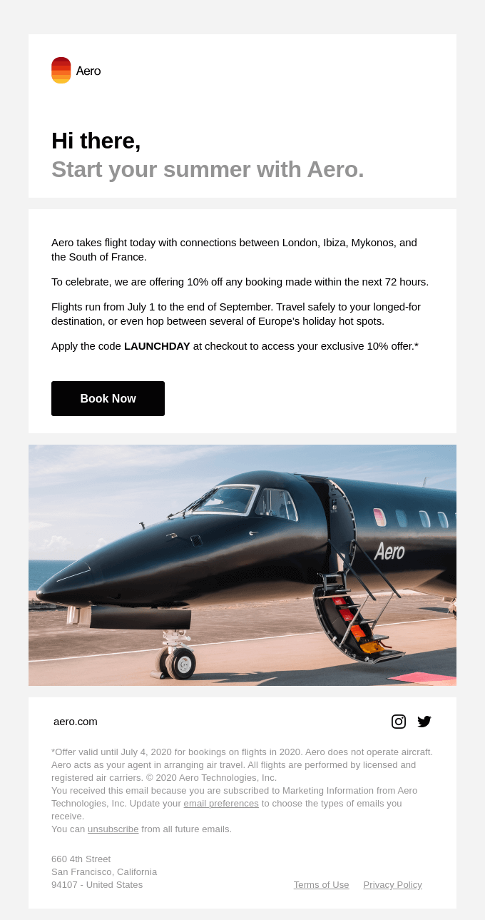
So this last one was about Ibiza and just gets a little bit more into some of the details of safety. I think this is an interesting case. I'm super curious to see what our audience thinks. What do you think are going to be their main questions?
Matt Helbig: I'm not sure how to impact this more.
You could add some more stuff, but then it might start feeling a little bit cluttered. Maybe this is a good example of letting someone know that, Hey, Ibiza is calling you. Maybe they're using their website a bit more to sell, and this is just an invitation to go learn more about their service.
Like you said, the email doesn't have to be super complicated. Maybe it is just a notification. That top of mind awareness to bring someone back or let them know that you are still traveling.
Matthew Smith: I wonder how often these things are getting sent and some of that, but I think one of the things that I am noting here is like, they keep promoting these feature sets per email, but they don't tend to repeat them.
So for instance, Your next vacation a way to avoid crowds. This is like one feature. Then the next time they've got another feature, just sort of the places that they're going. Then the next time they've got safety. So instead of putting safety, a variety of places, that kind of thing in one email, they separated up and hit you in some different ways.
It's just an interesting strategy. One of the main things that I would probably do is with an airline like this that is really about developing that sense of wanting to go that sort of like hunger to go and the ability, the financial ability to go. I think that the brand needs to get more refined.
Like this Aero brand that's hot. I like that. It's this idea of a sunset. Inside an airplane window.
Matt Helbig: Oh, I just got that. Wow.
Matthew Smith: That's hot. I want to travel to cool places and see sunsets in cool places. Look at me, I'm on an airplane. I think that to appeal to that audience, they will need to like step it up a little bit.
Think about Tracksmith's emails. Those don't feel like Old Navy shorts. They're legit. I'm wearing a pair right now. They're just refined, you know? They're more expensive too, but they're high quality.
I think you're going to need to start to sell the little details of what you're selling, not just a flight. It is nice to avoid the crowds, especially these days, right? Like that's a selling point, but I would promote it a little bit more clearly, I think.
We talked about this not long ago, but on Really Good Emails, you can go click the code on an email detail page, and then you can go see that code. This is a great example for you to go see this code and then go and take it and change it. So it's not copying and then play with it, learn from it, make it your own.
This is a great example of a very simple template that you could go and learn from and use and try things with. This is the kind of simplified approach that I think could work well for somebody out of the gate. Like just needing to get information out like this is. Pretty generic, I think is a good word, but it's doing enough of the job. I think the change that could happen in this email is the next 10 to 15%. A lot of it is already there.
Well Really Good Emails folks. We love you. You're such a great community. Thanks for being out there. Let us know who you want to see on Feedback Friday or who you think we should be talking to.
We will see you out there. Bye.
Matt Helbig: Peace.
Categories:
Feedback FridayMatt Helbig and Mailgun’s Megan Boshuyzen unpack Email Camp, showing how accessibility, live text, and smart CTAs turn event emails into signups.

Accessibility, applied: Matt Helbig and Kelsey Yen reveal how inclusive design turns real emails into better user experiences.
Dive into the world of unmatched copywriting mastery, handpicked articles, and insider tips & tricks that elevate your writing game. Subscribe now for your weekly dose of inspiration and expertise.