
Email marketing deep dive with Megan Boshuyzen
Matt Helbig and Mailgun’s Megan Boshuyzen unpack Email Camp, showing how accessibility, live text, and smart CTAs turn event emails into signups.
May 8th, 2020
Away designs, manufactures, and retails suitcases, bags, and accessories with premium materials for modern travel.
📋 TL;DR key takeaways from this episode:
1. Get creative. Showcase products in different ways throughout your emails. Use simple typography that is one color to make this work.
2. Here's a solid layout format for product emails: product image, supporting copy, CTA. Make the email easy to navigate without getting too intense.
3. Be careful with CTAs on mobile. The product photos and CTAs might appear too close together. Double the padding between your CTA and the next product photo to give your email a little more breathing room.
Matthew Smith: Hi, I'm your host, Matthew Smith, also known as @whale, like the animal. Here to host another episode of Feedback Friday for all you email geeks wanting to learn a little bit about design and what makes an email really good. Today we're going to review Away luggage, and they're really, really fantastic email series.
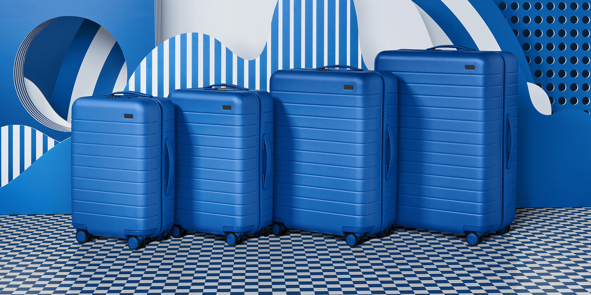
Lots of cool things that we can dive into today. So why don't you come on a little journey with me and we will dive right in. Let's look at their all blue, new year, new hue. Pretty interesting to see. This is a partnership that they've developed with Pantone [↓], which I think is pretty interesting. So it's a Pantone color of the year for 2020 it's a blue.
Pretty sexy, pretty interesting. I'm just going to say I'm gonna get it out of the way. These are all image emails and that bums me out big time because it's not future forward. That said, the content, the strategy, the aesthetic of these emails, the branding, all very strong. What does Away want to do here?
Why are they sending this email? They want to get new luggage out to new people and/or returning customers. They want to show them something really pretty interesting, right? And blue is not like your average luggage piece. So they're trying to get you to stand out from the crowd. Maybe you've got a bunch of black luggage and it's time to upgrade.
They do this little play at new year, new you. New year, new hue in this case. And I think that's clever and it's fun, right? So they're doing a great job of getting me to dive in and they get me a nice, clear copywriting statement, which I think is clever and fun. They gave me some supporting copy and give me a very, very clear CTA.Shop Pantone.
They use this imagery to help me understand what's available in the line and all the sizes that are available in this new color. I think that's extremely helpful. And then they give me little details, like being able to see that the wheels are even blue or that the interior has this sick, like little blue parts that the zipper is even blue.
I mean, these are details that some of us notice and care about. Right? And they've done a fantastic job of putting this together. And just a beautiful illustrated, fun way. Over here on the mobile side, everything looks really clean and it just makes sense. It's a little small. This is not really what you'd call mobile optimized.
It works on the mobile side. You can see that it's readable enough in this mobile view, but it could be even better. And again, that's one of the issues with mobile optimization is you're going to have a hard time doing that. You can load unique images for that, but then you have to design it twice, not that fun.
Right up at the top. Let's look at a couple of differences. So in this case, they're talking about a way in Pantone partnership, and in this one, they're using this tooling of putting navigation. So I'm curious what you're experiencing out there. Let us know if you have seen strength in that tooling.
In this case [↑], you know, shop and refer a friend are not like what you'd expect to see on awaytravel.com. So being able to see those two up top I think is pretty interesting. I'm curious how effective that was. So if you're on Away, team let us know. We would love to learn beside you.
They are letting us know right away that, Hey, if I make it a double or a triple, that there are options for me, and that's pretty cool. So if I buy a whole set, then I can get some discounts or some value opportunities and I can shop things in sets. I can also look for something that's more toward my match and I can see things that are properties or values of each of these.
One of the things I think is working really well is that they give me an image. They tell me what this image set is about. They give me the supporting copy and then a CTA, and then they repeat that down here with this set again, and I think that's working really well. The one thing that I think is a little challenging is if I'm in this sort of view, the CTA. Does it belong to this top one or the bottom one? The difference is just a tiny bit more padding here that suggests it's to the top one. If it were me, I would double that. So it just gives your email just a little more breathing room. The amount of scrolling that you have to do is not much more, and it gives the overall appearance a lot more breathing room.
So this is just a cool way to walk people down. I love how simple this is. You're going to hear this over and over from me is, this is a good example of design golf. Design golf is this idea that you pair down and you look for the lowest point value. Every single difference is a point. Try and get to the lowest point value you can during every design.
They have this font up top. They have a nice big heading on white in this background. But then as you go down these heading stay the same, the layout stay the same. It's extremely easy to navigate and to see the differences without getting too intense or too wonky. I think they've done a really nice job here with this.
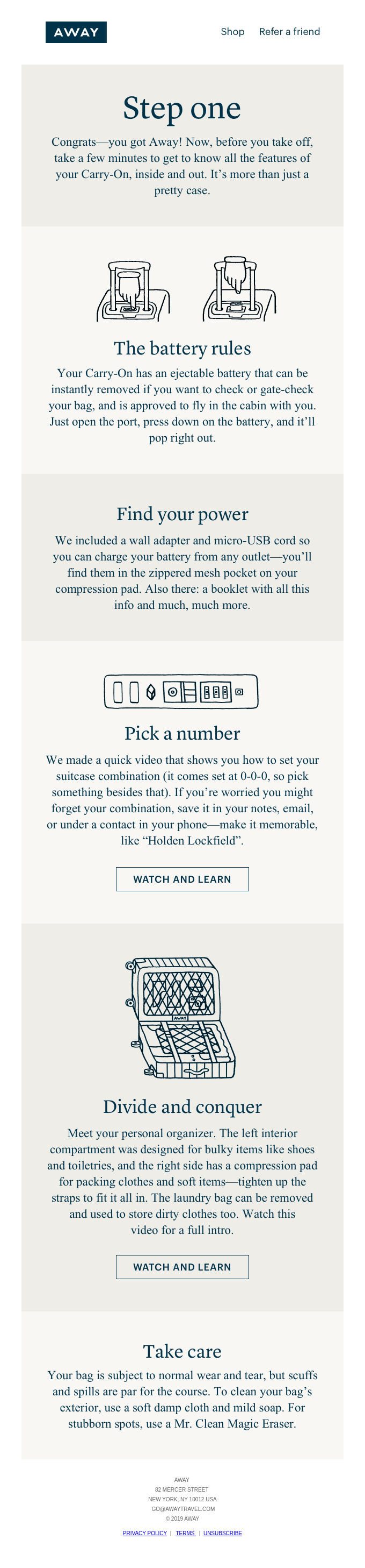
This is a great example of seeing the Away brand flex [↑]. Look at how different this feels. To this, and yet it's still part of the away family. One of the ways that they continue to be able to make that work, I think, is by using typography that is one color, and that is simple. And seeing if this other type of typography and illustration how it converts. So I would be super interested to know more about it. So in this case, this is, I've purchased an Away bag, and then what is the next step for me, right? So I get to see sweet, here's what's on its way, and here are the features that I can expect about battery power, picking a number to secure my suitcase, and then how to pack it.
All these little tools that I can actually, in these cases on these bottom ones, watch and learn. I think these are probably not worth watching a video about, like it's easy enough just to see the illustration, but I think they've done a nice job here. The one piece of feedback would be, I think that the amount of text here for our centered is a little long. It works because of how simple this is overall. If it were more complex, it would be really difficult. It's easy to scan, as I've been talking about with design golf, they've really trimmed it down so it makes it work okay.
I think it's fantastic to see them pushing their brand even further, doing fun things [↑]. The way I like to think about brand in this case is it's like a brand family, and so they're pushing it here, but it still is part of the Away family because it has to do with luggage obviously, but they are really pushing it toward this like old school eighties maybe like whatever this chalet era is, but just a fun GIF here.
Fun photography, really wonky, crazy email. Again, it's all images, which makes some of this possible. They could have done the imagery separate, and this could be live text very easily. But man, what a fun email. But yet, even with all this interesting stuff that they've introduced here, notice how it still remains very, very simple.
You've got all these twists and turns and the illustrations and different imagery here. But it still is essentially very straightforward, and that is a really important part of the design ethic of Away. I think it works very well. These are e-commerce emails, right? You've got to get good photography in front of the user and help them understand what the product is.
Show off the styles. In this case, showing imagery with some accoutrement like this chair and the helmet is an awesome idea. Being able to show it on the wall of like a ski resort, brilliant move there. That makes a lot of sense. Being able to show it with some environment like this, like the really nice old school chair and one of these chalets.
Then being able to show somebody using the product also loves seeing the diversity, especially in this sport of skiing. You don't see a ton of African Americans or Africans, and so it's nice to see some diversity and pushing that. I think that's wonderful. And it helps just keep the brand fresh and move the narrative of diversity forward.
They just have done a nice job of including even just this random little ski boot there I think is fantastic. Look at this little mountain icon. Fantastic little treatment. Just a bunch of details. Again, on the rest of these, these all start to tell a story of what's happening in the Away brand.
There's quite a bit of difference here, but enough sensibility that I feel like they've done a good job of showing the vast array of what's possible within Away, and moving me into product and giving me an opportunity to get to the site. Go see what else I can learn. Nice job Away.
Always looking for your feedback. What do you think? I'm not the only person who cares about this stuff, so please let us know in the comments or email us at hello@reallygoodemails.com and let us know what you think about the episode. Thank you for being here. Love you email geeks. I'm going to go have an amazing Friday and taking some time off and will rest my brain.
Alright, have a good one. Bye everybody.
Categories:
Feedback FridayMatt Helbig and Mailgun’s Megan Boshuyzen unpack Email Camp, showing how accessibility, live text, and smart CTAs turn event emails into signups.

Accessibility, applied: Matt Helbig and Kelsey Yen reveal how inclusive design turns real emails into better user experiences.
Dive into the world of unmatched copywriting mastery, handpicked articles, and insider tips & tricks that elevate your writing game. Subscribe now for your weekly dose of inspiration and expertise.