
Email marketing deep dive with Megan Boshuyzen
Matt Helbig and Mailgun’s Megan Boshuyzen unpack Email Camp, showing how accessibility, live text, and smart CTAs turn event emails into signups.
December 12th, 2019
This week we look at Flock's nurture emails.

Matthew Smith: It's Friday. What's up, Matt Helbig?
Matt Helbig: What's up email geeks? What's up Matthew Smith? How's it going?
Matthew Smith: Dude. Very well. Very well, my friend. I was pretty into these. You know you told me that these were submitted on the site from Flock, right?
Matt Helbig: Yep. It sounded like they had redesigned their onboarding emails and they were looking for some feedback.
Matthew Smith: It turns out this is Feedback Friday, so that's cool.
Matt Helbig: We're here.
Matthew Smith: Yeah, it works. So please submit your emails so that we can do this. We try to be clear about when things meet the standard and why and when they don't. Why? So we'll keep trying to do that. Keep in mind, this is four people running this.
And so we do our best and this is our side thing. We all have full time jobs, so any help you can provide is awesome. Thanks. Cool. So Flock. This just nails so many things for me. So first. As an onboarding series. They're doing some really interesting things here I think. One they're using from a design perspective.
Let's just cover that first. They've got very simple but very attractive brand. The logo is very clear. They've got a very good use of the green there and this mixture between a rounded piece of typography and like a traditional kind of humanist serif. So that's what this is. And the rounded from Flock up here, and then they use this green like, so there is a blue.
There is green, there's more or less a black and maybe a gray, and then they have their illustrations, but otherwise. Like there's so few colors, which makes this email very easy to read and see and scan, which scanability is huge. Now you could argue that maybe that their CTA color here is being used incorrectly by saying pro up here and Flock, I guess Flock is a link.
These are not links. I think in this case it works, and this is pushing the edge, but it works. But the biggest thing is it's just really simple to read, really simple to see. And all throughout this email, everything's just very scannable. I do think this little pro thing is fantastic. I don't know why it's there, but I'm assuming that in part of the onboarding that would be clearer.
I think that's a neat little tip. It's very clear the possibility of what I need to do to get the most out of my 15 day trial. And so I can do that. And then I get to understand these most used pro features and dial in and figure out what that's about and start going.
And then I get to see here right away how many days I have in my pro trial. I think that's a pretty neat way of helping me understand. Like the the volume, like yes, I understand 15 days, but then what's really cool, we're going to switch over here for a minute. When I'm on day seven, you can see this is getting smaller and it's getting yellow, which is serious business here, so that feels pretty cool. What do you think?
Matt Helbig: So I think they really hit a lot of the good points of getting out of the way and inviting your colleagues is definitely the main CTA that they want you to do next. I'm sure they have some data around once your colleagues are invited, it's more likely that you're going to use the rest of this pro trial.
Matthew Smith: Yea that's right.
Matt Helbig: I think these little check boxes, I'm not sure if that's maybe the best icon to use, but I think it still sort of makes sense to me, just kind of going down this list of what you can do with your pro trial.
Matthew Smith: What would you use instead?
Matt Helbig: I don't know. I guess like maybe if there were icons specific to each of these things, so maybe like "Search away" could be like a magnifying glass or something. I don't know. But I think the check boxes match to their brand and you know, using those colors, I think it makes a lot of sense. And I like how it's laid out.
Matthew Smith: No, that's a good call. That would improve scanability to do that. Sometimes icons can be funny that way. Like what would you do for "Take control"?
Matt Helbig: Yeah, true.
Matthew Smith: That's a hard one. But I think just having them be unique helps call them out as separate.
Matt Helbig: Yeah. I think I like that bottom CTA too. Repeating the main call to action and then I also liked that 15 days remaining at the bottom as like a an ending piece.
It's not like the main focus of the email. Just kind of reminding you how many days you have left. What would you change? I think this one overall hits all the spots pretty good for me.
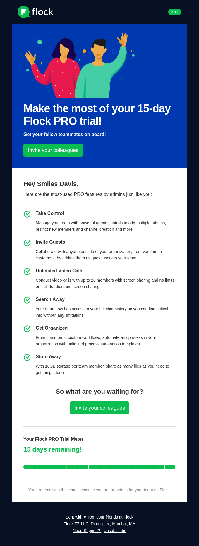
Matthew Smith: I can't really think of much. I did notice that, at least on my screen, the Flock logo is slightly blurry. Less so over here, but that's, you know, like if that's what I'm calling out as a potential to change, it's pretty small stuff.
I think they've just done a really nice job here. The topography is very dialed in. It makes a lot of sense. One thing that I'm noticing here is that this text size and this text size is very close to each other. Sometimes it can be helpful to make your sub, you know, this is almost like a subheading, right?
Like if this is your heading, I guess this is a subheading, but this is kind of your next piece of intro to make that slightly more so that there's no confusion that you really, you're creating hierarchy. So this is a little close. I might make it a little different, a little bit more pronounced.
And then they get away with this switching from left, left aligned to centered here. It works. And the reason it works is because this is they one, they leave enough padding right here, but then two is they have this sentence that is just long enough where it's kind of creates a horizontal that's kind of, that can be a no, no type of graphically and in design.
So one thing they could do would be to put another bar here like they've done here, or they could left align it. Or they could, you know, put the CTA left aligned here, and then some copy on the right or vice versa. You know, there's, there's a lot of things that they could do. It does actually work here and it's not terrible.
I see so many mistakes though in that way, and that seems like, are you serious? That's, that's really annoying. But I think what it ends up feeling like is if you do that incorrectly, it feels broken. And when you have a design that feels broken, it communicates in a subtle way that like your tool is untrustworthy and there's a reason for these design rules.
They aren't arbitrary. They aren't like some. You know, some designer didn't come up with them because that was a way to be nit-picky. It creates stability and stability, communicates trust and trust is what your customer needs to really value what you're doing. So these are soft parts of improving email.
In terms of a hard improvement. I'd love to know the data on, is this helping, you know, continue. Pushing the onboarding or people using it, but it seems like it's communicating clearly and then moving down through this flow. This is what I think is interesting, right? It's like "Pro Tip #2".
Now, one thing I'm noticing here is that they're switching aesthetic on this top area. I'm not sure why, but I started with this one and then now I'm switching over here. Where did the illustrations go and why am I now doing kind of a marker more hand handmade thing? I don't know enough about the product to know if this shows up in other places in the product.
It is inviting and exciting. It's interesting, but it is new, so you want to make sure that it's serving that purpose. I think you know what the fuck are custom fields and smart channels, you know? Okay. What if it was more like customers are using custom fields and smart channels to do X, Y, and Z, which is improving ABC, do you want to know how to use them? So just "What are they?" I don't know if it's like drawing me in, right. Maybe there's something that's a little bit more, that serves me as, as a tip. so that might be something,
Matt Helbig: I guess, like for me, I like this sort of mini case study idea. Thinking about other brands, maybe like a Slack or something where they pull in a lot more personal data about what you've done so far or something like that. I guess like this, this onboarding email is still pretty successful, but maybe pulling in a little bit more data with these pro tips about you or something, but I do enjoy that. You know, they're kind of standalone things and then they push you out to another page.
Matthew Smith: I think imagery too of the app could be helpful here in this process. You can see here on this final one, the illustration is a little different than on first day, if I'm not mistaken, eh, I guess it's got shadows and stuff.
Probably it fits. It looks a little more detailed. To me. And so it's again, nit-picky, but if you can maintain your design aesthetic than that's helpful for brand. I think it's working well. It's very clear what I need to do. If I want to keep using Flock, I need to upgrade. Here are the reasons to upgrade and upgrade to pro.
It might be helpful there to know, like if I don't upgrade, what I'm going to lose or how much upgrade is going to cost for me in this. A social proof about like Belinda. Upgraded and she's super happy she did it. And here's her testimonial. some social proof there or some Twitter quotes. I left this company to use flock instead and I've been really happy for these reasons.
That kind of stuff, like this is a decision point. So making sure that you'd double down about, you know, what's possible there. Those are some like hard things that I think could be changed about the email and again, using maybe a GIF or something like that to communicate what's happening in the tool or maybe some stats about how people have used the tool and it's been improving their productivity or communication, things like that. What about you?
Matt Helbig: Yeah. With this last one, I'm just thinking about, I guess it does feel pretty salesy. There's no like continue using without upgrading or maybe there's like a need more time sort of thing that allows you to, upgrade a pro for 10% off for the first month or something. I also would maybe like some sort of module around like still have any questions, like contact our customer service or send us an email.
Overall, I really liked the time's up sort of module. It actually kind of makes it feel like a little more urgency around it. It being red and stuff like that. It makes me feel like the obvious choice here is to upgrade a pro and then, you know, listing out the features again. But it would be nice if there was some dynamic stat here about your use case or you know, how many, you know, you saved this much time or you.
You know, you created this many projects just about, you know, outlining what your trial was about. And I guess with those tips previously too, it kind of made me think like, how many tips am I going to expect over this onboarding series? Is it one a day? So we've seen some brands kind of have a counter somewhere in these emails as well, letting, you know, like how many emails are you going to get during your trial period. Is it once a da? Or you know, can you opt in or opt out at those if you don't need them or something? So it'd be interesting, I guess creating that journey up until this 15th day kind of being clear about what kind of messaging you can expect. That would be maybe a nice little value add as well.
Matthew Smith: Another thing that I like here is this, you're receiving this email because you're an admin for your team on Flock. I think that's cool. That's a nice little way of reminding people. You know what's going on. Also, they're using live text that's freaking rad
Matt Helbig: In all all these is really good.
Matthew Smith: Great. Keep rocking Flocking.
Matt Helbig: Yeah. I love to see how this performs. You know what kind of A/B testing they can maybe do, but to me this is a pretty well thought out onboarding series, and I'm interested to see, you know, how it kind of works out for them.
Matthew Smith: Yeah. These are flocking good emails.
Matt Helbig: Well have a great week!
Matthew Smith: Bye.
Matt Helbig: Bye.
Categories:
Feedback FridayMatt Helbig and Mailgun’s Megan Boshuyzen unpack Email Camp, showing how accessibility, live text, and smart CTAs turn event emails into signups.

Accessibility, applied: Matt Helbig and Kelsey Yen reveal how inclusive design turns real emails into better user experiences.
Dive into the world of unmatched copywriting mastery, handpicked articles, and insider tips & tricks that elevate your writing game. Subscribe now for your weekly dose of inspiration and expertise.