Email marketing deep dive with Megan Boshuyzen
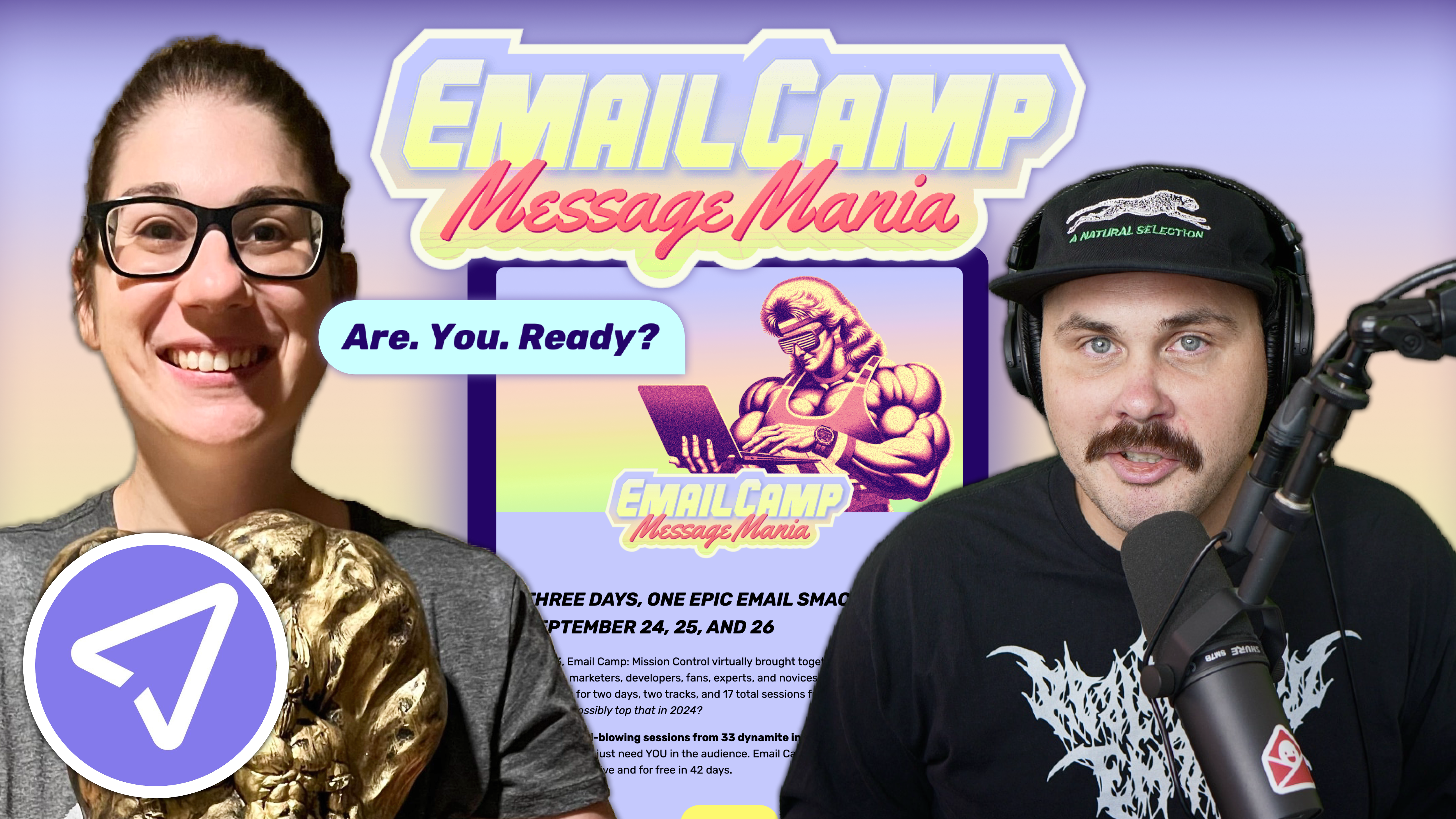
Matt Helbig and Mailgun’s Megan Boshuyzen unpack Email Camp, showing how accessibility, live text, and smart CTAs turn event emails into signups.
January 15th, 2021
How do you get your email team on the same page to create a consistent message and design that serves your audience? This week, we dive into some GIF emails that push email to the limit with Rob Hope from One Page Love and Email Love.

Knak sponsored this FF episode. Schedule a demo to build your own really good emails and get them to market in minutes.
-----------------------------------------------------------------------------------
📋 TL;DR key takeaways from this episode:
1. Watch your email size and think about who's your audience. Your email team should decide together: What's the limit with the email? What's the bar? Can you achieve the intensity you're aiming for with a smaller email? Make sure the email (and email size) serves the audience.
2. Check your analytics before creating something new and check-in with your audience. Ask all of your subscribers OR ask a select group of subscribers how they feel about a new design you're testing out. The more you get to know your audience, the closer of a relationship you'll have with them, and you'll earn their loyalty toward your brand.
3. Talk with your email team to decide what the objective of the email is. How can you incorporate that objective into the email copywriting and design? Own it. Maintain your brand uniqueness. Refine your typography and design styles to dial that in. Fewer changes = less friction. Be consistent.
*BONUS* Use as much live text as possible in your emails and in CTA buttons for the best accessibility and design experience.
-----------------------------------------------------------------------------------
Matthew Smith: Happy Feedback Friday, everybody. It's a good day to be alive. I am here with Rob Hope of One Page Love and Email Love. I am super psyched to talk about Formula 1. This is going to be sick. Look at these frickin amazing GIFs.
I want to pimp Landing Page Hot Tips here for Rob. He didn't pay me for this, but I'm just psyched about it. I went through all 100 days, and we all need to read this stuff. I am telling you about this because our audience is always looking for better ways to learn design. And I believe that emails are landing pages delivered. Learning about great design and strategy tips for landing pages are killer. Rob's got the book to boot. Get into these emails. It's super helpful. Thank you for putting them together, Rob. Again, I loved it. Great copywriting in it and great examples. Well done.
Rob Hope: Thank you. It's interesting because when you promise a hundred emails in a hundred days, it may seem overwhelming, but I spent so much time stripping the email lessons down to their core.
Rob Hope: Sometimes, you get two paragraphs. And it's just a reminder about some fundamentals when it comes to design, and I still get so many replies.
So, it's an email drip. If you sign up today, you get hot tip one today or tip two tomorrow, hot tip a hundred and a hundred days. It's crazy because I set this up a couple of months ago, and I’m still getting replies. Someone replies to, you know, tip number 70 today to go.
And dude, I appreciate this one. I'm like, which one was that again? And you'll be surprised at how many people got through a hundred. It's the appreciation of just cutting down lessons. People appreciate snackable bites of information.
Matthew Smith: I agree, man. Especially these days, there's so much information, so much noise. It's hard to break through. So speaking of that, how is email working in that engagement? We've talked before about this idea that email is utility minimum viable content. Get it out there, say your thing, do it with as few elements as possible. What's killing it in that way in this email?
Rob Hope: We're always going to turn to GIFs to try and create a little bit of action in our emails, and they've nailed it. So this is a Formula 1 car. As it hits the showcase, the copy comes in. It's just remarkable. There's no email in your inbox that looks like this.
It has all the same traits to watching a live race. Cameras everywhere cars buzzing past. So it's reminding you about the action that's coming up. It's an excitement builder and so on.
I’ve torn this email apart a bit, and it's quite interesting. This GIF is 3.4 megabytes.
You know, I want to just throw the question at you. Matthew, what do you see out there? Like where is the limit? Because this email is a 7.3-megabyte email. That's what you're loading on your phone. And the GIF itself is at 3.4 MEG. Is it too much?
Matthew Smith: It's such a hard question. So, let's go into Matthew's storytime. I quit drinking four and a half years ago. Life had to change. Things weren't working, and on that journey - I swear, I'm going to get back to the point here - I discovered this narrative of how rarely binaries work.
Binaries being like, this is true. That is not true. This is right. That is not right. There are very few things in this world where that kind of binary thinking works, or it's helpful, or it serves people, and I think this is a good example.
So, one of the things that I think about here is, who's the audience? Is somebody going to be looking at this email in Sub-Saharan Africa where there's no internet connection? Probably not, I don't know. That's the question. A 7.3 MB email? That's a lot for a little bit of communication. This team that's putting this email together needs to decide together, what is the limit? What is the bar? Could we accomplish this intensity... You can almost hear that *wah wah* Wow. You know, it's just jamming. You feel it. That's cool. That gets me. Is it worth it? You have to figure it out with your audience. You know, generally speaking - best practices, this is too big.
So I would say that 7.3 MBs will be pushing a limit that's on this far end, but is it serving their audience? Only they can know that. That's where I think there's no truism out there. There's no binary find out from your audience. Here's the thing not to do: don't just put something out there and not check your analytics, not check to see how it was affected. Check-in with your audience. Ask them a question: find out is this working? Is this annoying?
You can either ask them in an email, like, this email specifically. Hey, this was a big email. Did this suck, or was it okay? You can break the third wall and get into a conversation with your audience. Or you can email 25 audience members and ask for an interview. You can give them a $10 Amazon gift card for something like that. Learn more about how your emails are serving them. Learn more about them as people. And the more you get to know your audience, the more in a relationship you can be with them. And the more vital that relationship is, the more loyalty you can garner for your brand.
Rob Hope: I just want to add three things out of this GIF that other email designers and creators out there can take. Three things are happening here that make this unique because this could be a little square within the email, but it's not. It's full width. It's got this little band at the bottom, which is part of the GIF. So it feels unique. You know, this is the Formula 1 brand aesthetic where it's got bends and turns everywhere, but they've included that in the intro.
Matthew Smith: This curve you're talking about, it's right from this "F." You feel it. The brand system has identified to use angles. See the angle of the yellow here.
I think it's the same as the "F" here. You're spot on, dude. I didn't even notice that until you pointed it out. You feel it.
Rob Hope: Yeah, so it's super on brand. But another thing that I want to mention is that this header with the logo and the issue number is part of the GIF.
And what this does is it creates this feeling that there's a car driving over the email. I know I'm dramatic. They didn't have to do that, but this GIF...the whole image has taken over. And then the third thing is that they've included the flag colors within the type.
So there's just so much in this intro, and that's exactly what the Formula 1's going to be. You know, the copywriting, you love it. We love it—twenty gurgling beasts returning to the track. The copywriting is just on point when it comes to the hype before the race. Our call to action buttons, we can call that copywriting to get in the know, expert advice.
This could just say click here. It doesn't. Every single thing has to do with creating the hype. So again, when you're talking with your team, what is the objective of the email? The top of the pyramid is hype, and we've got here, Formula 1 cars coming and riding over the email logos. We've got good copywriting.
This is a very comprehensive email, as well. We've got little snippets, expert advice. If you scroll a little bit further, you'll see there's Mark Webber. Yeah, I love the big images.
So yeah. Look for graphics of the actual track. You get to see all the different turns. As a Formula 1 fan, you want the nuances, you want the specific information. As a fan, you are happy with this email.
Matthew Smith: It's so consistent too. Notice, this was interesting. They've got sort of a sub-branded space happening here. I think that must be drawing on some Star Wars theming or something like that, right? You feel this neon lightsaber, and they go ahead and own it.
Instead of using this same red here, they maintain that sort of brand uniqueness here.
They've done a nice job. Let's look at this other one. What are the things that you see here again that are mimicked in this one?
Rob Hope: Brilliant. So you can see that design system, you know, they've got a massive document that they're just ticking with every send.
This GIF, I'm not even sure how they created this. Probably with some animation tools. But that's a very impressive GIF to start an email. It just shows speed. You know, that's a speed blur. Even the fonts, like slightly blurred around the edges, meaning that you can't even read things because it's going so fast.
So yeah, that is just super consistent with the other send. The colors are strong. If you scroll down this email, you see a very similar format, but again, look at this track. This Grand Prix is coming up in Austria, and they're showing you this track. That is exactly what you would like to know.
So, let's talk about positioning yourself when you're about to start creating this email, the team gets together, and they ask themselves, what exactly would a Formula 1 fan want to see in a fan email leading up to the race? And you know what you want to see? You want to see the noteworthy corners, look at last year for Verstappen tussled with Leclerc in turn for, you know what I mean, oh, I remember that, sparking an old memory.
So it's got these little highlights, and this is proper fan stuff. You recall old stories, you know. This is not for new Formula 1 fans. This is for real fanatics.
Matthew Smith: I love it. And even if you're not on that level, you feel it. And you're invited into that. There's so much that's happening here.
And we talked a little bit about the weight, the file size of these emails, and the more time I spend in these, the more I realize it's a trade-off. Think about what Formula 1 fans are doing on TV. They're spending a lot of time in front of a very visual experience.
This brand is very visual. Yes, they support it with great copywriting. They don't let that slide off. Also, I appreciate that they bring in live text as often as possible here, but you know, they do something unique. This coded in an email would have been a challenging thing to do - it would have been amazing, but okay. We're not going to go to town on something like that, but we are going to still use as much live text as possible. They do that well.
They could easily get what's called a bulletproof button set up here where they could have that live text. If there's one thing other than increased live text, which I'm always just going to be banging on about that, I would love to see here would be just a little more refinement in terms of the use of different typography design styles.
So I talk about design golf, and I think they could go one or two steps further in just dialing that in a little bit. I understand they have these sort of sub-brand moments, and they use different fonts to break in with some of that kind of stuff.
This is a different font than some of this up here. There's some shared characteristics. They add a lot. And I think that's part of the brand, but me personally, especially in an email, if there's anything you can do to keep the email in sort of a utilitarian way of thinking, it's little stuff like the grid.
So there's a lot of different places in the grid. You've got left-aligned. Now you've got a bizarre, not quite center aligned. Then this kind of unique lockup, left-aligned again. Right-aligned again, or this time, and then left-aligned again. And then a little bit of different. On their own, any of those things are fine, but they add up to many differences, which causes some friction, I think.
So, just something that I think from my perspective. Do you agree with that, Rob, or do you have a different perspective?
Rob Hope: No, I agree with that for sure. I see this in landing pages as well, and it's so overlooked. I'm not saying that this team isn't top design, but there's an inconsistency in vertical spacing.
This is just something that happens in emails where we don't ever look at it. It's so difficult. But if you look under the buttons, they're not all the same spacing. Some of the headings...I'm trying to be harsher, but I think they've achieved quite a lot for what they've done.
You know, they're trying to make it comprehensive. They're trying to gain the hype. They've got their GIFs. So there are some trade-offs here. Maybe there were time constraints.
Maybe this email took a hundred hours, and that infographic they did of the track, they say to ourselves, okay, well, if we have 20 hours left of our time allocation, maybe let's attempt this. But they ran out of time, and then now you ask yourself as an email team, you say, Do we not include it because it's an image or do we have it as an image? And I think it's the right call, but it's just interesting. It's all a trade-off.
Matthew Smith: That's right. That's a good way to put it as trade-offs. I think they've balanced out so much. And generally speaking, email teams are tiny. To achieve this much with likely a small group, I think it's pretty impressive.
Feedback Friday folks, if other emails are high quality like this that we should be reviewing, please submit them or just let us know on Twitter @ReallyGoodEmail or Instagram, @ReallyGoodEmails. Twitter didn't allow us the "S", so we had to remove that.
It's so good to have you on again, Rob. We'll have to do this again before too long. And dude, it's always just good to be with you. What are you going to get up to this weekend?
Rob Hope: Man, I've been working pretty hard, and like you were saying that you were going to take a trip. I think I'm also going to spend some time in the ocean. Hopefully, I'll get a few surfs in and clock off, get a hard recess, and then bang out the next week.
Matthew Smith: Dude, one of these days, I want to come to learn to surf with you. That would be so sick.
Rob Hope: We have plenty of waves in South Africa, man.
Matthew Smith: I grew up snowboarding and skating. So, it's in my blood. I want to take that leap to learn the nuances that are surfing. I've heard it can help, but also it's its own thing. I've always wanted to get over to South Africa.
Rob Hope: You’re always welcome.
Matthew Smith: Thanks my man. It'll be good to catch up again soon. Feedback Friday folks, email geeks, thanks for being here. Stay healthy. Stay safe. Remember to be kind, to be really good, and we will see you the next time. Peace!
Rob Hope: Ciao, guys.
Categories:
Feedback Friday
Matt Helbig and Mailgun’s Megan Boshuyzen unpack Email Camp, showing how accessibility, live text, and smart CTAs turn event emails into signups.

Accessibility, applied: Matt Helbig and Kelsey Yen reveal how inclusive design turns real emails into better user experiences.
Dive into the world of unmatched copywriting mastery, handpicked articles, and insider tips & tricks that elevate your writing game. Subscribe now for your weekly dose of inspiration and expertise.