
Email marketing deep dive with Megan Boshuyzen
Matt Helbig and Mailgun’s Megan Boshuyzen unpack Email Camp, showing how accessibility, live text, and smart CTAs turn event emails into signups.
April 14th, 2020
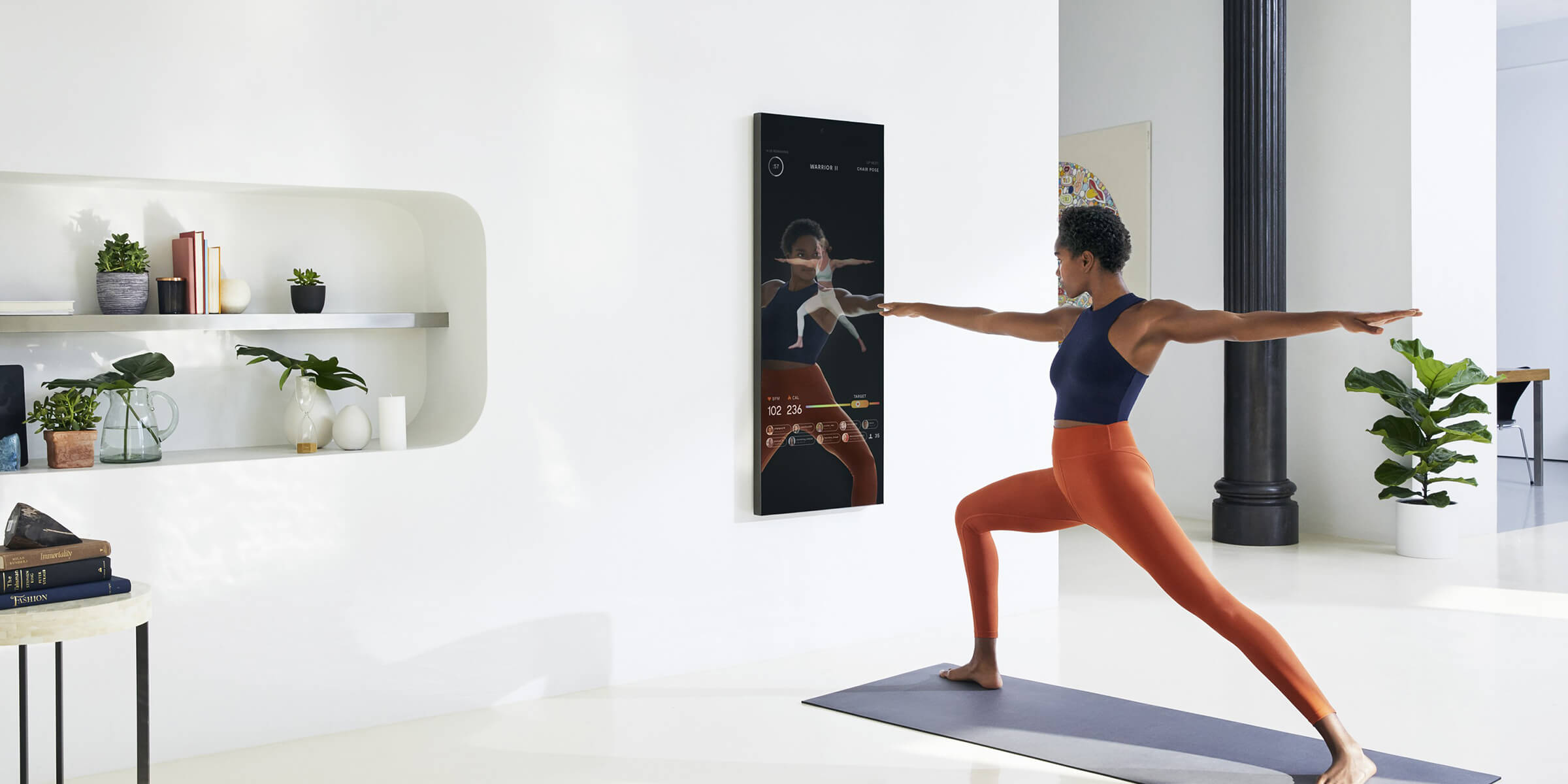
MIRROR offers a nearly invisible, interactive home gym with personalized live and on-demand fitness classes on a full-length mirror.
📋 TL;DR key takeaways from this episode:
1. Maintain readability. Centered text and gray text can be difficult to read. Darker, left-aligned text will provide a better reader experience.
2. Keep paragraphs at a consistent length so the content remains clean and refined from top to bottom.
3. Give the reader an idea of what they're getting. Show them with images, and guide them to learn more with links to the website, “take a sample class,” give them the option to ask questions or contact support.
Matthew Smith: Hey everybody! It's Feedback Friday! I hope you all are doing great. It's another episode of Feedback Friday. Whale here from Really Good Emails. Matthew Smith represent. It's fantastic to be here today. I am going to walk us through some MIRROR emails. My buddy Kevin actually did the user interface for this app and pretty interesting tool.
I am not in the space to spend that kind of money on this type of tool. But that's cool, but I do think their emails are kicking. They've done a nice job, so some interesting things here to walk through. Again, reduced palette. Notice that they use photography in a nice way. They get the black and white and gray working simply.
I will say this type. Two or three things I would do a little differently here. One, when you're doing centered text. This is the absolute longest. You should have your centered text. They're very specific typographic rules. You can read about them in The Elements of Typographic Style by Robert Bringhurst or Web Typography by Richard Rutter.
Center text is harder to read. The other thing is that be careful of your gray text. I'm not sure if this follows or meets ADA standards, but you want to, you want to check into that. So I think this probably maybe squeaks in, but it's pretty light. So it is nice because you get good hierarchy. You see this first and then this feels secondary, this subtext.
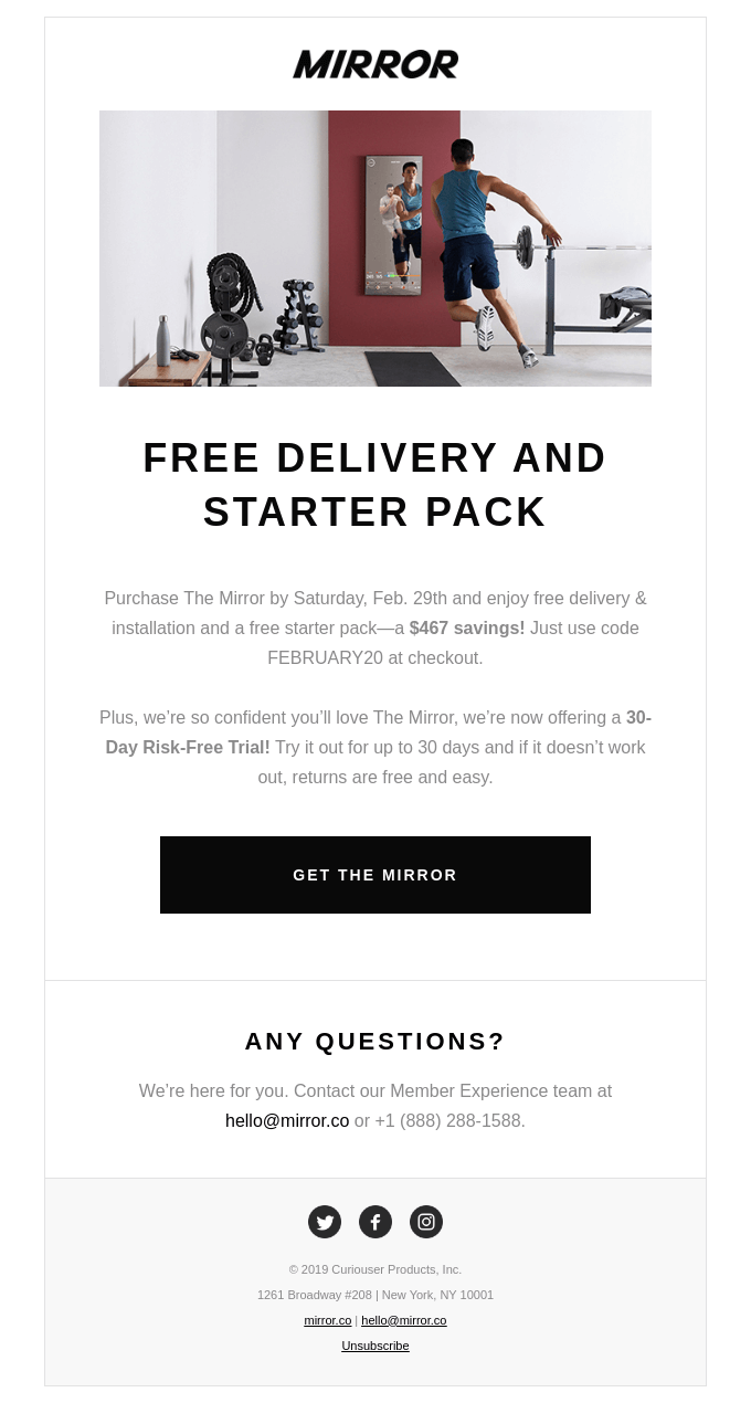
But keep in mind, you want to be able to maintain readability. Those two issues aside though I think it's working really well. Their CTA is nice and big and clear. No questions there. And then this email down here also that dark color. One thing about upper case text here too is be careful about how much you use it.
It's working here. Okay. I prefer to only use it for small labels. It's harder to read than your traditional sentence case. Just keep that in mind, but let's jump over to some other examples from MIRROR.
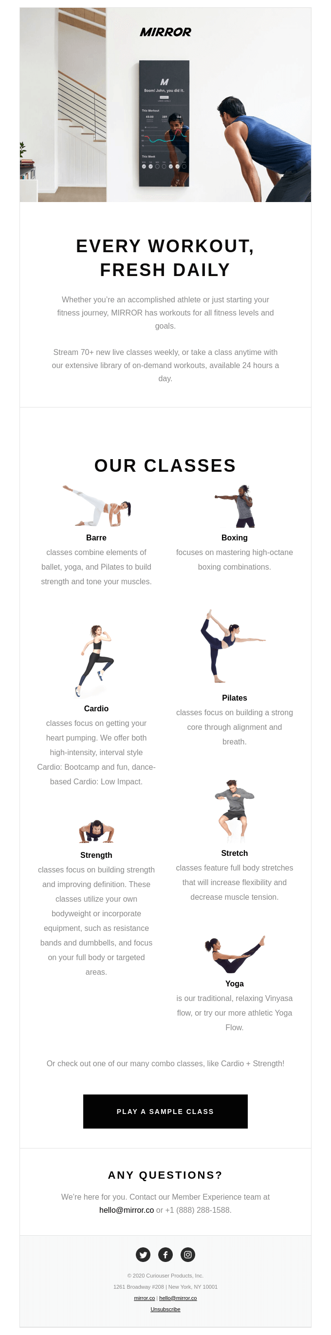
Same cool aesthetic, but a bit different lockup here. I just think this is gorgeous, and they're doing a great job of pulling these out.
One thing though, this is a neat lockup. I like seeing these visuals about how people are using mirror. Look, how difficult to read and scan this centered text is. So me, I would have put these images not into with white backgrounds. Or they could be, but I would actually create a boundary around them and then left aligned, you know, Cardio, Pilates, Strength, Stretch, and all the paragraphs that go with them.
I also would have done a little more content curation to try to make the paragraphs more consistent so that they're about the same length. This gets the job done, but I just think it looks messy. Nothing about this aesthetic feels messy. It feels refined. So then why would we do this here? Also, note in mobile over here.
This works fine. But notice that like oftentimes you want to double check and see if you can avoid what are called orphans or widows here. There's different ways of referring to orphans and widows, but more or less in web typography, it's not really pages, but in web typography we're referring to a word that gets orphaned down here by itself.
In print topography, it's a little different where it's a line that's on a separate page, but anyway, you get the idea. Small things that can be changed, but look how refined and simple these emails are, and they get the job done right. They'd call out right up top what's about to happen. You get the idea of what MIRROR is.
They show you the classes that are available, so I know what's available in the app. And then I can play a sample class or I can dig in with more questions. So from a strategy point of view, I think they're hitting all the boxes. One thing I would probably do is put a CTA up top or test that to see if adding it a little higher.
You know, might be something to try there. Or if I want to go do a bar class or see a bar class, give me a CTA there to see more about what that looks like. All right. I think we've got one more.
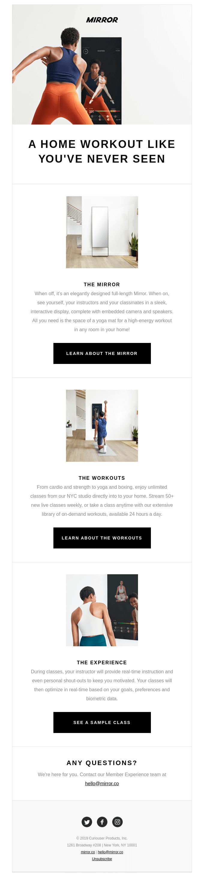
So again, a different lockup here, but you can again see in the imagery, you're starting to get a sense of like what's happening and how to use the app, which is cool.
Home workout. And then, wow, I see the MIRROR and it looks beautiful, so I'm getting the idea, Oh wow. It's not just a big black screen all day long, but it can be a mirror like this, which is pretty rad. I can learn more about it. I can figure out more about the workouts.
These are nice little modules. I can see a bit about the experience and see a sample class. I think that's pretty cool. Again, like you can see the simplicity of the design. I think that these are too long to do centered. You probably are like, Matthew, you're crazy. It's no big deal, but I just find that if you can left align line some of these kinds of things, you're going to have a better overall experience, but I'm being picky. I think it's working great.
I would love to hear your feedback and see if there's anything that you would change and as always, keep those emails coming. We appreciate it. I hope everybody's doing okay out there in pandemic land and staying healthy, staying safe, staying home, and just know that I really appreciate you.
We have such an amazing community. Me this weekend, I'm going to be doing a meditation with my mom and sister from a distance and doing that online and through a different organization. Looking forward to that and might go on a hike or just get outside. That's a real way for me to stay sane.
So hope everybody is doing okay out there. Never hesitate to reach out to me @whale on Twitter or @reallygoodemail on Twitter or Instagram. Those kinds of things. All right, friends, be well. Stay well, be really good. Love you. Bye.
Categories:
Feedback FridayMatt Helbig and Mailgun’s Megan Boshuyzen unpack Email Camp, showing how accessibility, live text, and smart CTAs turn event emails into signups.

Accessibility, applied: Matt Helbig and Kelsey Yen reveal how inclusive design turns real emails into better user experiences.
Dive into the world of unmatched copywriting mastery, handpicked articles, and insider tips & tricks that elevate your writing game. Subscribe now for your weekly dose of inspiration and expertise.