
Email marketing deep dive with Megan Boshuyzen
Matt Helbig and Mailgun’s Megan Boshuyzen unpack Email Camp, showing how accessibility, live text, and smart CTAs turn event emails into signups.
April 24th, 2020
This week we look at Sonos emails LIVE at UNSPAM.
Matthew Smith: Who's been following along with a Feedback Friday? Sweet. So for those of you who don't know, we've got our own YouTube channel. Really Good Emails, and our primary thing there is releasing Feedback Friday. So, Feedback Friday was our response, to continuing to be able to have more evidence of what makes a really good email.
There is a level of subjectivity to some of what we're doing because we're using our own experience, our own testing that we've done, what we've learned along the way, and applying that to emails. We're not part of that team. We don't know how they're performing.
So we're taking a customer point of view oftentimes and layering on some experience that we know about what works well, what delivers well, what stays in the inbox. What gets used. So there's a caveat to all of this, but what I'm going to do is walk you through some emails that I think are very effective, and then I'll pause and look for additional critique or thoughts and or positive remarks from you.
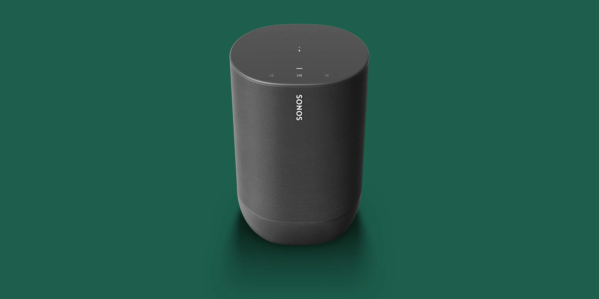
Okay. Now, not included in this is send time from address, pre-header, any of that kind of information. So bear that in mind. So first up here, we've got Sonons. I've been really impressed with the simplicity of their emails, over the last six months or possibly a little longer.
One of the things that they continue to do that is interesting to me is they have a very small lineup of products, and so therefore, it makes sense to have a small sort of form factor for your email. I was really interested in the fact that they chose such a thin form for this and such a reduced impact. Where everybody else is zagging and going right and 600 pixels and does this very clear thing that everybody expects, they went in this other direction. I think it's working really well for them. The text here is all live text, well done, Sonos. As you move down through the email, everything is just clear to the point. Very scannable, right?
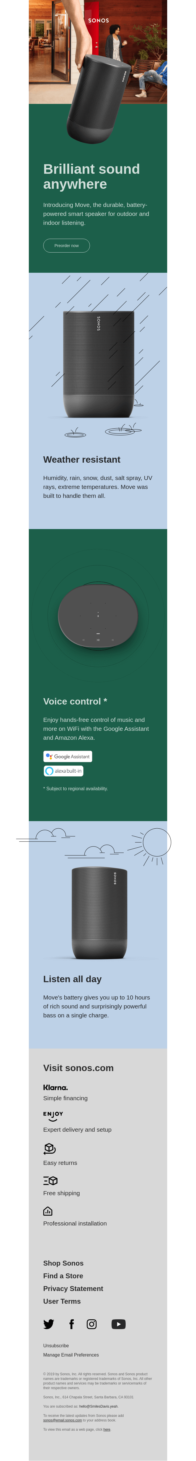
So in this case, they're talking about Move, their mobile speaker. So right off the bat, okay, I can see it's a speaker that somebody is actually controlling with their hand. They're giving me imagery that is helpful, that says what I can expect in the rest of the email. Right? So, if they were trying to introduce Move and they just showed a lineup of all their speakers up at the top. That would be too obtuse, too open.
It doesn't get direct enough into what, they're trying to promote. So they moved down into introducing Move. They give me some additional copy, and they give me the chance to preorder. They show me a bit more about the product. They tell me that I can listen on WIFI or Bluetooth.
And that I can keep learning more. They give me all these opportunities to go from education into, okay, I'm ready to dive a bit deeper, which I think oftentimes is one of the most effective ways that you can use email is email, not as telling me absolutely everything I need to know, but driving me into exploration on the page.
So oftentimes I think of email, especially with our mobile opens these days as a utility experience, right? We're not there to do research. Give me the taste and I can say, yeah, I'm into that taste. I want to eat the meal. Right? Like that's the sort of effect we're looking for. So we dive in a bit more.
We can see they're also talking about their Sonos One SL and all that it offers. Also can preorder an additional with the port. And then they finished with a very simple navigation and opportunity for some social and then a relatively simple legal and meta-text at the end.
If I were to critique this email for anything, a couple of thoughts for me would be, I think that "The future of listening is here", is pretty boring. So I think that sounds like something that I would expect from a lot of people. This is what your hook is and this doesn't feel like the future of listening.
People already have mobile Bluetooth speakers. So this doesn't feel like the future. Instead, can you use some quippy language that digs me into how I actually want to take really vibrant, powerful music with me outside to entertain. Going back to my last talk, what is the feeling that your customer is having and how can you serve them with that? Right? How can you know that and identify it. So good copy would help here.
The other piece is letting me know. Oh, they're on little bird icon. They're on F icon. They're on Instagram and YouTube. Like, who gives a shit? Show me what you're doing there. Show me. Oh look, this is the content I can get on Instagram. Yeah. I want to see more of that. This isn't a taste. This is just saying that we exist out there. That feels really boring to me. And I think a lot of us do this right? This isn't a critique like, this is obvious., you should have already done this.
This is something we all should be thinking about. I think we've even talked about it on Really Good Emails. How do we celebrate our content in a way that's meaningful? Yes, we have a YouTube channel, but how do we show the amount of videos? The numbers of Feedback Fridays like this that we have. So instead of just showing the icon. So those are the things.
Again, legal text. My MO is to say, does that content right there serve the customer? No, it doesn't. Your copyright doesn't matter to me at all. And so that should be in a link and it should go to a legal page. And that has been set as a precedent. That is allowable.
Giant companies with very difficult legal challenges have done that. You can too. Right? So try to get your legal text and the things that do not serve the customer out of this kind of environment and put them in a place that is easier to deal with later. And of course, some of these other things are required and can be dealt with.
One of the things I appreciate for them, and that I recommend, is if you're going to have a link like support or to unsubscribe. Go ahead and make it clear. Don't be afraid of somebody unsubscribing from your email. That might be the service that they need. You need to keep your lists clean. Go ahead and be clear about it and get out of the way. So that's the first of Sonos.
Next up here. Similar kind of stuff. Just being able to look at different layouts. A lot of people will do layouts where you just have a simple photo that blocks up the entire width of your email.
But this is a great example of letting something float off to one side and it's the perceived quality of having that blank space. Now that's still one image, right? It's a ping in this case, but it's occupying that whole territory. So blank part occupies all of that, but I think it works really effectively.
Notice that these shop now buttons are full width here, which creates a really nice, line A horizontal rule, if you will. I think that works really well considering that they're using this content all the way down the way on either side. So it's just a very well neatly balanced email. Same critiques down here.
I think this was another good example of being able to take something that you've got that's a standard and draw it into a seasonal time. So this was, okay, we're starting to deal with things in the fall and winter, and so start showing off some seasonality, but they do a great job of changing the color, which makes the email feel evergreen and fresh.
They've come up with a design language here that can be used over and over again. So my thinking is that these emails are actually very easy to develop and build. So if you're able to develop that design system upfront, you'll be able to move through it much more quickly.
And then finally, you can see there's just a variation here on that same theme. Pulling that soundbar way up into the top here. So this is fun because it grabs my eye cause it's breaking the boundary of that original boundary that you're used to seeing. And so they will have needed to have developed the email so that it's got a larger boundary to account for that. But that's very easy to do.
And then being able to look at all these other tools. You can see that this is a bit different lockup than we've had before. They're letting me know some of the values of shopping with Sonos, right? Visit Sonos.com. You've got simple financing, easy returns, free shipping.
These are things, again, that give me safety. I personally don't shop online unless it says free returns. I'm going into the next person. I just can't afford to deal with the hassle. I'm too busy. I've got other things going on. So this creates security and safety for the feelings that I need. So these are the things I like about Sonos.
I think they're doing a great job, easy to scan, great topography, unique coloring across all these different emails. I talked yesterday about playing design golf and reducing to the absolute simplest that you can. They're doing that here.
I don't have to invent a whole new language every time that I read something. The number of times that I go into an email, and they have 15 different pieces of typography, my brain at micro levels has to go, okay, what is the yellow wait, okay, now black now green. Okay, what is, which one is the CTA? I thought it was blue, but now it's this other thing, right?
But when you reduce that to the lowest common denominator. It's like being able to go downtown and you're in a brand-new city, maybe even a brand-new country, but you know that the red sign with white letters mean stop, right? It doesn't mean, hello foreigner, it means stop. Right? And that's the kind of language you want to develop in your emails.
So that's me. What would you add or what would you disagree with?
First email. Here we go.
Audience Member: I agree with you on that header. I would want it to be a little more actionable.,"Let's move" or "move with us". I think their photography is fantastic, but this was a missed opportunity for amazing animation. Like pick it up. Carry it.
Matthew Smith: Fantastic. So the feedback was that something like, "Let's move", "Let's get moving", could have been a good quippy heading and copywriting, but also the opportunity for an animated GIF or some motion would be perfect cause it would tie in with the theme directly. Right.
Who else? Yeah, go for it.
Audience Member: I personally really dislike this image. I think the hand Photoshoped over it is really strange.
It's hard to see the actual product and the image. It's called Move. You could have had it outside. There's so many possibilities, and I think that this image really missed the mark completely, but that's also just my personal opinion of it. But I do really like the simplicity and the rest of the email. Could you scroll down a bit?
I think that there is such an urgency of people who don't write email copy for there to be more copy in emails, at least from the places that I've worked. I like that there was just the headline there and sub-headline. It's literally direct, concise, easy to digest. That's what email should be, and I think that their copy does a really good job with that.
Matthew Smith: Great. Thank you. Wonderful.
Audience Member: The photography is really weird though. Now that you mention it. Especially when it's a pre-order, I think there's a lack of a sense of urgency. Again, you never know if there's a follow up email that drives a sense of urgency, but whether it's quantity or the time or some incentive to pre-order at this juncture. Generally I've always seen a much higher engagement when there is some sort of sense of urgency in there.
Matthew Smith: Fantastic. Yeah, that's good feedback. I know that at Relay Foods if we showed stock numbers, that was a way of helping people understand what was available. When it was losing availability it drove up speed.
Anybody else on Sonos?
Audience Member: I actually had a question and if anybody has an answer I would definitely love that opinion. So you mentioned that for the legal terms in the footer it would be nice to just have a link that leads to another page.
Do you consider that the best thing to do when it comes to like promo terms and conditions as well?
Matthew Smith: Right. So her question is, if you have a promotional and you need to have terms in service in your email as a part of the promotion, should those be removed and put on another page as well? So the way I answer that is, would you do it in a relationship? Right?
So if you were trying to say to somebody that you cared about, "Hey, there's something I really want you to participate in, but I'm not going to tell you what the other thing is that you have to know or.. blah blah blah". You're not going to do that. Do you have to say it all in legalese? No.
All the legalese, the stuff that the lawyers need to be have to be said. I get it. We live in a litigious society. You can say that stuff on another page, but you have to reply to this email in the next 24 hours, you have to meet these conditions. Absolutely.
In fact, I wouldn't make that small. I would go ahead and tell it like it is. We get into these patterns, right? Oh, that's how everybody does that. Let's do that too. But when you rethink those patterns, you can even say, Hey, the last time I saw a promo. people hid this text and it's really annoying, isn't it? We don't do that because we care about you. Boom. You've won loyalty, right? So go ahead and treat people with respect, but you don't have to do the whole thing. Does that make sense? Awesome.
Anybody else have a thought on that question? Terms of service, or on Sonos in general? Nout?
Nout Boctor-Smith: Maybe I'm a weirdo, but whenever I get a coupon I always read the terms of service because I'm trying to get away with the most things I can do with it. Does this apply to sales? Does this apply to this? Can I stack? Can I do this? When does it expire? Because I get paid tomorrow, blah, blah, blah. So if you put it in a link, I'm going to be pretty annoyed.
Matthew Smith: Okay. So Nout's point was make sure that whatever terms of service will actually apply to her being able to get the most out of the coupon or the promotion should be available.
Anything that's legalese or non-important to you utilizing that promotion can be removed. Is that accurate? Great. Okay. Yes, right here.
Audience Member: I see that the "view as webpage", is at the very bottom, sometimes at the top, and sometimes it's not there at all. So just wanted to see what's your opinion on that was. I have a lot of clients in my work that they constantly click, like the customers, click on "view as webpage". It doesn't matter if it's live text or not and we're trying to figure out if we should like, take it out because we want them to actually click on the call-to-action in the email.
Matthew Smith: On something like "views as webpage", what I like to do. Is one, go and find out what everybody's doing. That's interesting. Data point. Then go and see what your competitors are doing who have similar clients. Data point and not just data point, what should we do, but potentially data point, how should we be different? Right? And then make a choice.
Do a split test or just choose one, see what happens, run a different test, see what happens. On those kinds of things, my sensibility is you're going to have a greater impact when you choose from the gut about relationship first and then do your testing. Then do your tweaking. So if you happen to know that your product is serving people who are on mobile devices in areas where the internet is weak often, then yeah, probably send them to the webpage. If the webpage is going to be faster, lighter for instance, or if you know that they're on an email client where the images are going to be problematic. Those kinds of things. Yeah. Just try to think about that audience and how to serve them. But yeah, that's a good question. Great. Okay.
Audience Member: The idea I had, this is really more campaign related, but if we're talking about the mobility of this particular speaker. You haven't addressed the sharing with anybody else in the community. So if you're talking about mobility, like, Hey, share this with a friend, you could almost imagine the actual physical moving of it and having a way to say like, Hey, this is great and great for the next party, whatever it is. But that's a real big missed opportunity here. That's the point of this. That it's mobile.
Matthew Smith: I think what I heard was how do you address your content and your content strategy of the email to be on point. So because this email is so much about movement of that speaker, what are ways that either visually you can communicate movement, you could use a blur, you could use actual animation, you can show people literally moving.
In this case, we have established that this very creepy kind of hand of God holding the speakers a little odd, but there are some things that you could do that would be more illustrative. For instance, I would imagine it'd be pretty rad to have an experimental email where it probably doesn't work that much on many clients, but it might get some renown to have an email with a fixed item or something like that.
It would work on like one or two clients. You'd get a lot of hits about, and it could travel down the whole email. That'd be sick, you know? That'd be fascinating. So there's so many different things that you could try or that you could guide people to a video or a webpage, et cetera, but also your copy. Right?
What if there's a way of moving someone's eye down through the story of the email? They could start at home and then go to the backyard. And then go to the front yard and then go to their friend's place. Right? Like there's so many ways you can theme something like that. And I came up with that sitting up on the stage in front of a bunch of people, right? Get together with somebody else. How can we drive this a bit deeper?
We're all a community. We've established that here. We're all for each other. This Sonos team, they're killing it. Do they have things that they could improve? 100%. Does Really Good Emails? Oh my God, I'm embarrassed sometimes, but we work our asses off and it's a side thing, which is crazy.
We're all trying to do this. So again, like with mindfulness, just observe your email without an evaluation. What could be improved? Who's read, "Atomic Habits" by James Clear? Incredible book. Highly recommend it. The idea is make something 1% better, like each week, right? So what's something that you can make 1% better in your email that week that's measurable.
Go and do that, and then keep doing that each week and then do another thing. And now you're 2% better, and within a year you're 52% better. That's insane. Like you've really knocked something out of the park, right? So each week just see what you can do. This is how we make really good change.
So fantastic Feedback Friday. Would love for you all to keep participating. Let me know if you have questions @whale. Reach out. All right. Thanks everybody.
Categories:
Feedback FridayMatt Helbig and Mailgun’s Megan Boshuyzen unpack Email Camp, showing how accessibility, live text, and smart CTAs turn event emails into signups.

Accessibility, applied: Matt Helbig and Kelsey Yen reveal how inclusive design turns real emails into better user experiences.
Dive into the world of unmatched copywriting mastery, handpicked articles, and insider tips & tricks that elevate your writing game. Subscribe now for your weekly dose of inspiration and expertise.