Email marketing deep dive with Megan Boshuyzen
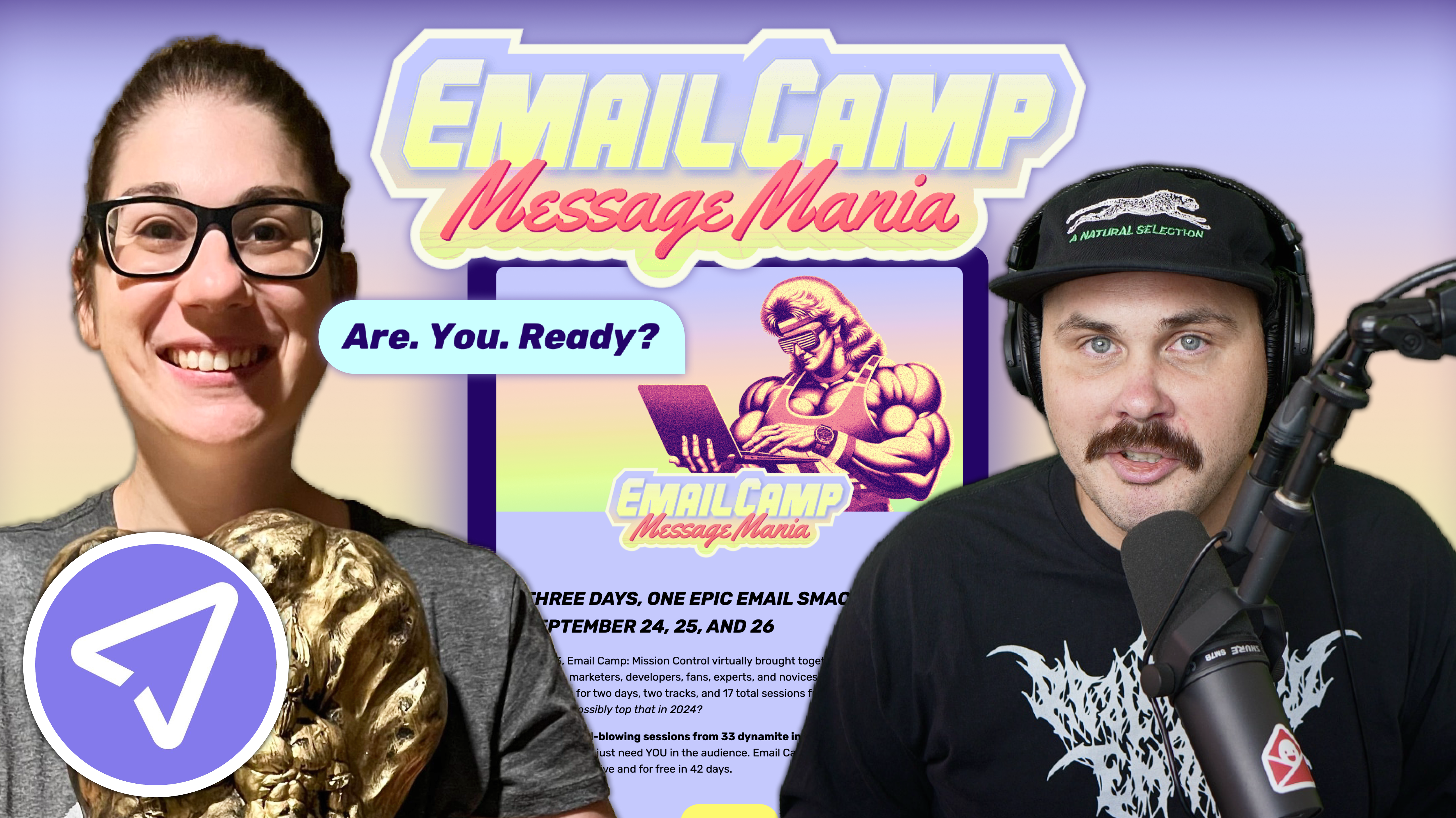
Matt Helbig and Mailgun’s Megan Boshuyzen unpack Email Camp, showing how accessibility, live text, and smart CTAs turn event emails into signups.
November 13th, 2020
Truebill is a free platform that helps you find, track, and cancel all of your paid subscriptions and recurring payments.

This FF episode was sponsored by emfluence. Get paired with a marketer to see how your strategy will work in the emfluence Marketing Platform.
📋 TL;DR key takeaways from this episode:
1. Deliver a welcome email that reinforces what you’re going to do and the problem you’re going to solve.
2. Typographic hierarchy can keep an email polished and scannable.
3. In an upgrade email, it’s helpful to send a dedicated email to welcome your customers and explain what premium features you’re offering.
4. Adding icons with text to explain the features can also help keep your message on-brand and easy to read.
Matthew Smith: Hey, it's Friday again, everybody. Feedback Friday where we review emails that come into our inboxes that we think are really good and why we believe they're really good, and what, if anything, we believe they could change or improve. Super excited to be here today again with Matt Helbig. What's up, my man?
Matt Helbig: I'm excited to be here, Matthew. I'm glad to be back. Another Feedback Friday.
Matthew Smith: Sweet dude. Well, thank you, email geeks, for joining us. I hope you're all having a fantastic Friday and looking forward to a good weekend despite the challenges in the world.
I want to tell you a little bit about Truebill and their email series. There are many apps out there for managing or checking out your transactions and your subscriptions for your credit cards or your bank accounts or whatever. I've tried a lot of them, and this is the one I landed on.
Damn. It's awesome. I'm like super, super primed on it. It's doing a great job, really like it. I ended up paying five bucks a month for it. It's worth it. It's just cream that their emails are lit and just really doing some great work. So I'm super, super stoked to kind of walk through those here today.
First things first, they do a great job of very simple typographic hierarchy. Like the episode on YNAB the other day, they do a great job of using a card layout with this slightly light gray background and a white foreground.
They do excellent custom illustrations. They get me into their path of the text, features, et cetera, very colorful and yet very clear and focused. They make it clear, like where I need to click for my CTA. They have a simple footer that gets out of the way. They do a fantastic job.
If we jump over and start to look at some of the others, you can begin to see, like, this is a recent scan of my account. I think this was when I first signed up. They give me a sense of how many subscriptions I have, how many bills I have, and then the ability to view my account and see more about what's happening.
Clear, really simple. Everything from them just felt very succinct, and yet there's some difference in these templates, and they make it work. Being able to go through this email and again, see these very cool icons. See them separated into features and then being able to dive into Truebill then. All that feels fantastic.
One of the other things I love about Truebill, we're not showing them here, but they're available on reallygoodemails.com, is they do a nice data update on all the things that are happening in my account. If I get a big transaction, like a check comes out, I get an email about that.
Lots of transactional emails that just are really effective for me. Just look at how simple and effective these emails are. This is a great example, too. I talk a lot about typographic hierarchy. So we've got a nice big heading. Then we have our subheading. Happens to be the same type of text, the same size of text as even this lower down heading, but it's dark.
Then I have these subheads, and then the text under those subheads is now gray, still dark enough to be accessible. Then the CTAs are just links. There's so much that it's just really simple about these emails, but it works, and it's still elegant. It doesn't feel like a wireframe or anything.
The reason is because of these colorful icons and colorful illustrations. This is such an easy email, and it ends up that you have a beautiful, easy to code, easy to maintain set of emails for your system. So I'm very impressed. I'm noticing over here on the mobile footer that some things could probably be improved. A little bit of the line height here, reorganization of these social icons, but nitpicky stuff. Matt Helbig, what do you think, man? Do you think this is really good?
Matt Helbig: In that first premium welcome email example, it is exactly like how I want to feel when I upgrade to premium. When you convert, something like this is nice to receive, even if you send your receipt in a separate email. This dedicated premium email communication is nice, welcoming you to this unlimited access and everything else. That's nice to see.
I like how they use icons across the different campaigns to back up their message. I feel like these could be plain-text emails for many of these, but making it a little bit more polished, they can add in a bit more information and make them feel a little bit more scannable and readable.
This is an interesting approach where I wonder if they could turn this into a more plain-text email and test that versus this more polished template.
Matthew Smith: I think that's a good call. You brought up a great point about flow in this kind of stuff too. You're right about this email. Being able to deliver a welcome email that reinforces what you're about to do and the problem that is about to be solved in your life in addition to that receipt. That's an excellent call.
So something for our email geeks to call out is many times you'll get a receipt, and you're off to the races, and it's kind of up to you, and now you're on your own. Getting this series of emails keeps me sticky to the product.
If the emails from Truebill did not come, I probably would forget about the product because I turn off notifications on my phone. I don't want to be hit all the time. I'm not getting messages in my email that are annoying. They're incredibly helpful. They remind me of things.
Truebill will negotiate my bills down on like the internet or something like that. They'll let me, hey, this bill seems high. Would you like us to negotiate it for you? It's just really interesting little stuff like that that I think adds up and is an excellent example of how email can be so powerful to make a brand sticky and a product sticky for the customer.
Well done. Truebill. Pretty impressed. Again, go check out the many, many, many other Truebill emails that I collected and put up on our site. All right, well, email geeks have a good one out there. We will see you on the flip.
Matt Helbig: See you.
Categories:
Feedback Friday
Matt Helbig and Mailgun’s Megan Boshuyzen unpack Email Camp, showing how accessibility, live text, and smart CTAs turn event emails into signups.

Accessibility, applied: Matt Helbig and Kelsey Yen reveal how inclusive design turns real emails into better user experiences.
Dive into the world of unmatched copywriting mastery, handpicked articles, and insider tips & tricks that elevate your writing game. Subscribe now for your weekly dose of inspiration and expertise.