
Email marketing deep dive with Megan Boshuyzen
Matt Helbig and Mailgun’s Megan Boshuyzen unpack Email Camp, showing how accessibility, live text, and smart CTAs turn event emails into signups.
June 12th, 2020
Thirty One is a community and mixed-use project space for designers.
This FF episode was sponsored by emfluence. Get paired with a marketer to see how your strategy will work in the emfluence Marketing Platform.
📋 TL;DR key takeaways from this episode:
1. Make links clear on both desktop and mobile. Underline linked text since there’s no hover state on mobile.
2. Let functional links breathe. Add space between links like a “view in browser” link and an “unsubscribe” link to prevent readers from accidentally unsubscribing.
3. Think about your audience. They might understand content in a very specific way. You can communicate to them uniquely. The more you know about your readers, the more you can serve them, excite them, and engage them.
Matt Helbig: What's up Email Geeks? What's up Matthew Smith? Welcome back to another fantastic episode of Feedback Friday. BTW, what is Feedback Friday?
Matthew Smith: You know what Feedback Friday is? Feedback Friday is the time when we get together, Matt Helbig and Matthew Smith, or one of us and a guest, and we talk about what makes these emails really good and some areas from our experiences where they could improve. We love having guests share their insights as well. So if you would like to be on the show, let us know. We would love to have you.
Why don't we dig into this wild stuff you brought here, Matt Helbig. What the hell is going on?
Matt Helbig: I only look at weird emails that are not even really emails. Those are the ones that make me excited about email.
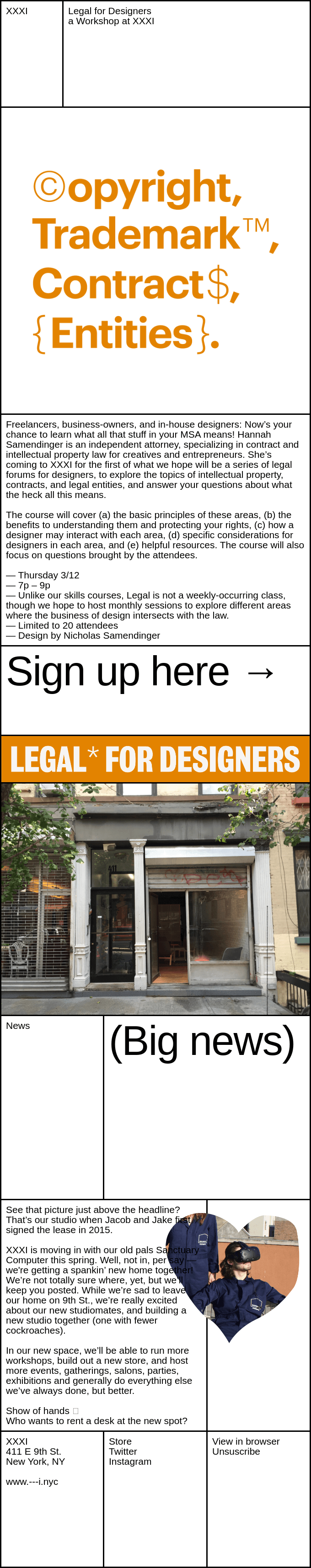
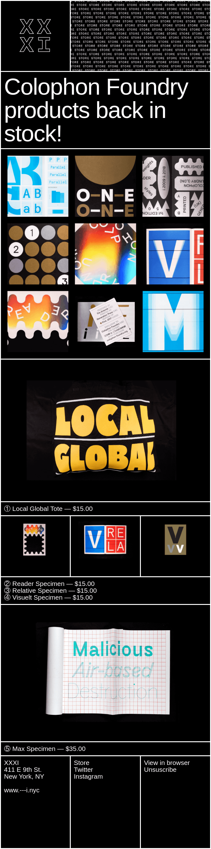
So these are some newsletter-style announcement emails from XXXI (Thirty-One) They are very out there. They're not like anything I've really seen in other places. I thought you'd be the perfect person to talk about them and what this design language is about and some aspects of this style of email design.
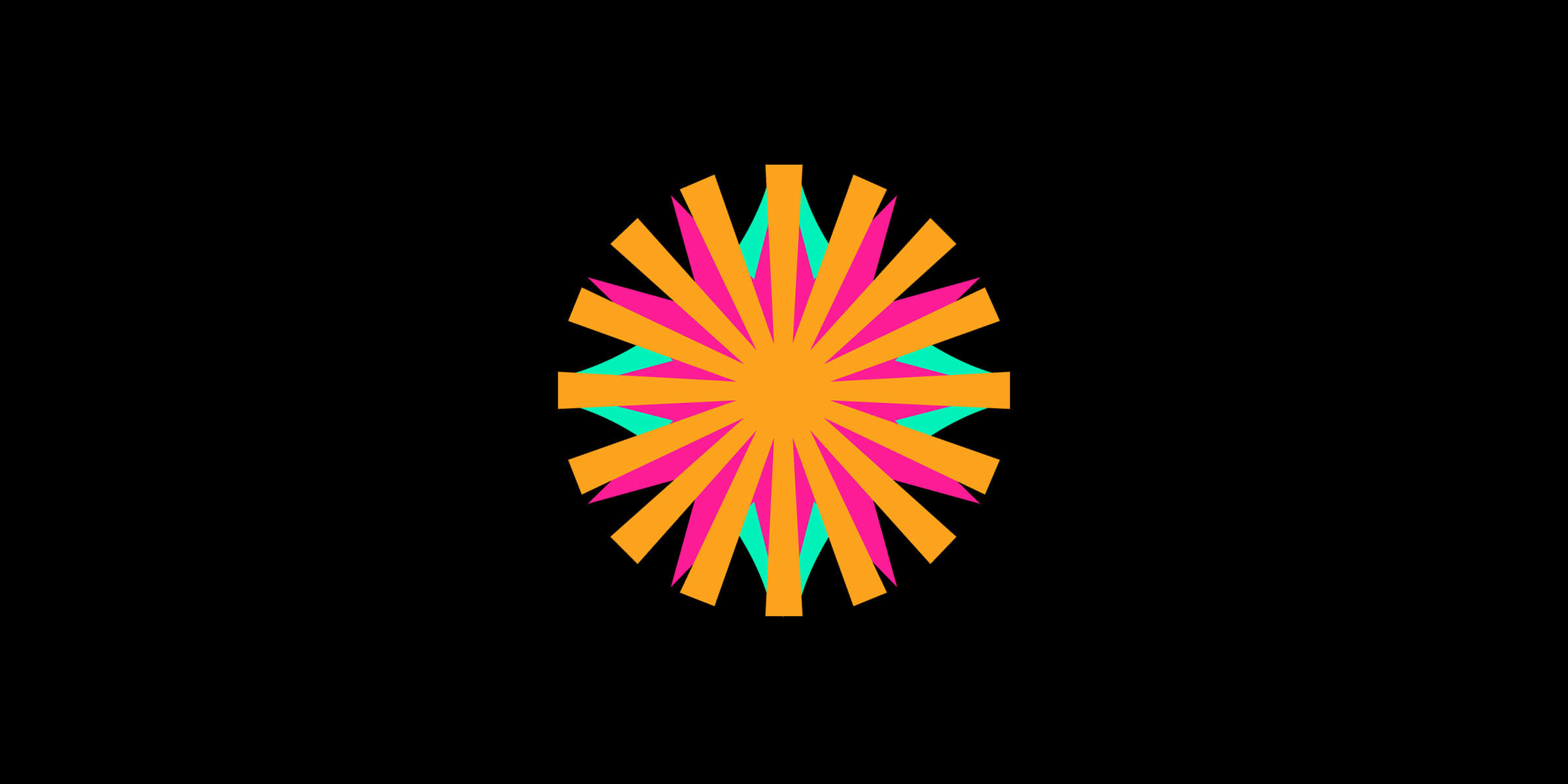
Matthew Smith: This is what you would call brutalist design. You can probably understand why they call it that it feels like you're getting smacked in the face. It's intense.
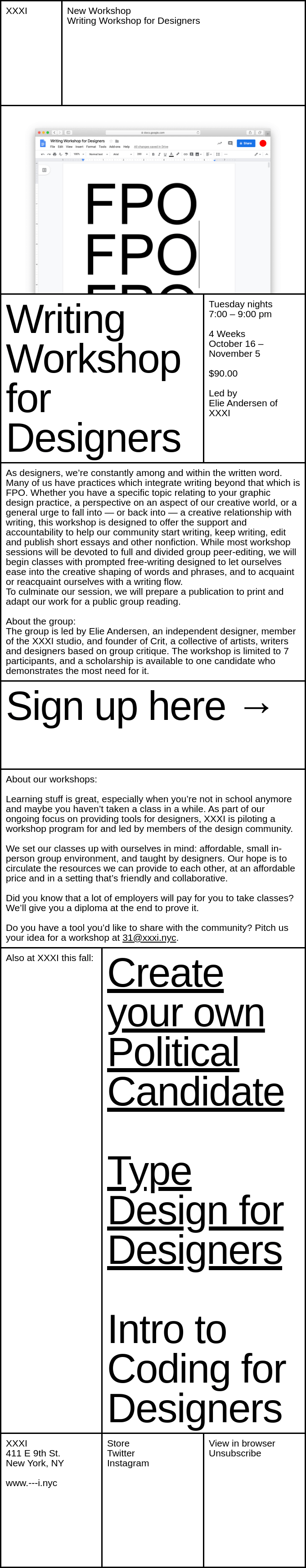
I personally don't like brutalist aesthetic. It doesn't work for me, but I think it works for a lot of brands. I think it's very hip right now and it's like super in. They're doing an interesting job in something like this. I think they're exploring some new categories, how to make something like this work. They're using tables and they're just owning tables.
Like you feel the table in this design, right? Like everything is locked up in these boxes. There's not very much padding. The writing is all over the place. It breaks so many rules that I'm going to say are good for customers.
Let's talk about the audience. Does this work for my mom? No. Does this work for my dad? No. Does this work for me? No. Does it work for designers who are selling to designers? What if the audience here is other designers who are then going to say to their bosses or to people on their team, you know, who I want to work with is this sick, new brutalist design studio XXIX (Twenty-Nine). That's the stuff that I'm going to guess that some of these folks are going after they're able to change up their design system, to go black here in this situation, show off some really intense, kind of interesting brutalist design.
And this is their thing. This is what they seem to be all about. If that's going to work for your audience, like that's your play, that's your brand. I think they're doing some really interesting things here. Like they're doing stuff here where they're using background images that feel like stickers that break the boundaries.
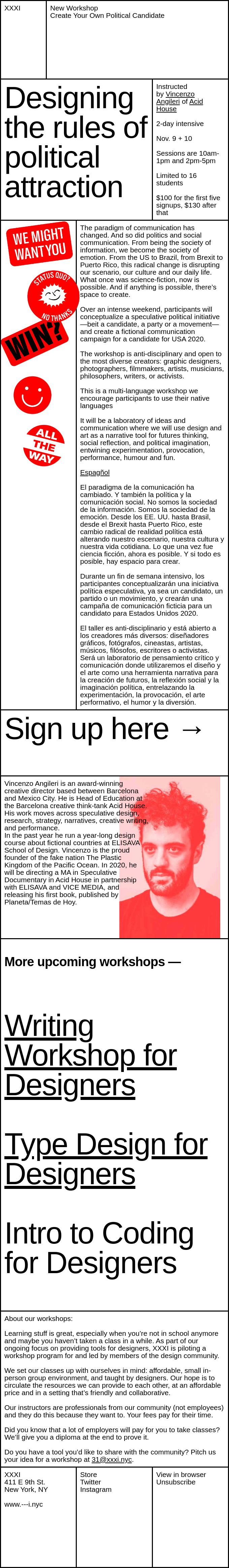
I think they're breaking this boundary using this as a background image. Visually it feels like they are doing things that are very boxy, very clear, and then everything gets broken out of that. I like the idea of being experimental.
I would love to know like, is this working for them? Is this doing its job? I think it's appropriate to have something on the show here that like, is this even email? Yes, it's gotta be right. Like you're sending it in email. It's content. Is it serving the customer? I would love to know.
As a customer who's enjoying this? Here's a question: do they enjoy it and actually read it or enjoy it and just look at it? Does that make sense as a question?
Matt Helbig: I think this one breaks a lot of rules. As you notice too, there's no CTAs in this whole thing. It's all regular text. With the whole series, I was really impressed by how well it bounces from desktop to mobile, how the content sort of reorganizes and stacks on different sections.
As we go down our list of normal email tropes of what makes a really good email. I think in some ways, like it has large typography, it is somewhat accessible with live text. With this one, the question is: Is this a regular consumer-facing email, or is this just something nice to look at? For me, at least, it's just a new thing to see in the email inbox and it stood out to me.
Matthew Smith: I love that they're pushing boundaries. One thing I'll say is that from a usability standpoint, this is rough city. This is the worst thing I've seen in a long time. "View in browser" link and "Unsubscribe" that close together. That's just waiting for someone who didn't mean to unsubscribe. And now I've got to like to go through this big thing. This is a very functional link next to like a very functional link with two of diametrically opposing purposes,
Stuff like that. This is where I don't like brutalist design. I feel like a lot of brutalist design disobeys to be contrarian. And that's one of the reasons why I don't like it.
Like, okay, Local Global Tote, 15 bucks. Cool. Like that works. I can click here and do this, but why not make this also a link? Or little things like on mobile, I can't choose between these three. If I think those are links, now I can choose up here these three, but there's nothing visually to indicate to me that this is a link and this is not. On mobile, there's no hover state. So I don't know. I can tell what's a link in desktop. Cause I get my little finger pointer, which is a hilarious part of the internet. On mobile, that's gone. Things like that are challenging.
I'm glad you brought this because it asks some heavy, hard questions. The audience is super-specific. These are designers, right? So designers are thinking about things really differently than your average person and have a lot of language context. It would be like sending a very specific type of content to people who understood just Japanese and a very specific dialect of Japanese in a very specific way. You can communicate to them uniquely.
As you're sending to your audience, the more that you know about them, the more you can serve them, excite them, engage them. One of the questions I've got here is maybe the brutality of this design really serves that audience because it excites them and it shows them cool examples of pushing the boundaries.
I think this is half art and half what I would call design. To me design, it's core function is to serve the user and deliver content in a usable way. Whereas art specifically has the opportunity to cause feelings and create a dissonance between what you're delivering and the feeling that you get.
This does that. It leans in. It creates emotion. It's very opinionated. It gets in your face.
Matt Helbig: I am impressed that with all the challenges that email gives you, that they did end up here. It looks pretty okay in an inbox to me. That's commitment to some sort of vision of, Hey, this is how we want our emails to look.
Even if it's maybe not for everyone, getting here and troubleshooting and working with those tables and embracing the limitations is also a really nice thing to see.
Matthew Smith: Yeah, that's a good point. It's hard to make an email. Email is like a little mini-feature on a product and it's hard to build it.
I'm just talking about one email, like email as an entire flow is a massive part of the product. I stumbled on this wording the other day that I, you heard it here, folks. I'm the first one to say it. I think. Email is product delivered. I've been saying recently email is relationship designed, and I'm going to also say email is product delivered.
I think that really helps. Not all email is product, but where product is involved, it's product delivered. Getting good user experience, doing the normal work of figuring out how to serve your customers, and really get that attention to detail about developing the right features in the product.
Bringing those into email. It's not easy. We're working on Really Good Emails and the next version of Really Good Emails right now. It's hard. It's hard to know what to do, but they have followed up on their vision. I like the way you said that, dude. Good job folks. Good job XXXI.
Yeah. Before we leave, dude, I needed to tell you a really serious thing here.
Why did it take so long for the pirates to learn the alphabet? They got stuck at sea.
Matt Helbig: I didn't even have a chance to answer, but very good. Thanks, Matthew for that.
Matthew Smith: It's so good to be a dad. All right, my man. Have a great weekend. We'll see you later Email Geeks. Stay safe out there. Thank you for being such a cool community.
Matt Helbig: Thanks a bunch. See you out there.
Categories:
Feedback FridayMatt Helbig and Mailgun’s Megan Boshuyzen unpack Email Camp, showing how accessibility, live text, and smart CTAs turn event emails into signups.

Accessibility, applied: Matt Helbig and Kelsey Yen reveal how inclusive design turns real emails into better user experiences.
Dive into the world of unmatched copywriting mastery, handpicked articles, and insider tips & tricks that elevate your writing game. Subscribe now for your weekly dose of inspiration and expertise.