
The A/B test nobody asked for: What happens when you accidentally improve your best email
Kelsey Yen accidentally boosted her newsletter performance, proving that even top-performing emails should be tested.


You know that email you've been sending for years? The one that works. The one nobody questions. The one that's so stable you stopped looking at it a long time ago.
Kelsey Yen, Lifecycle Marketing Manager at Really Good Emails and Beefree, took the stage at Unspam 2026 and accidentally broke one. Sort of. She went in to do a light visual refresh and came out with an 80% lift in click-to-open rate. No new content. No new strategy. Just some font sizing, line spacing, and color blocking.
Then she did it again, on purpose this time, except not really, because she wasn't supposed to run a test at all. Two accidental experiments. Two rounds of results nobody expected. And one framework for why your safest, most consistent emails might be exactly where you should be looking next.
Case 1: The accidental redesign
The RGE newsletter, the one you're probably already reading, has been doing its thing for eight years. Driving community engagement, building trust, and making people click. So naturally, nobody touched it. If it ain't broke, right?
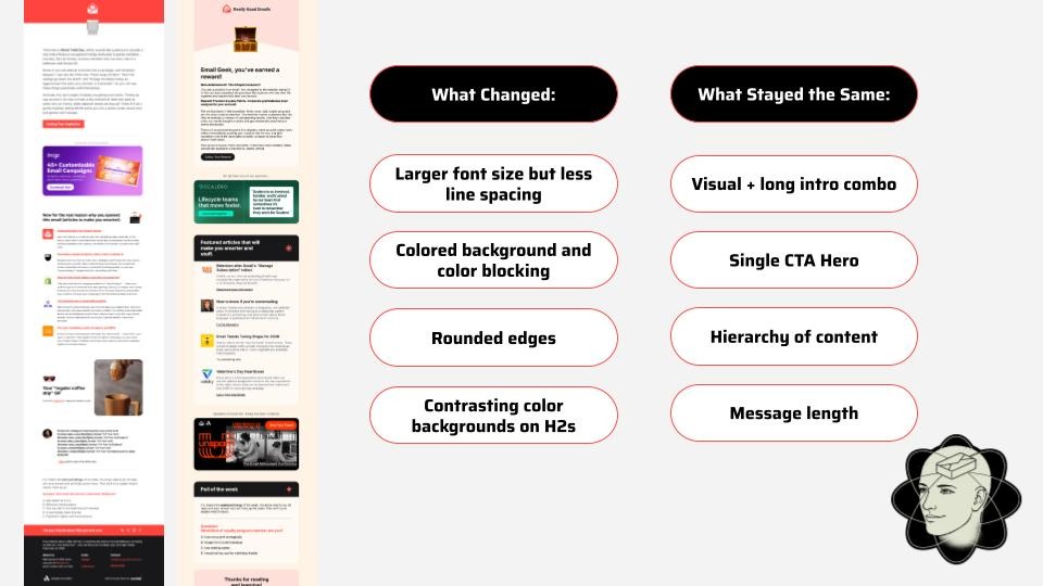
Eventually, the team decided it was time for a light visual refresh. Not a rebrand. Not a rethink. Just: slightly bigger font, adjusted line spacing, color blocking between sections, and rounded edges. The content stayed identical. The strategy stayed identical. They did not think this would be a big deal.
The click-to-open rate jumped from 10% to 18%.
That's not a small bump. That's people reading further, clicking more, and completing the poll at the very bottom of the email, something they hadn't been doing at the same rate before. The email hadn't changed its message. It changed how easy it was to consume.
More space to breathe. Clearer hierarchy. A layout that lets readers figure out what they actually want, instead of presenting everything at the same visual weight and hoping for the best.
What actually changed
Yen's framing: think about the difference between a tasting menu and a family-style restaurant. When courses come out one at a time, you enjoy each one. When everything arrives at once, you pick at the pile. Most email templates are family style. Nobody's enjoying anything. They're just picking.
The redesign made the RGE newsletter a tasting menu.
What's in it for you: if people aren't getting to the bottom of your newsletter, it might not be the content. It might be the container.
Case 2: The test she wasn't supposed to run
The second experiment started with a clear brief: launch a newsletter for Beefree's developer audience. Learn what they want. Technical or conversational? Long-form or linked-out? Heavily designed or clean and minimal? Good hypotheses. Scientific approach. Very responsible.
Then Yen did something she wasn't supposed to do.
Her designers came back with two template options. One was the normal version, built on standard brand styling, saved rows, typical CTA placements, the way things are usually done. The other was described simply as "the fun version." Yen looked at both. Didn't see much difference. And thought: why not send them both and see which one wins?
Wrong move, apparently. Except the results were so statistically significant that it's hard to be too upset about it.
Version B, the fun one, won in a landslide. 21% click-through rate vs. 13% for Version A. A 63% lift in CTR. A 56% higher click-to-open rate. Within 2 hours of sending, the email drove 400 visitors to the GitHub library and generated 100 positive reactions on the technical documentation. Which was the whole point of the newsletter in the first place.
Why "fun" isn't the lesson
Here's where it would be easy to walk away, saying fun beats functional and go home. Yen didn't do that.
The more interesting question was: why was the normal version underperforming? The template built on established brand patterns, saved rows, and the standard approach wasn't doing what it needed to. That's worth sitting with, independent of what beat it.
When she looked more closely, what she'd written off as small differences were actually significant. Version B put much more visual emphasis on the main article. It used a solid color background with white-section contrast to give readers room to breathe. It added a 3D border effect that made each article feel distinct and worth clicking.

Same principle as Case 1. Hierarchy and space. The template that gave readers room to process won.
What's in it for you: before you blame your content, your subject line, or your send time, look at your template. The container might be the problem.
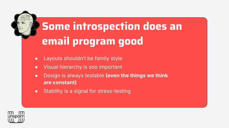
The framework: stop ignoring your constants
Both experiments pointed Yen toward the same realization, and it flips the usual testing logic on its head.
Most A/B testing instinct pushes you toward underperformers. Fix what's broken. Squeeze more out of the weak spots. Yen's argument is different: your most consistent, stable, high-performing emails, your constants, are your best candidates for structural testing. Precisely because they're stable. You know what normal looks like. Which means you can actually measure what a structural change does, without all the noise.
And if you improve the baseline, you raise the floor of your entire program. Apply what you learn about hierarchy, white space, CTA isolation, and image placement to your templates, and the lift doesn't stay in one campaign. It travels.
Her process: find the emails that consistently perform well and haven't been touched in a while. Use those as candidates for stress testing. Don't just test creative swaps like GIF vs. static or lifestyle vs. product image. Test the template itself. Redesign the whole thing and see what happens.
Then take what you learn and raise the baseline. Once you've done that, go back to your underperformers and pull the other levers: segmentation, frequency, timing. You're not starting from the same floor anymore.
The goal isn't to break what's working. It's to understand why it's working, and then use that across everything else.
What to take with you
Yen closed with the line that anchored the whole talk: "Every email we send is sacred. But not every sacred email we send is untouchable."
The emails you haven't questioned in years are exactly the ones worth questioning. The biggest performance gains Yen found weren't from campaigns she was excited to test. They came from the ones she assumed were already done.
That's the A/B test nobody asked for. It's also the one worth running.
Articles to whet your whistle


Subscribe to our newsletter.
Dive into the world of unmatched copywriting mastery, handpicked articles, and insider tips & tricks that elevate your writing game. Subscribe now for your weekly dose of inspiration and expertise.