

Halloween email design: 6 tactics worth trying
Six practical Halloween email design tactics, illustrated with real campaigns that go beyond the usual candy and costume promotions.

Every October, without fail, the inbox turns into a haunted house of the same six ideas, a pumpkin here, a pun there, and at least one spider web GIF that somebody in a Tuesday afternoon meeting was way too excited about. You know the subject lines that go with it: "Don't miss this spooky deal," "Trick or treat yourself," "Frightfully good deals await," the kind that could sit on top of literally any Halloween email ever sent. And look, I get it, Halloween is the one holiday where marketing gets to have a personality instead of just a discount code, so the temptation to go full costume party with your email is real. But the brands that actually stand out this time of year are, more often than not, the ones that resisted that exact temptation and leaned on a handful of design decisions that would work whether or not Halloween existed at all. Here are six of them, borrowed from brands that clearly know something the rest of the inbox does not.
Create a clever product arrangement
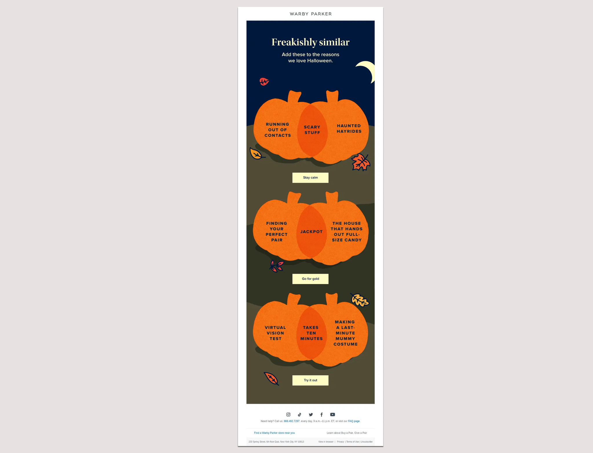
If you're trying to feature more than one product without your email turning into a digital junk drawer, structure is doing more of the heavy lifting than people usually give it credit for. Eyewear brand Warby Parker figured this out by building its whole email around one repeatable joke instead of a product grid: three overlapping pumpkins, each pairing something spooky with something mundane (running out of contacts, haunted hayrides, both landing on "scary stuff" in the middle), each with its own small CTA underneath ("Stay calm," "Go for gold," "Try it out"). Every section uses the same shape, the same two colors, the same button style, and no extra text cluttering things up. The joke does the seasonal work, freeing up the rest of the email to stay well-organized.
Keep it simple
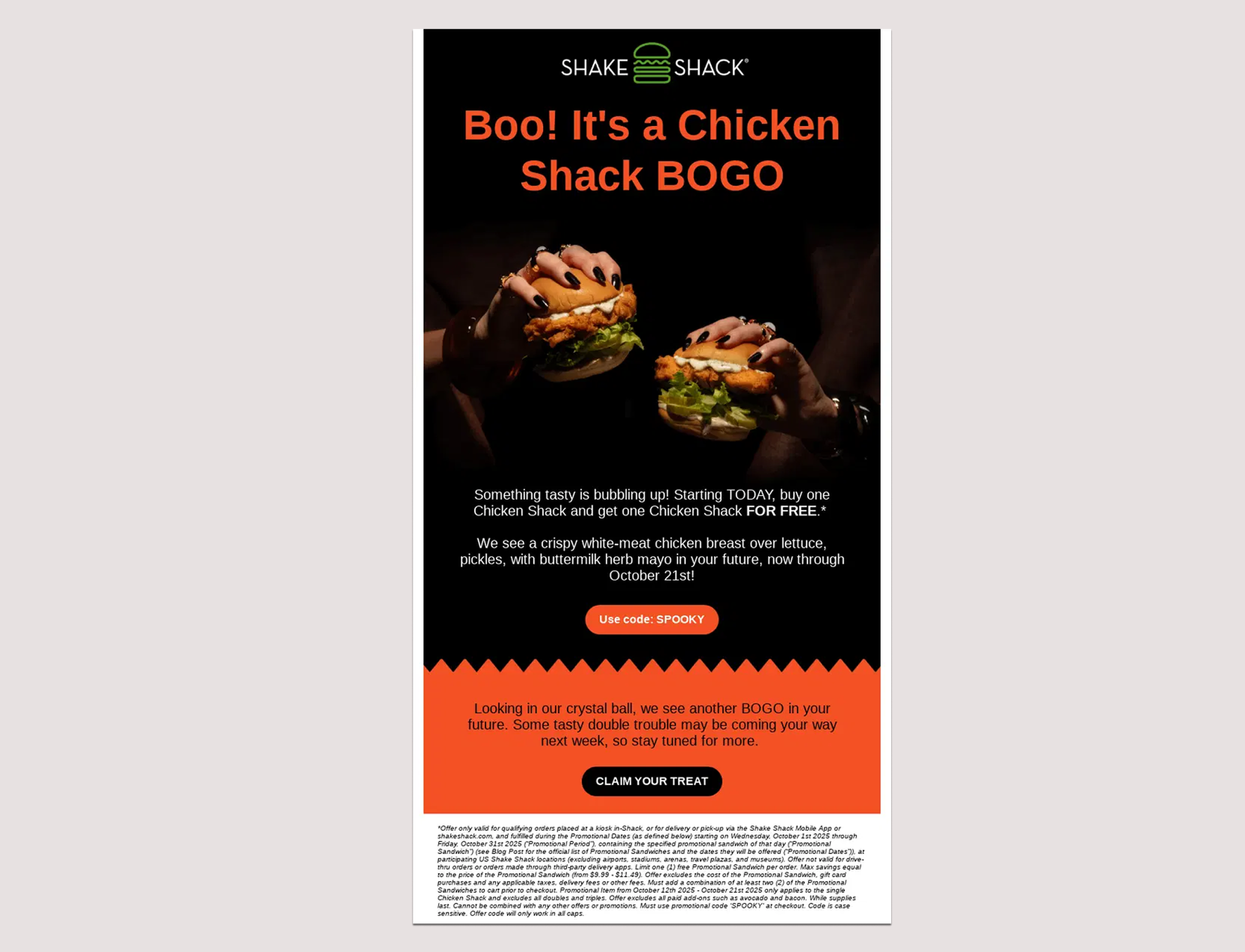
Some of the best Halloween emails don't need an elaborate design to make an impact, and honestly, that restraint is doing a lot of the work. Take Shake Shack, which built its Halloween send around one hero photo, a short headline, and a clear CTA, then repeated that same simple pattern once more, further down for a second offer. The design stays clean and uncluttered even as the copy leans fully into the holiday ("Boo!", "Use code: SPOOKY," "looking in our crystal ball"), proof that restraint in layout and playfulness in language aren't mutually exclusive.
Use eye-catching images
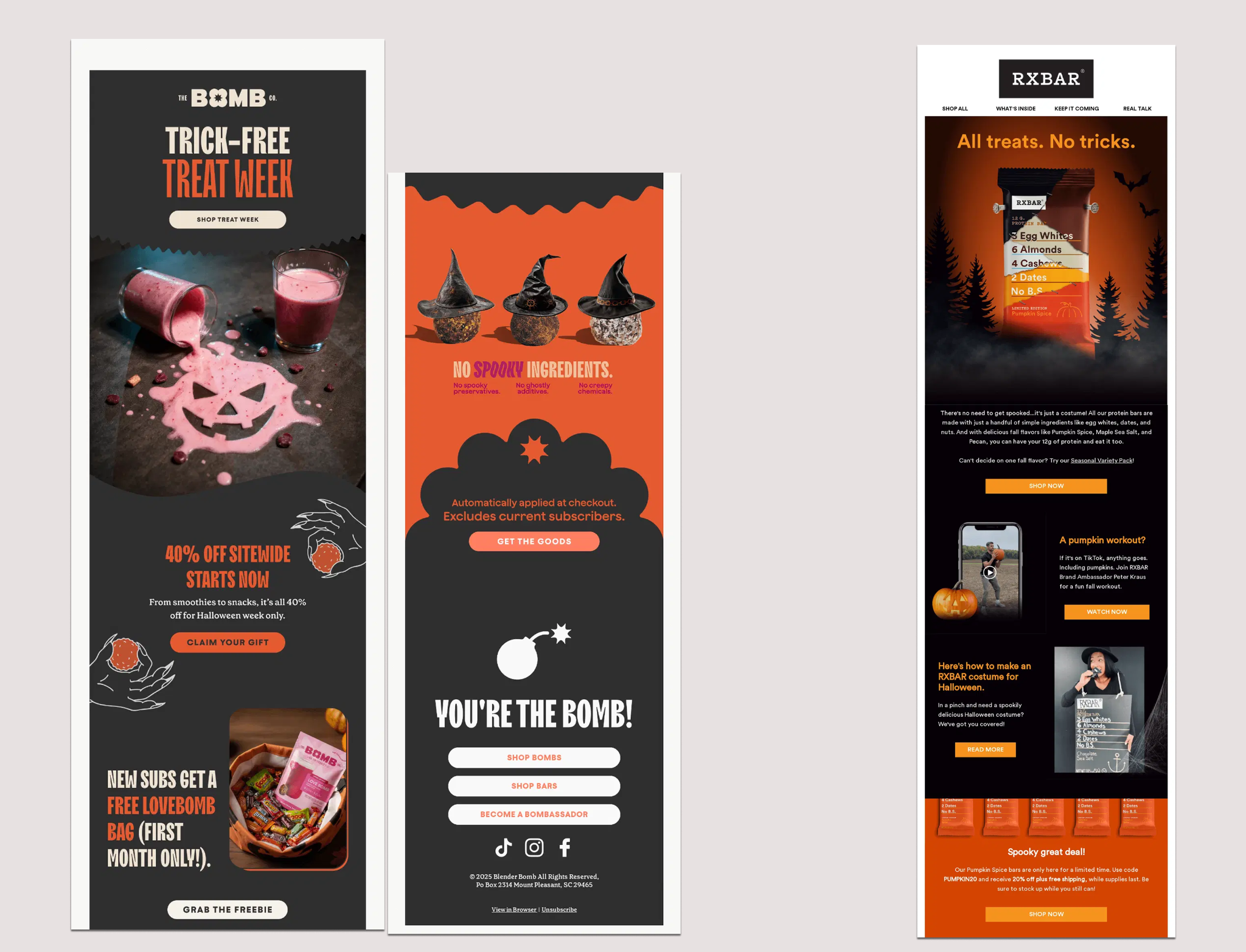
The Bomb Co. went the full unapologetic-image route: one dark, dramatic shot of a spilled smoothie forming a jack-o'-lantern face on a bare countertop, barely a line of copy above it. RXBAR got to a similarly striking place through a very different technique, staging a single protein bar like a movie poster in a foggy pine forest with bats overhead, turning a genuinely unglamorous product into something cinematic right out of the gate. Neither brand needed five mediocre images when one strong one would set the tone, and both kept the copy immediately around that opening shot minimal on purpose (RXBAR still has plenty to say further down, but the hero image doesn't have to compete with any of it for attention). If you're going to lean that hard on a single visual, treat it like a decision, not a shortcut. Never let the whole email become one giant image file, and always write the alt text, since plenty of inboxes won't load that gorgeous photo the moment it lands.
Establish a clear hierarchy
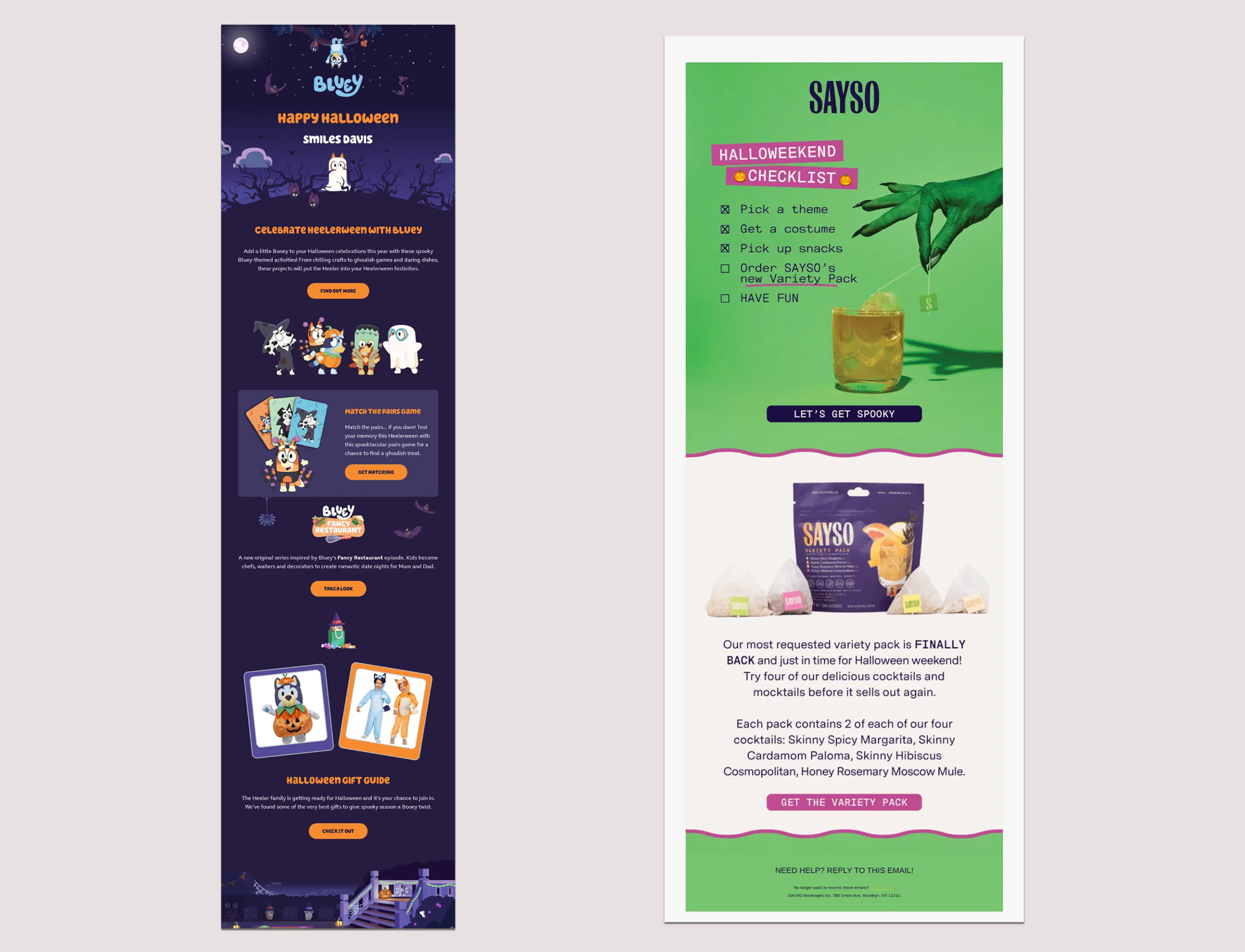
Whatever shows up first in your email is, realistically, the only part some readers will actually absorb, so it's worth fighting for. Bluey built its Halloween send around a single moody night scene, a full moon, bare trees, a ghost-costumed dog staring straight out at you, and kept that same dark palette running through everything that followed, so the whole thing reads as one cohesive scene rather than a grab bag of ideas. Sayso had the same instinct, opening on a clawed green hand dunking a cocktail teabag before anything else on the page, then letting the checklist and the product shot fall into place underneath it. Neither brand is being subtle about what matters most. The big visual at the top tells you exactly where to look first, and everything after it supports that decision.
Clear the clutter
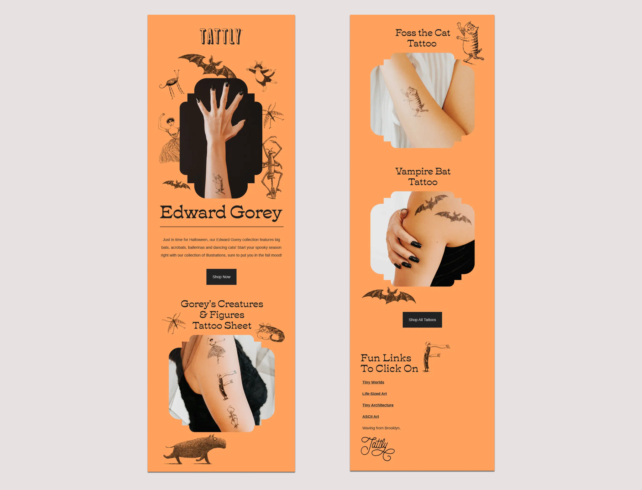
White space gets criminally underrated in email design, probably because an empty margin doesn't feel like it's "doing" anything. Tattly, the fake temporary tattoo company, absolutely could have gone the traditional route here, pumpkins everywhere, cobwebs in every corner, the whole cluttered seasonal aesthetic. Instead, for its Edward Gorey collection, it gave the illustrated bats, acrobats, cats, and skeletons generous room to breathe against one flat background, and that single choice pushes the whole email from "county fair" to "actually kind of sleek." The same illustrations crammed into half the space almost certainly wouldn't have worked nearly as well, which is most of the case for white space right there.
Optimize your CTAs
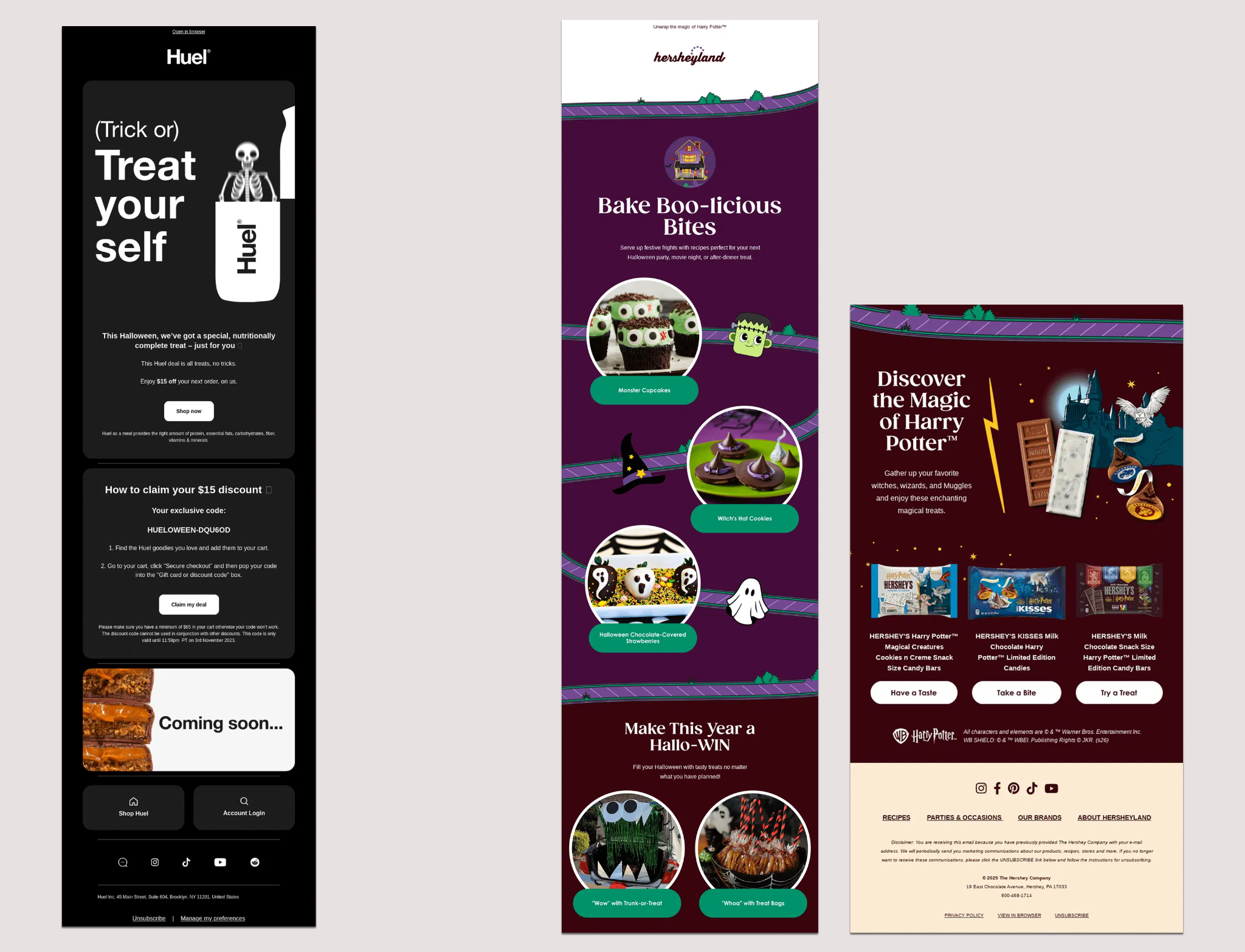
A CTA earns its click through contrast, clarity, and timing, not through clever copy alone, no matter how tempting the pun. Huel's Halloween email leans into a single-column rhythm, a clear headline, a short block of text, and its own CTA for each offer, so every decision feels contained instead of one long scroll asking for your attention all at once. The buttons themselves stand out clearly against the black background and use language that tells you exactly what happens next. The Hershey Company's Hersheyland newsletter walks readers through three separate recipes, and then three more products further down, with its own CTA anchoring each one, rather than saving the ask for the very end. Both make the next move obvious in their own way, and both keep the buttons themselves simple: short labels, real contrast, real button code instead of an image pretending to be one, and enough breathing room around each one that nobody has to aim carefully to click it.
Putting it together
None of these six tactics requires a bigger budget or a more elaborate theme than whatever you already have planned. Whether you came here looking for Halloween email examples to borrow outright or just a framework to build your own campaign around, it really comes down to a short list of decisions:
- How you arrange products so that more does not mean more cluttered
- How much you actually include, and just as important, what you leave out
- Which single image is doing the talking
- How you sequence what someone sees first
- How much room you give your best visual to actually breathe
- How clearly you point people toward the next step
Want to see this kind of breakdown in action? We did a full Feedback Friday teardown of Uber's Halloween emails, worth a watch if you want to see the whole thought process, not just the finished screenshot: Feedback Friday: Uber.
And once you're ready to put any of this into practice, RGE Studio lets you test different layouts, adjust spacing, reorganize product modules, and refine your CTAs before sending your Halloween campaign, so none of this has to be a guess.
Articles to wet your whistle


.png)
Subscribe to our newsletter.
Dive into the world of unmatched copywriting mastery, handpicked articles, and insider tips & tricks that elevate your writing game. Subscribe now for your weekly dose of inspiration and expertise.