

Here’s what the most-saved emails tell us about Q3 2026.
We compared the emails everyone saved with the ones they didn’t. Here’s what actually stood out.


Every quarter, we (but more like I) look at what people are saving on Really Good Emails and try to figure out what the most-saved emails have in common. It’s super useful if you are trying to figure out what’s going on in the heads of email makers, what they are planning for, and what is catching people’s attention. But, it’s also a little like staring at a cloud until your mind tells you that it’s actually the shape of a kangaroo on a boat.
If you hand me 50 great emails and tell me to find some trends, I will find trends. Maybe everyone loves orange right now. Maybe serif fonts are the only thing standing between us and societal collapse and only the best email makers know it. I’ve definitely had to question my own confirmation bias and pattern recognition over the years, so that’s why this time we did something different.
We compared Q3’s most-collected emails against hundreds of other emails published during the same time and a little before. What we looked for wasn’t what the most popular emails had in common, but rather what shows up the most in popular emails more/less often than we should expect.
To do this, we had to create a whole deterministic extraction system that isolates and evaluates hundreds of characteristics across things like design, layout, typography, color, campaign type, imagery, CTAs, and more. Then we took several characteristics that stood out in our initial review and asked what we'd expect to see in a random group of Q3 emails. The result is statistical evidence that shows emails in the most-saved list do something differently than the rest.
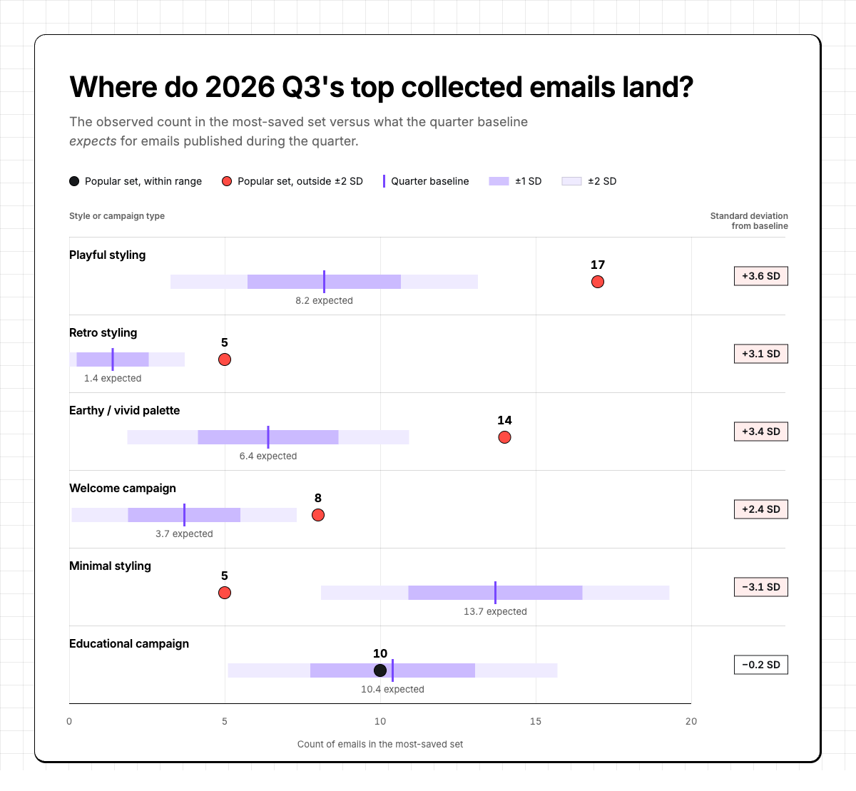
The purple bar is what we’d expect to see and the band around it shows the normal variation for that characteristic or campaign type. The dot is what happened when we plotted the most-saved emails against the normal variation, with a red dot showing standard deviations outside the expectation.
Here’s how the most popular emails in Q3 hit differently than others you probably saw in your inbox:
Playfulness was a vibe and the biggest outlier
First, when we say playful, we don't just mean “we thought it looked fun.” It's a predefined style in our email analysis.
What we mean by “playful”: Our analysis labels an email as playful when its visual style uses expressive, fun, or intentionally unconventional creative choices—things like whimsical illustration, doodles, unexpected typography, humorous visual treatments, energetic compositions, or game-like elements. It describes the email’s overall visual language, not whether the copy contains a joke. (Although we always like a good joke.)
Across Q3, about 26% of emails were classified as playful. But among the most-collected emails, that jumped to 34%. You can see in the chart that we expected around 8.5 emails from our top-saved list to fall into this category, but we actually ended with 17 (a +3.6 standard deviation away from our baseline).
When we looked at those with this characteristic, what we saw were some funky emails. Maybe your boss would say “can you add some wobbly letters to let people know we’re fun?” But that’s not the kind of playfulness we saw. Here are some of our favorite examples:
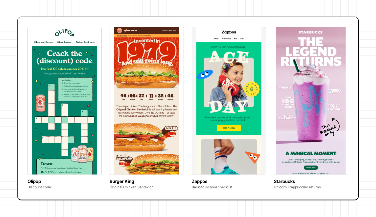
- OLIPOP turned their email into a crossword puzzle
- Burger King used a timer that counted up from 1979 (when their Original Chicken Sandwich debuted)
- Zappos got a kid to use their shoe as a phone and then colorfully broke their mode
- Starbucks treated the return of the Unicorn Frappuccino like celebrity news
What you could steal from these examples:
Before your next campaign, ask: “What's the part of this email someone could describe to a coworker tomorrow?” If the answer is “the 20% off,” congratulations on your coupon.
Minimalism is not bringing all the boys to the yard
Okay, so if you are sticking with the whole “We should expect a lot of emails like this type” in our random sample, the data showed the complete opposite. Minimal styling in the top-saved list was -3.1 standard deviations away from that baseline. (There should’ve been around 13, but there were only 5).
This was super interesting to me because I can hear my design professor from his grave saying: “Give it more whitespace. Take away more things. Keep it clean. Remove something else. No, seriously, remove another thing. Let it breeeeeeathe.” Yet, the emails people were saving in Q3 were some of the strongest examples of dense, layered, and highly compacted. For example:
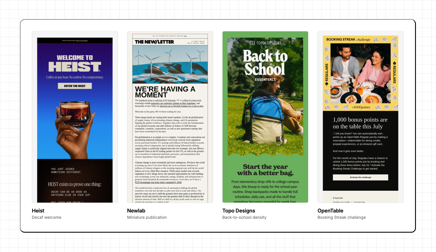
- Heist has a welcome email that isn't afraid of information. It introduces a philosophy around decaf, comparisons, membership, products, preferences, and an entire after-dark coffee identity.
- Newlab basically sends you a miniature publication.
- Topo Designs packs products, personalization, organization, capacities, and back-to-school context into the same message.
- OpenTable crams in illustrations, images, and challenge points into their hero
Before you post to LinkedIn that RGE said that you should cram more stuff into your email, that isn’t what these emails do. What I see here is that clarity and minimalism aren’t the same thing. A dense email with a strong idea can be easier (and considerably more visually interesting) to explore than a sparse email with not much to say.
What you could steal from these examples:
Before adding more to an email, think about how each background, illustration, color, and spacing adds cohesion or leads someone to a point in the email.
The winners committed to a color world
Got yourself brand colors? So do we. But the emails that got picked up the most in this quarter stuck to vivid and earthy colors. We expected around 6 emails in the set to have vivid/earth color palette, but we ended with 14.
The opposite of vivid or earthy isn't really “pastels” if you ask me. It's closer to a neutralized or conventional brand palette (white/gray/black foundations, restrained accent colors, soft muted palettes, or several brand colors sharing attention without one color dominating). On the other hand, earthy colors, such as olive, clay, sand, cream, and botanicals are nothing like vivid colors like electric blue, hot pink, saturated green, etc. But they do have one thing in common: They both make for a purposeful color decision that evokes an outdoor feeling.
The data doesn't tell us why those palettes were more popular, but Q3 gives us some pretty plausible explanations. July through September moves from summer into back-to-school and early fall. Citrus, food, outdoors, harvest, school supplies, late-summer launches, fall wellness. All of those categories have strong sensory color associations.
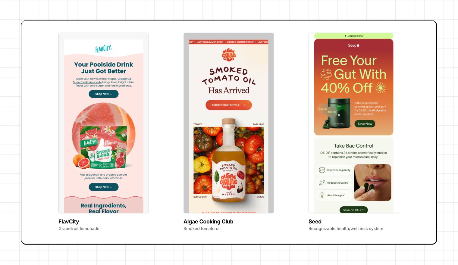
- FlavCity's grapefruit lemonade practically marinates in grapefruit.
- Algae Cooking Club lets the food, ingredients, illustration, and palette inhabit the same visual universe.
- Seed builds a recognizable health-and-wellness system rather than treating color like something picked from the brand guidelines five minutes before send.
Color is doing something that keeps showing up elsewhere in this analysis: It's making the email specific. I don’t believe people want more color in their emails. People want to make recognizable creative decisions. Playful is a decision. Covering an email in grapefruit orange is a decision. Feeling retro (the next thing we’ll look at) is a decision. We all know that a “clean, white email with brand accents” can absolutely pass the bar and still have its own beauty, but it’s not as memorable as those drenched with purposeful color decisions.
What you could steal from these examples:
I know this is going to make some brand owners very nervous to share with their team, but think of your email as something other than approved brand colors. Maybe ask the question of “If this campaign could own one color world, what would it be?”
Apparently, email makers are still going through a retro phase.
Generally, only a small set of emails that had a retro theme showing up wouldn’t catch my eye and call it a trend. But with our handy-dandy dataset, we can see that Retro styling showed up 5x more than we expected.
When only about 4% of the entire quarter’s emails on RGE had a retro style, this one definitely stands out as an intentional choice and helps bring together a cohesive theme. Retro designs give brands something that modern templates usually don’t include, like odd typography, print-inspired layouts, and texture.
However, when you look at the emails, nothing pops out as being mid-century modern or 80s feels. What was flagged was more of the chunky 70s-style font choices. For example:
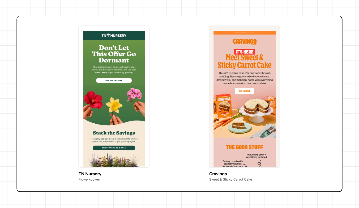
- TN Nursery’s flower-power email
- Cravings’ carrot cake that gives us nostalgia for being back in grandma’s kitchen
- Burger King’s Still Going Strong campaign that we highlighted above
We’ve seen this trend before. Why I think it continues is because people aren't specifically collecting retro emails. They may be collecting emails that don't look like email templates.
What you should steal from these examples:
Connect with readers by playing the nostalgia card. Look for inspiration from a cookbook, magazine, newspaper, restaurant, clubhouse, or your grandparents' junk drawer.
Welcome emails are punching above their weight.
Not as bananas as “playfulness,” but there were more welcome emails this quarter that made the top-saved list than expected. What you see is that there are some pretty cut-and-dry examples in here (like the one from Target), but there’s also some interesting experiences that brought people into their own little world. For example:
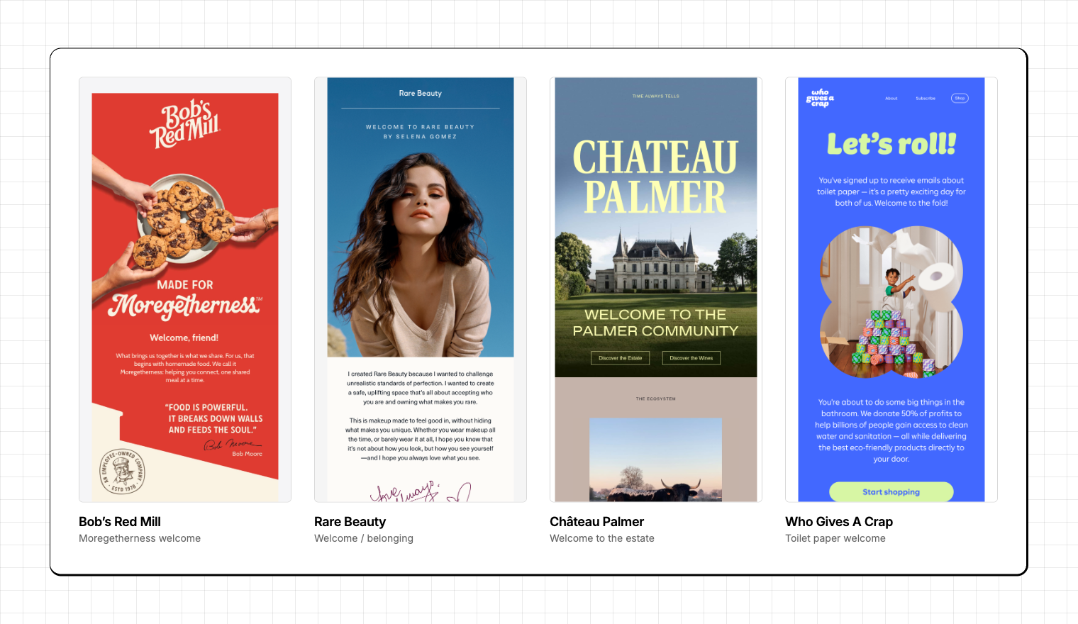
- Bob's Red Mill starts with food as something shared, then backs that up with employee ownership, heritage, and ingredients.
- Rare Beauty begins with belonging and self-expression.
- Château Palmer brings you into an entire place: the estate, ecology, people, architecture, culture, and wine.
- Who Gives A Crap manages to make receiving emails about toilet paper feel like joining a cause with significantly more poop jokes.
As people ramp up for Q4, it is no surprise that more email makers are preparing their welcome strategies for the new people getting added to their list soon.
What you should steal from these examples:
Your first email doesn't have to explain everything your product does; it should just make someone feel good about having raised their hand. There will be plenty of time to introduce Profile Settings and new deals later.
So what do Q3 email trends mean?
Someone could argue (like me) that the best emails in this group aren’t the loudest, darkest, simplest, densest, or most sophisticated specimens wandering inside the inbox. True that there are some more interesting ideas, but generally, from what is there, these are all pretty normal for RGE. What’s unusual is the mix of creative decisions people chose last quarter and what they are gravitating towards. Why are people saving more playful emails? Or ones that have more of an outdoor feel? Or what is it about “simple and minimal” that seems boring compared to others? Those are all questions that come out of this analysis that are harder to answer.
Articles to wet your whistle

.png)
Subscribe to our newsletter.
Dive into the world of unmatched copywriting mastery, handpicked articles, and insider tips & tricks that elevate your writing game. Subscribe now for your weekly dose of inspiration and expertise.