
Stop treating email dark mode like an afterthought
Dark mode email breakdown: Annett Forcier explains six client behaviors, logo visibility hacks, and why dark mode needs to start at design, not at final QA.

In this edition of Feedback Friday, we sit down with Annett Forcier, founder of EmailBoutique and email design systems consultant based in Vancouver.
Annett builds email design systems for a living. Which means she has sat through more "why does our logo disappear in dark mode" conversations than most people have had coffee. She has also figured out how to ensure that conversation happens on day one of a project, not the day before it ships.
The topic: dark mode. Why it is more complicated than you think, why it needs to happen earlier in your process than you have probably been treating it, and what to actually do about it.
👇 Let's break it down.
Here's the moment every email developer dreads
You have spent weeks building a design system. The master template is coded. Everything is QA'd. You sit down with the client to walk through the final result and pull up the dark mode preview.
The logo has disappeared. The carefully chosen brand colors look like they were picked by someone who has never seen the brand. The yellow button is now, in Annett's exact words, "poop brown in Gmail."
And then the argument starts.
"The brand team was like, 'Our yellow button is now poop brown in Gmail.' And then the argument starts. 'Yeah, but Amazon does that too.' It's like, yes, Amazon also lives with the poop brown button."
Here's the thing: that moment does not have to happen at the end. Annett's entire process is built around making it happen on day one instead. Before the template. Before the design system. Before anyone gets emotionally attached to anything.
"If I deliver a finished email and show the problems at the end, they get frustrated and reject. If I explain and show upfront, the project goes way smoother."
What dark mode actually is, and why it's weirder than you think
Here is what most people think dark mode means for email: the background goes dark, the text goes light, everything looks fine.
Here is what actually happens: the email client tries to apply a transformation that it was never designed to coordinate with your brand. And it cannot distinguish between your background color and your logo.
A black logo on a white background? In dark mode, that logo can simply vanish. A warm beige background you carefully chose to feel on-brand? It might become charcoal grey. The email client is making its best guess based on pixel values, with no idea what your brand is supposed to look like.
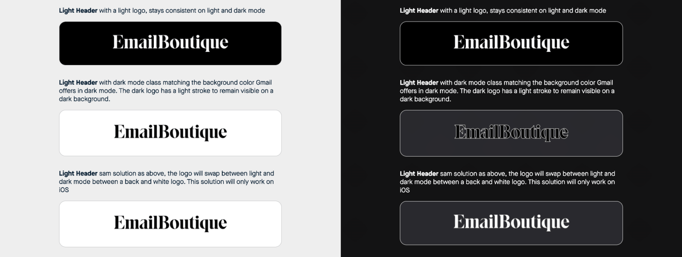
And here is the part most teams do not realize: there is not just one dark mode. Annett calls it "six different dark modes" because the same inbox family can behave differently across native apps, mobile apps, desktop apps, and webmail.
- Apple Mail (iOS native): the cooperative one. You can target it with CSS and make deliberate choices for both environments
- Gmail on iOS: partial support, but behaves differently from Apple Mail even on the same physical device
- Gmail on Android: the aggressive one. It darkens backgrounds, inverts text, and changes brand colors whether you want it to or not
- Outlook desktop and Outlook mobile: each has its own rendering logic, and they do not match each other
So when someone says "just handle dark mode in the code," what they are really asking for is a group of overlapping workarounds with no guarantee that every client will behave the same way. You are not designing for one perfect state. You are designing for forced background shifts, partial color inversion, text overrides, and clients that ignore your CSS.
That is the reality Annett's process is built around.
Why this is a design problem before it's a code problem
Most teams treat dark mode like a code ticket to close at the end of the project. If you do it that way, you are already too late.
Figma supports background toggling. Photoshop can do it too. You can test a logo, illustration, button, or social icon against a dark canvas before anyone writes a line of code. If the logo disappears in Figma on a dark background, it will disappear in the email too.
That is not a code problem. That is a design problem that ended up in the wrong department.
Design problems caught in Figma take five minutes to discuss. Design problems caught during final QA are the cause of the argument.
"If it doesn't stand in the design, it will also not stand in the email."
Every visual asset in your email should be stress-tested against light, dark, and mid-grey backgrounds before it goes anywhere near development. Logos, social icons, illustrations, buttons. All of it. This costs nothing and saves the conversation you do not want to have at the end.
The style guide that changes everything
Before Annett builds any template or design system, she delivers a coded style guide. Not a deck. Not a PDF with screenshots. A live-coded document that tests every ingredient of the email in real rendering conditions.
Think of it as mise en place. In a professional kitchen, you do not start cooking and then go hunt for your ingredients. Everything is measured, prepped, and within reach before the heat comes on. The style guide is the same principle applied to email: every asset tested, every problem surfaced, every stakeholder aligned before a single module gets built.
What goes in it
- Brand colors against light, dark, and mid-grey backgrounds
- Typography with fallbacks
- Logo in three states: light mode, targeted dark mode (iOS), and forced dark mode (Gmail)
- Social icons
- Illustrations
- Buttons with brand colors
- A complete footer with placeholder text

Every element gets tested against common, messy rendering conditions, including the grey background that Gmail on Android tends to impose without asking.
When a dark logo disappears during a style guide review, it is a technical conversation. No one is attached to a finished campaign yet. The brand team can review the options and make a decision calmly, since nothing is finalized yet.
When that same logo disappears during final QA on a campaign shipping tomorrow, it becomes a crisis. People get defensive. Blame gets distributed. Someone mentions Amazon. No one has a good time.
"If a problem repeats, that means it's not a human issue. It's a system issue or a process issue."
The style guide is the process fix. It puts the bad news at the beginning, which is the only place it can actually be dealt with.
Three ways to fix the disappearing logo
The disappearing logo is the most visible dark mode failure and the one that almost always requires a conversation with the brand team. Annett does not walk in with one correct answer. She presents options. Her job is to show what can happen and the trade-offs. The brand team owns the brand.
Option 1: use a dark background container
If the header uses any dark background (does not have to be black, dark green or deep red, both work), a white logo functions in both light and dark mode without any special handling. One image. Stable contrast. Less drama.
The trick to locking that background in Gmail is a CSS linear gradient with the same hex value for both the start and end colors. Gmail's forced dark mode does not recognize it as a solid background color, so it leaves it alone. Annett found this by accident: she copied the wrong hex value when building a gradient, ran the email through testing, and noticed Gmail had not inverted anything.
"Dark mode doesn't understand that this is supposed to be a gradient. It just leaves it alone."
In Annett's testing, this worked across most modern email clients, except for one older Outlook version.
Option 2: add a white outline stroke to the logo
A white stroke around a dark logo keeps it visible even when the background flips dark. Most widely used hack in the community. Requires a brand conversation because you are technically modifying the logo, but most teams accept it once they see the alternative.
The same logic applies to buttons: a two-pixel border holds up better in Gmail's forced dark mode than background colors do, because borders do not get converted as aggressively. Stronger stroke, more definition, less poop brown.
Option 3: image swap via CSS class targeting
Show one logo in light mode, a different one in dark mode. The limitation: this only works reliably in native iOS Mail. It does not work in Gmail. So the light-mode logo still needs to survive Gmail's forced dark mode anyway, which usually means you are back to thinking about outlines or containers.
This is why Annett does not say "here is the one correct logo solution." There is not one. There are options, and the right one depends on the brand.
What else disappears, and what to do about it
Logos get the attention, but they are not the only things at risk. Here is how Annett handles the other usual suspects.
Social media icons
The simplest fix is often a mid-grey icon that works on both light and dark backgrounds. A good grey can survive both environments without much extra code.
If the brand needs more control, add a circular container behind each icon to create a stable contrast zone. That reduces the chance that one icon gets inverted differently from the one sitting right next to it. Because yes, that can happen. Email remains unserious in very serious ways.
Illustrations and custom graphics
A black line drawing that looks intentional on a white background can vanish entirely on a dark one. Or worse, it stays technically visible while appearing to belong to a completely different brand.
Annett's fix usually happens in Figma, not code: add a white shadow or outline behind dark lines, reinforce internal edges, strengthen contrast in areas likely to get lost. The goal is an illustration that carries its own structure regardless of what background it lands on.
Buttons with brand colors
Buttons are where brand dreams often meet Gmail reality. Yellow can become brown. Beige can become muddy. Carefully chosen colors can become something no one approved.
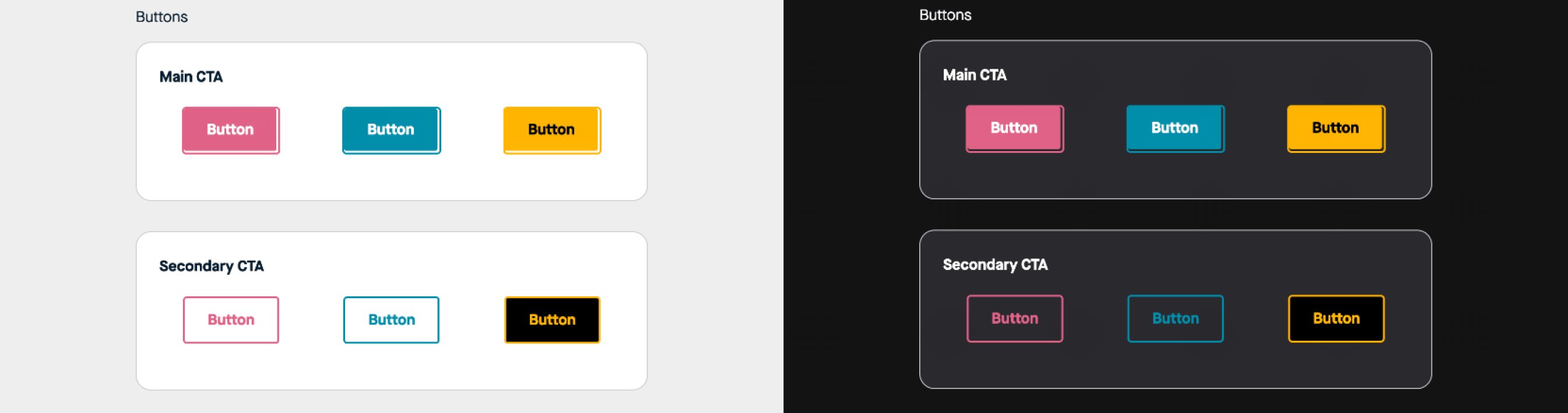
There is no universal code fix for Gmail's forced dark mode. Better move: test button colors early, show the brand team what happens, and decide on acceptable fallbacks before the button appears in a real campaign. A stronger border can help preserve definition when the fill color shifts.
The Gmail trick for keeping white text white
On dark background sections, you want white text to stay white in both modes. In iOS native mail, you can target this directly with a prefers-color-scheme media query. In Gmail, you normally cannot. Gmail does what Gmail wants.
There is a CSS mix-blend-mode technique that changes this. Applied to white text on a dark background, it preserves the white color instead of letting Gmail invert it.
"It works in Gmail magically."
One limitation worth knowing: it only works in one direction. You can keep white text white. You cannot force black text to stay black in the same way. At least not yet.
For brands with dark-leaning email palettes (Black Friday campaigns or those that already default to dark aesthetics), this is a significant advantage. If you are always fighting Gmail's color inversion, one option is to stop fighting it by leaning into a darker design system from the start.
All-image emails are not the answer
When dark mode problems come up in a client meeting, the first non-developer instinct is usually: "What if we just make everything an image?"
If it is all a JPG, the email client cannot change the colors. In theory, that sounds convenient.
In practice, it creates a much bigger set of problems:
- Alt text becomes nearly impossible to populate properly, which is an accessibility failure
- File sizes are larger, and for subscribers on mobile data plans, that cost lands on them
- If images are blocked or slow to load, the email is empty
- Last-minute copy changes mean going back to a designer and extending production timelines
- All-image emails have historically raised concerns with spam filters, and that has not entirely gone away
You would not build an all-image website to avoid CSS problems. Email is the same. The move is not to give up on code. It is to plan for dark mode before the email becomes one giant screenshot with a CTA.
The ESP gap nobody talks about
Here is a structural problem worth naming: most ESPs and drag-and-drop builders still do not give teams meaningful dark mode controls.
You can choose a background color. You can choose a text color. But there is usually no field that says "what should this color become in dark mode?" That creates a frustrating gap. A team can understand dark mode, a designer can plan for it, a developer can know what should happen, and then the actual sending platform does not offer the control needed to implement it cleanly.
Sometimes the team knows exactly what should happen. The tool just does not give them a clean way to make it happen.
On testing tools
Litmus, Email on Acid, Parcel, and Everest are all good starting points, but they are approximations. Annett tests across real physical devices: a PC, a Mac, an Android phone, and an iPhone, each running native apps plus Gmail, Yahoo, and others. Screenshots are returned to Figma so stakeholders can see the full range of rendering outcomes side by side.
"Any testing tool is great as a starting point. But it never really looks 100% to what I see on my devices."
For checking which CSS features are actually supported across clients, caniemail.com is the reference. Think caniuse, but for email, people who enjoy suffering together.
What the live email reviews showed
After the walkthrough, Matt and Annett looked at a few real emails in dark mode. The pattern was consistent: the best examples were not perfect. They were simply the ones where someone had clearly thought about dark mode before QA.
Nothing
The Nothing email handled handled dark mode well overall. The logo treatment looked intentional, likely using an image swap in the native iOS preview. The buttons held up better than a default inversion would have produced, and the product imagery mostly survived the background shift.
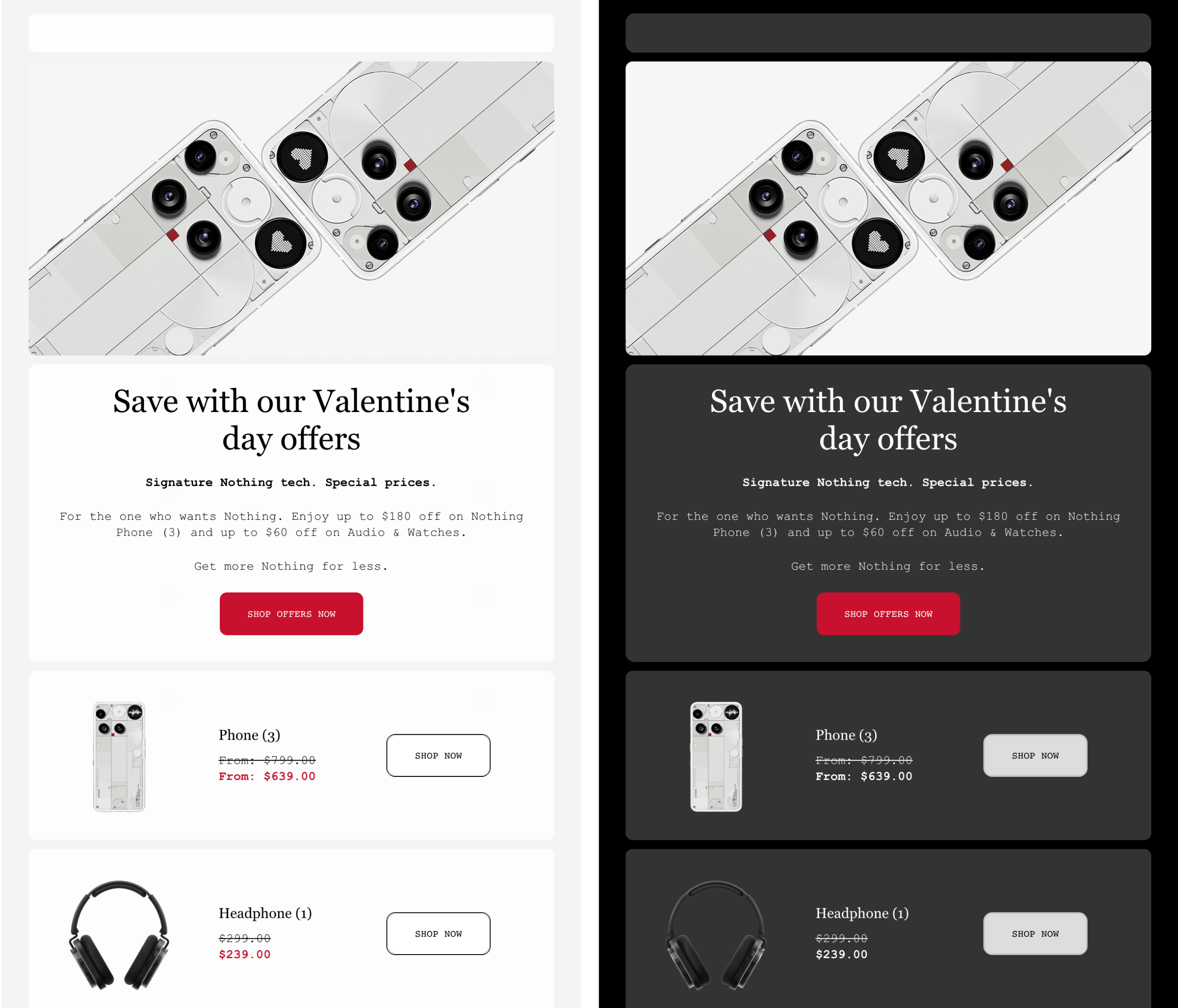
Annett's main note: the product images were still a little close to the edge in terms of contrast. A subtle outline or additional light detail could help them stand out more. But the overall verdict was high. If someone is using a hover state and a toggled image, there was clearly thought behind it.
DoorDash
DoorDash's email had a strong system and, in many places, clear, dark-mode thinking. The icons were handled well, the footer looked solid, and the overall structure suggested dark mode had been considered at a design level.
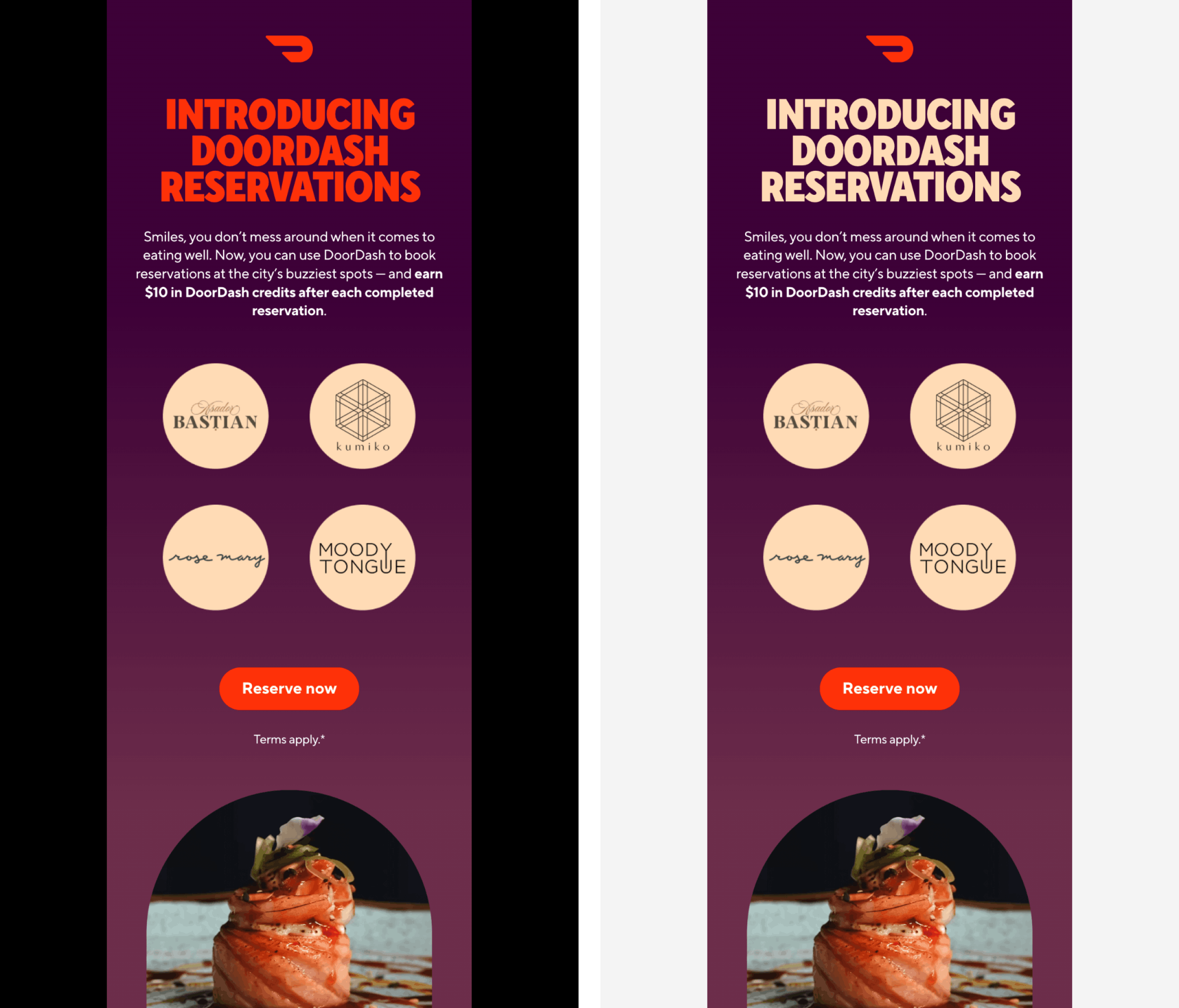
But one section had text that nearly disappeared. Annett's read: someone had likely copied and pasted content in a way that overwrote the intended styles or removed a class by accident. A useful reminder that dark mode is not only a design system issue. It is also a production issue. The person assembling the email needs to understand how not to break the styles that the template depends on. The developer gets an A. The content production process gets a note in the margin.
Inverse
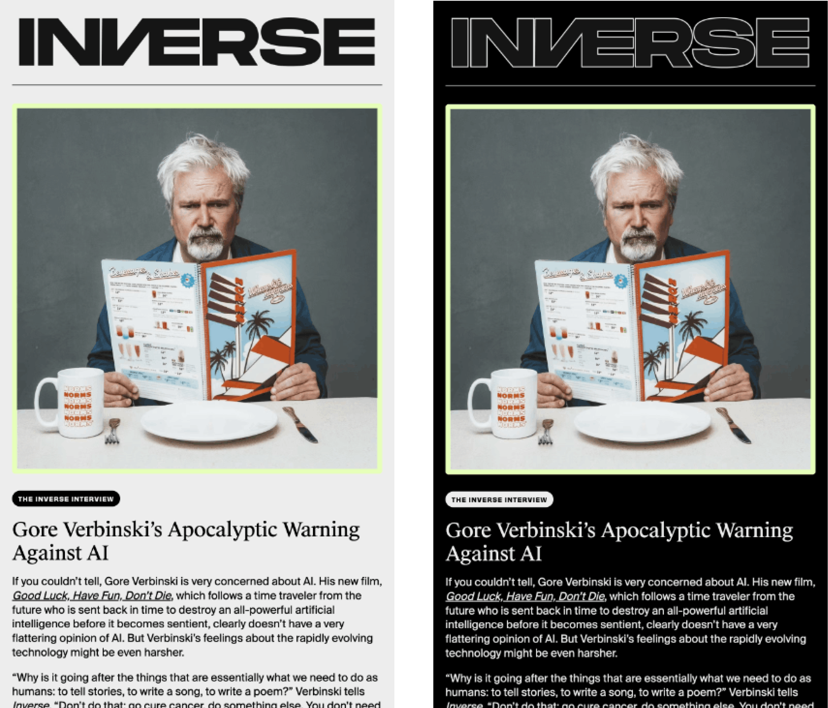
The Inverse newsletter was a good example of why dark mode matters, especially for long-form email. When an email has a lot of text to read, dark mode is not just a visual preference. It can make the reading experience feel softer and less harsh, especially late at night. Annett noted that dark mode had clearly been considered at the design level: the logo treatment, content readability, and overall contrast held up well.
Claude
The Claude email showed a different kind of problem. Some parts worked well, but the dark mode version lost definition in a few sections of the content. The card-like structure became less distinct, and some container backgrounds did not carry over cleanly.
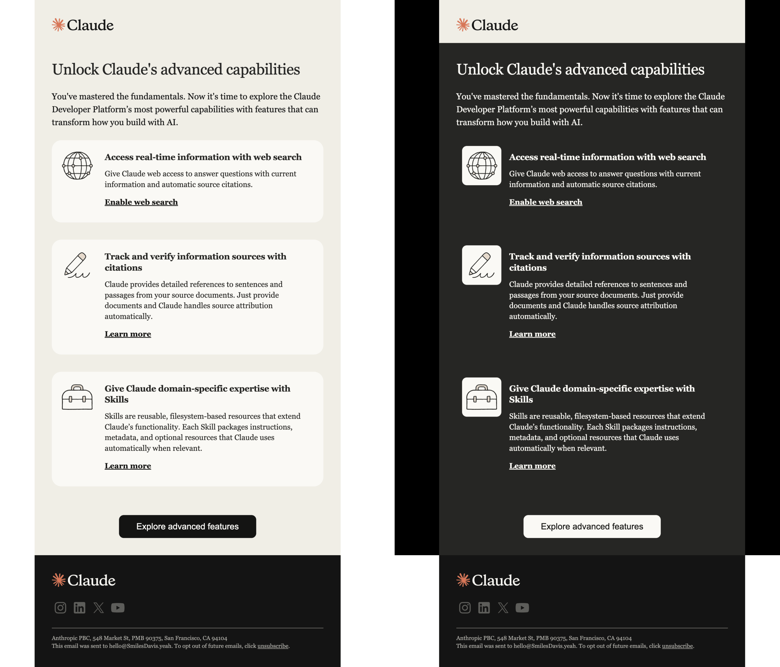
Annett's take: this may not have been the team's fault at all. It looked like the kind of limitation that often comes from a drag-and-drop builder or ESP that does not offer dark mode-specific settings. Even thoughtful teams can run into limitations with tools. Sometimes the question is not "Did anyone think about dark mode?" It is "Did the platform give them a way to control it?"
What the standard workflow gets wrong, and how to fix it
Most teams build emails in a straight line: strategy, design, development, testing, and send. It sounds logical. In practice, it creates a cascade of late-stage problems.
Designers work on static canvases without toggling between light and dark. Dark mode is ignored until code review, if it's considered at all. QA happens under deadline pressure or gets skipped entirely. The result is a template that has been patched and modified across so many campaigns that it becomes genuinely hard to fix. Code drifts from the original structure. Nobody knows what changed or when. There is no time to start over before deployment.
Annett's process changes the order. The style guide comes first. Stakeholders review the implications of dark mode before any template exists. Everyone agrees on what acceptable looks like before anyone has anything to defend.
"This is only set up once. And afterward, there's less head-banging and arguing about it, because everyone is on the same page."
Once the style guide is signed off, she builds the email design system: a component library in Figma, a coded master template, and sample emails by category (newsletter, welcome series, promotional, transactional) that are fully coded, QA'd, and stored in the ESP, ready to clone. Not previous campaigns that may have accumulated errors and drift. Clean, tested starting points. One source of truth.
Know where your audience opens. If your list is heavy on iOS native mail, prioritize that experience. If Gmail dominates your opens, design around what Gmail does. Pixel perfection is the wrong scoreboard. The right benchmark is whether the email is readable, the brand comes through, and the experience works for the clients your subscribers actually use.
"No email is pixel-perfect from the design, or even in between inboxes. That's just a fact. And we have to stop worrying about that because it's just not going to change."
Dark mode belongs in brand style guides
The longest-term point Annett makes: email best practices need to live inside official brand style guides.
Most companies have detailed rules for logo usage, color systems, typography, photography, and web design. Almost none of them document how those same decisions should work in email. That means every email developer has to rediscover the same problems from scratch. Every project starts from zero. Every stakeholder conversation repeats. Every dark mode surprise feels new, even when the industry has seen it a thousand times.
"If it's in there, it will no longer be an afterthought. I'm advocating for that."
A useful email section in a brand guide might include:
- Approved logo treatments for light and dark backgrounds
- Acceptable button color behavior in forced dark mode
- Icon and illustration guidance
- Fallback font rules
- Tested background colors
- Accessibility and contrast expectations
- Examples of light mode, targeted dark mode, and forced dark mode states
That is how dark mode stops being a last-minute crisis. It becomes part of the brand system.
The short version
If your eyes glazed over somewhere around "mix-blend-mode," this is the part to keep.
- Dark mode is not one thing. Different email clients handle it very differently
- If an asset fails on a dark background in Figma, it will probably fail in email too
- Dark mode is a design problem before it is a code problem
- Logos, icons, illustrations, and buttons all need to be tested before development
- All-image emails are not a responsible workaround
- Testing tools are useful approximations, but real-device testing still matters
- Pixel perfection is the wrong scoreboard. Readability, brand clarity, and subscriber experience are the right ones
- Email-specific rules belong in brand style guides
- Delivering the bad news early is always better than discovering it during final QA
Wrapping up
Dark mode is not new, but it is more widespread than ever. More devices default to auto mode. More subscribers have it enabled. More email clients apply their own transformations whether you want them to or not. That gap between design intent and rendered reality is not closing anytime soon.
What Annett's process actually offers is not a magic fix. It is a way to stop being surprised. The style guide, the Figma testing, the day-one stakeholder conversation: none of it produces a perfect email. It produces a team that has already looked at the hard stuff together, made decisions, and agreed on what good enough looks like across inboxes they do not control.
The bad news will always exist. The only question is when you find it. In a professional kitchen, mise en place is not about perfection. It is about not being surprised when the heat comes on. Email, it turns out, is exactly the same.
Subscribe to our newsletter.
Dive into the world of unmatched copywriting mastery, handpicked articles, and insider tips & tricks that elevate your writing game. Subscribe now for your weekly dose of inspiration and expertise.